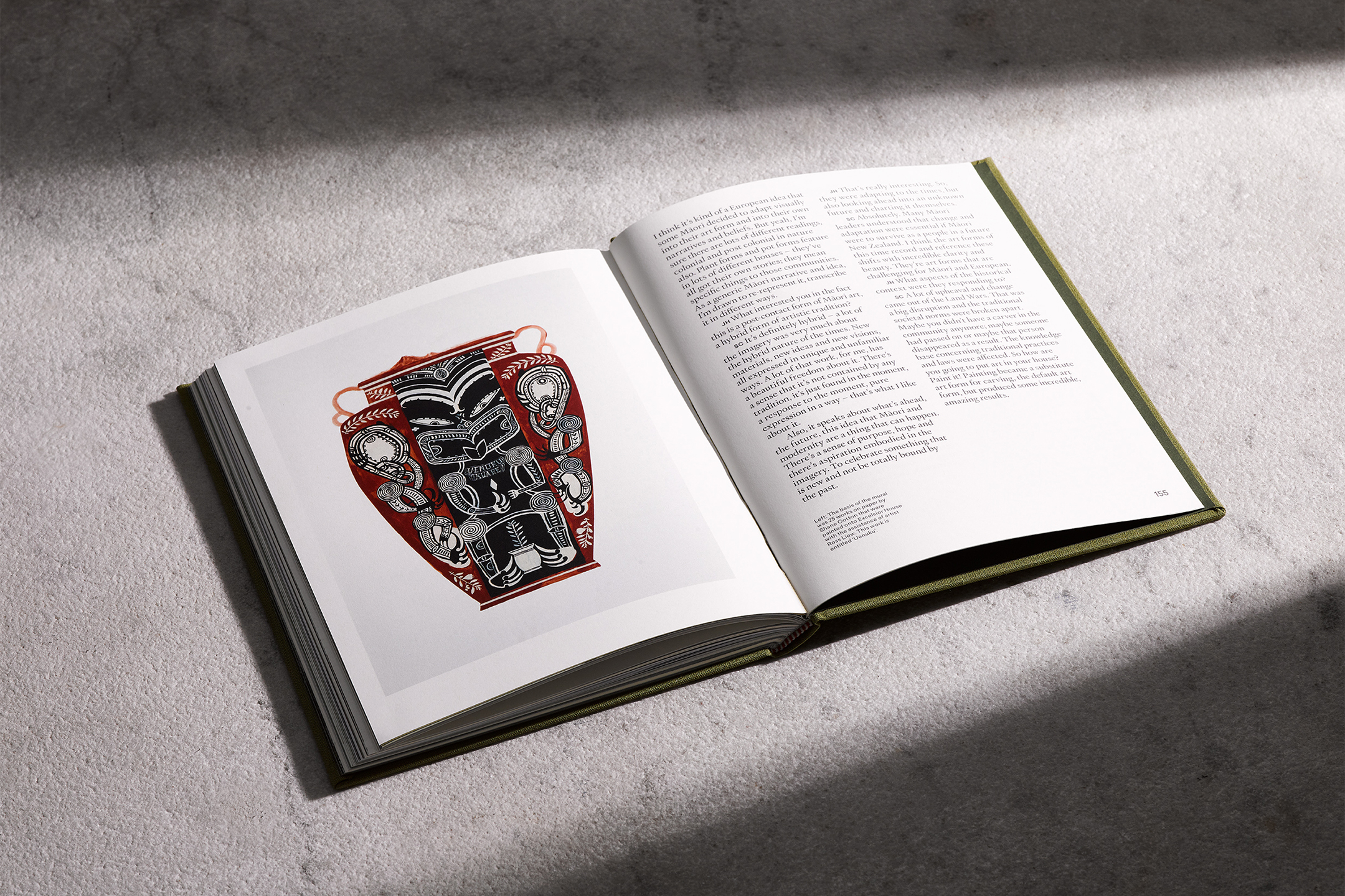
-
Field Studies Flora
[Designed at 1/1 Studio]
Creative Director
Natasha Sawicki Mead
Designers
Alexandra Turner
Typefaces
Caslon Ionic & Henry
Paper Stocks
Munken Print Cream 80gsm
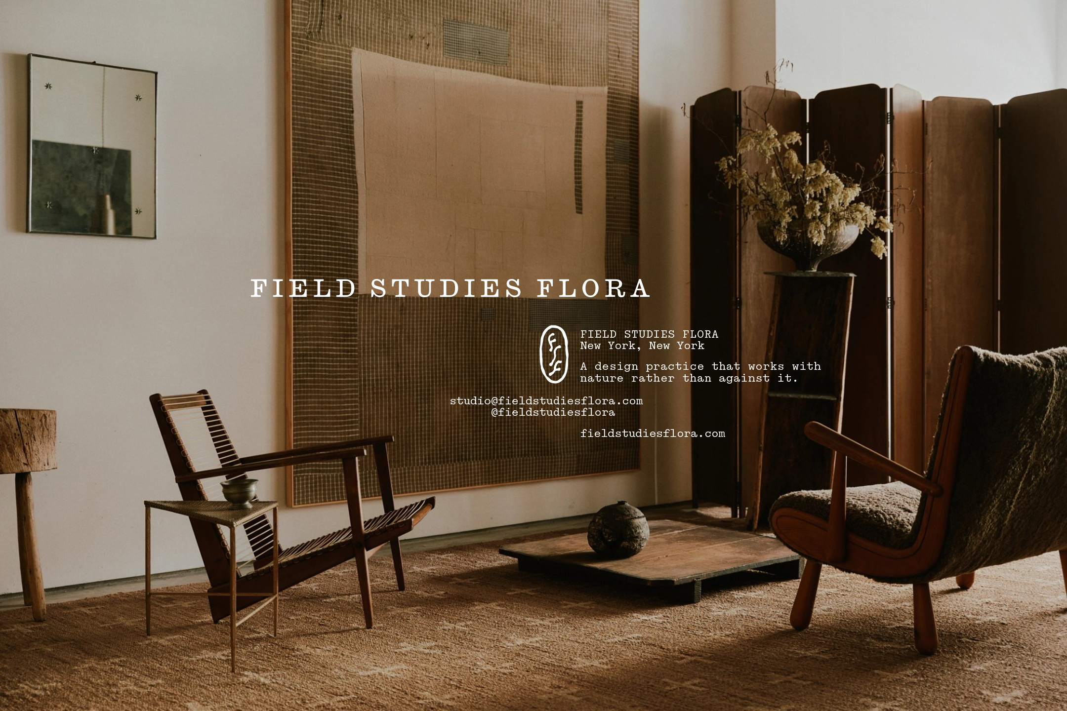
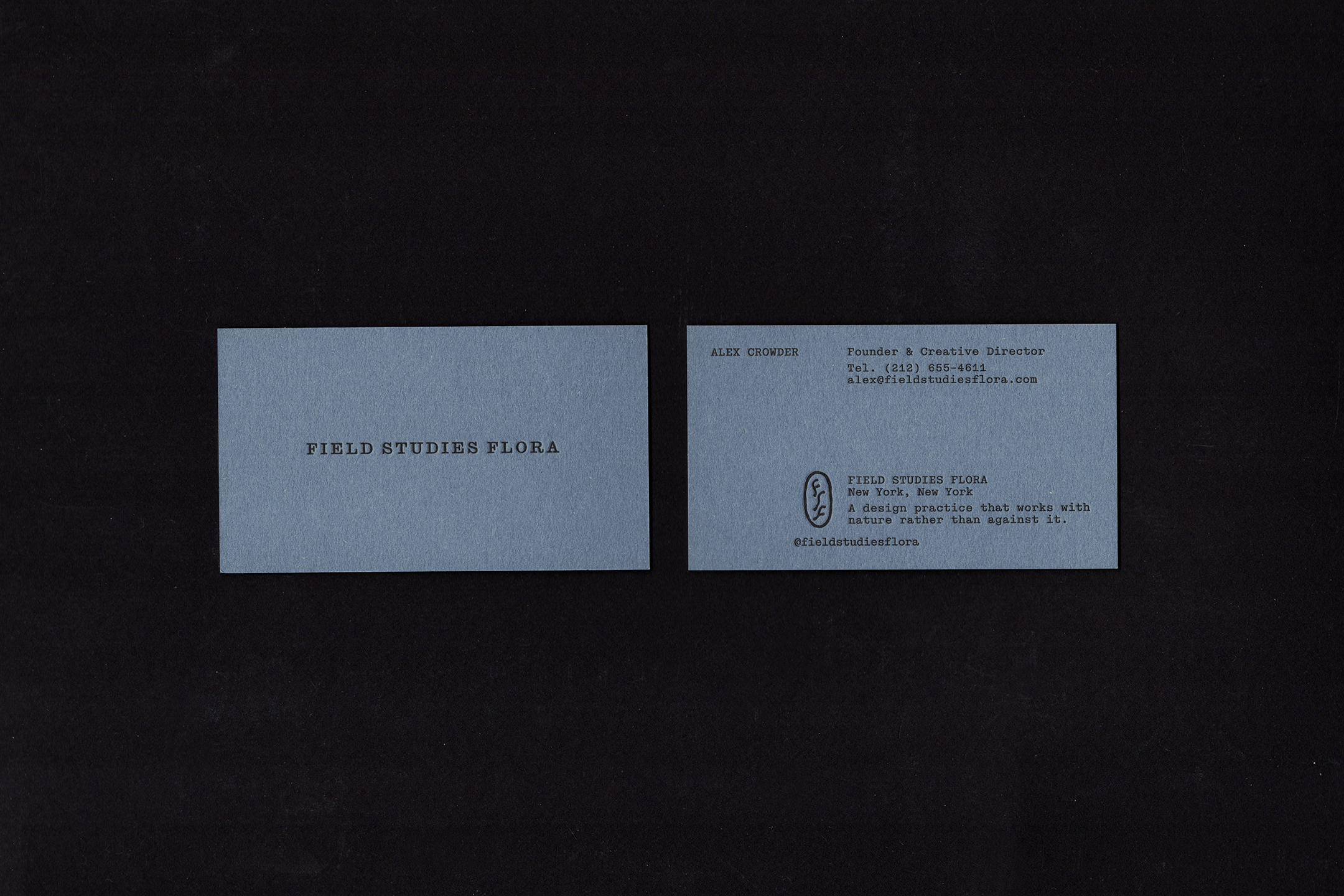
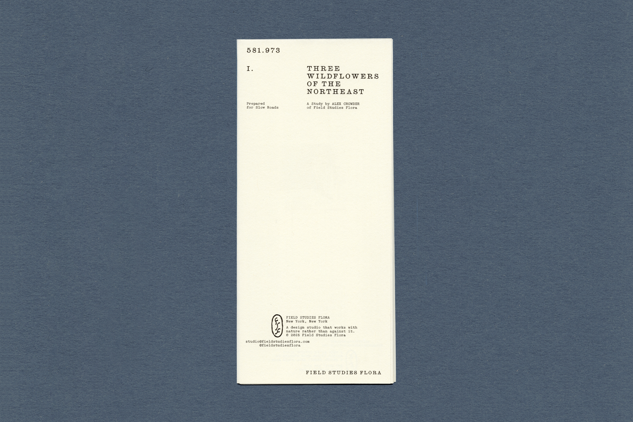
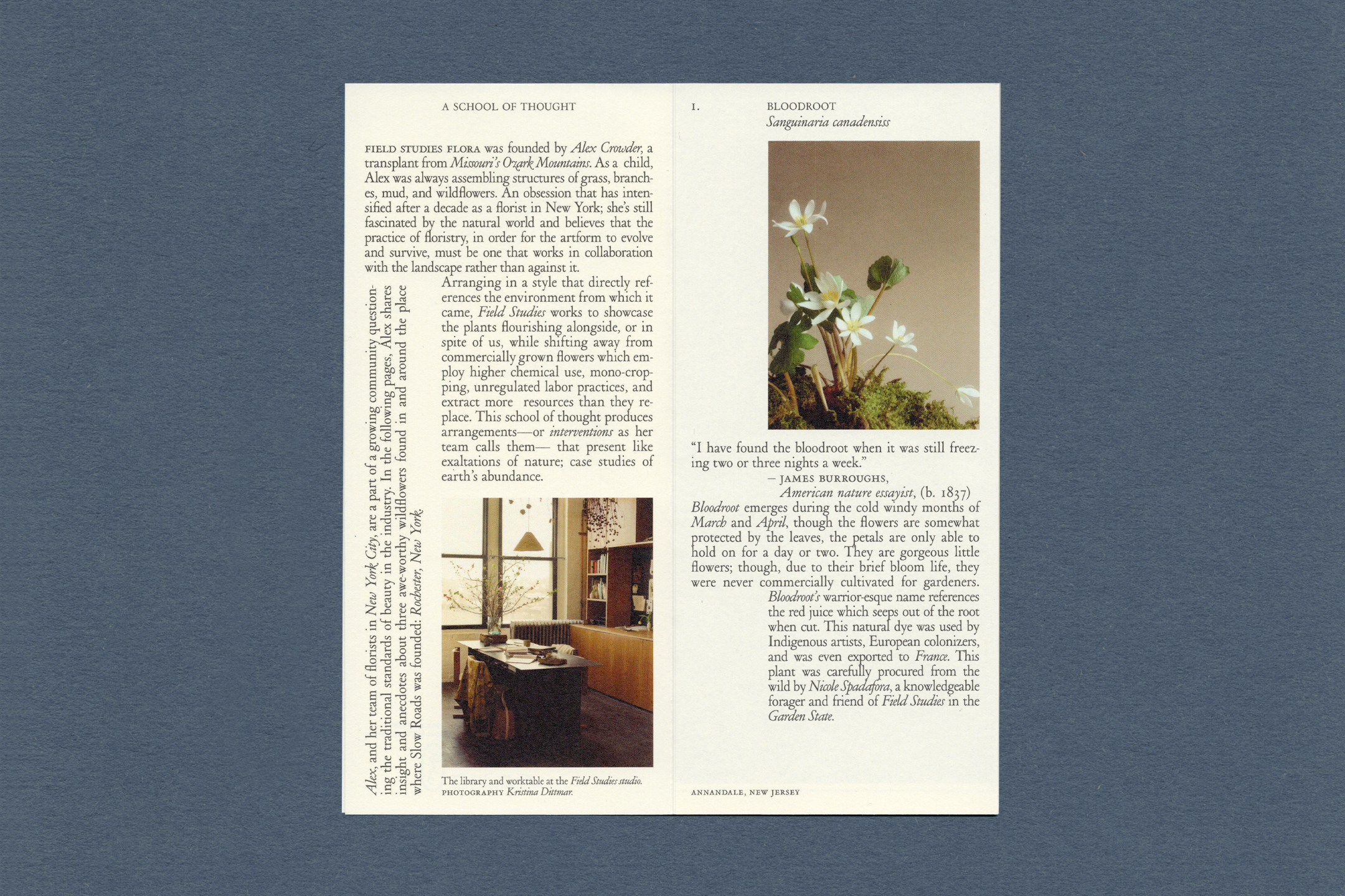
Materica Acqua 540gsmBased in New York, Field Studies Flora is a floral design studio working with foraged and locally grown flora. Their practice draws inspiration from historical specimen field notes and the quiet beauty of the natural world; observing seasonal shifts, subtle forms, and imperfect textures.
The branding reflects this sensitivity: understated typography, muted tones, and tactile materials. The identity system extends across packaging, print, and digital touchpoints, capturing the studio’s balance between design intention and natural irregularity.
A bespoke monogram mark was created, intertwining the FSF characters into a single, balanced form. The design draws on the natural structure of a plant stem, slender, organic, and quietly expressive, reflecting the studio’s connection to flora and the natural world.
![]()
![]()
![]()
![]()
![]()
![]()
![]()
![]()
![]()
-
Don Juan 1973
[Designed at 1/1 Studio]
Creative Director
Natasha Sawicki Mead
Designers
Alexandra Turner
Photography
Annika Kafcaloudis
Typefaces
Topol Bold & Acumin Condensed Semibold
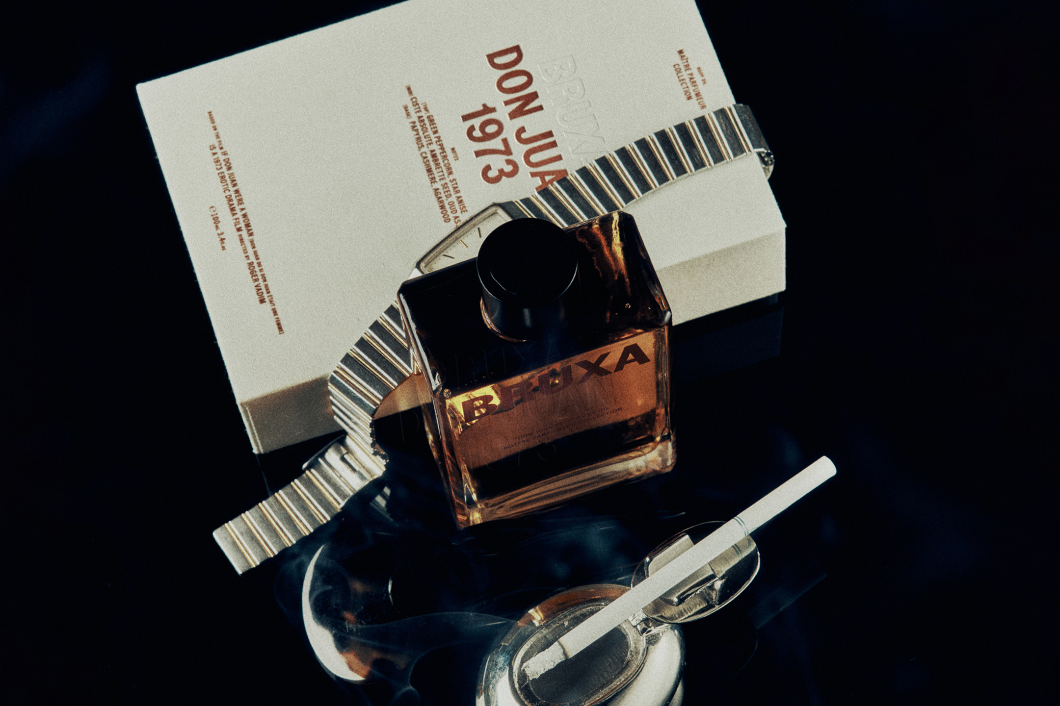
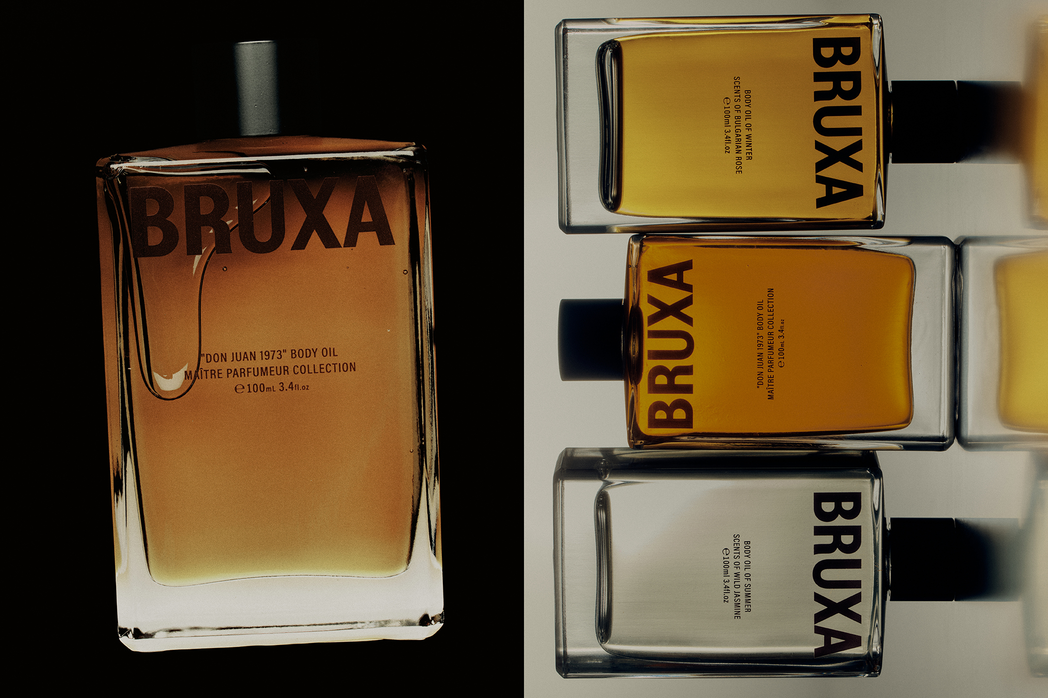
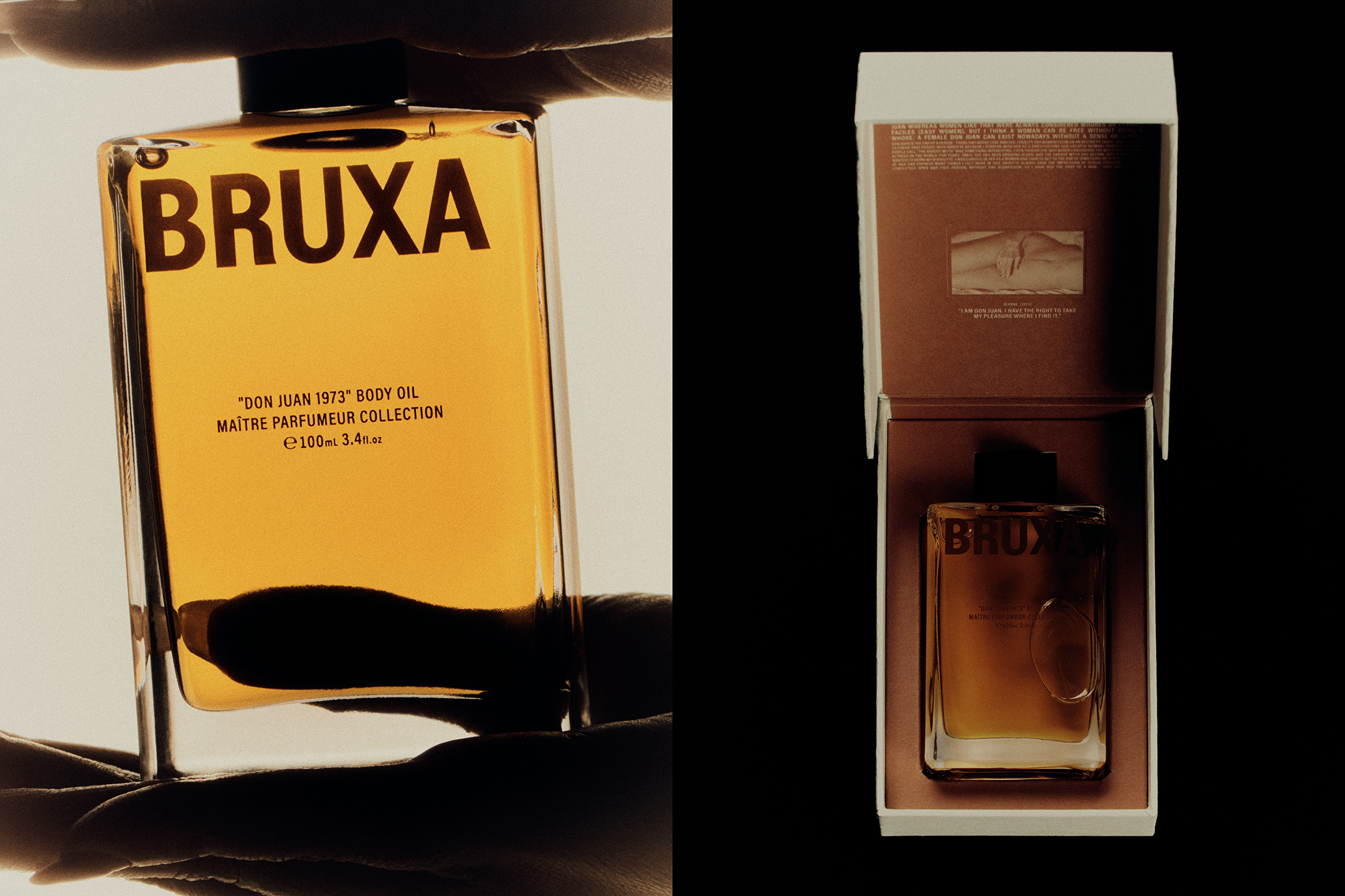
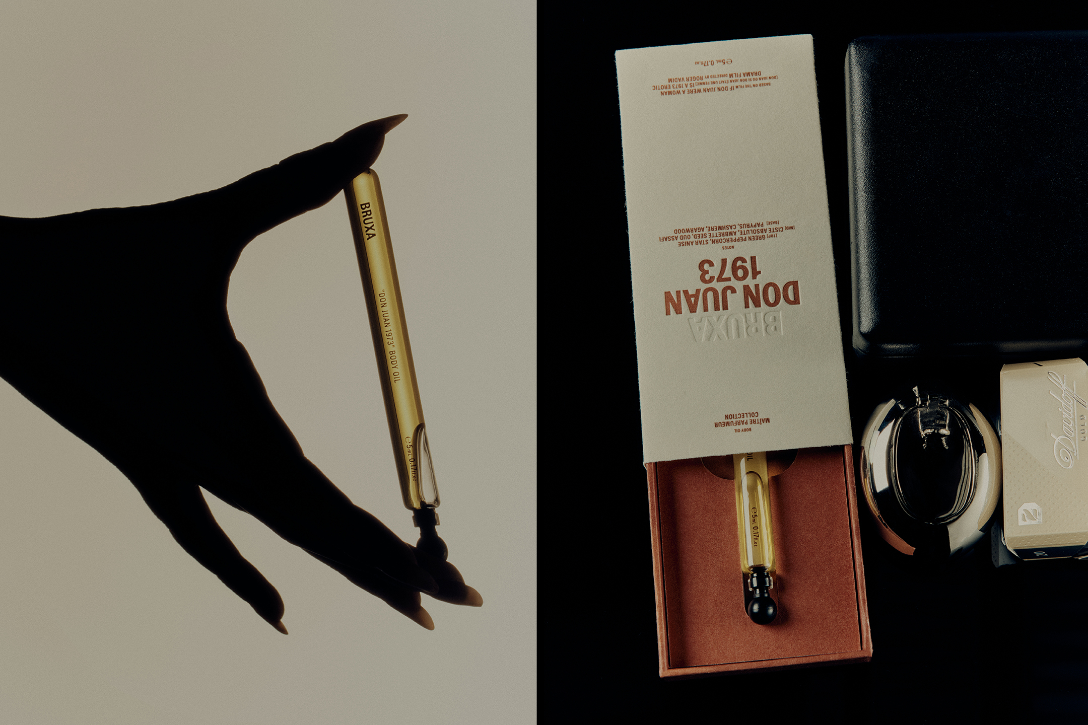
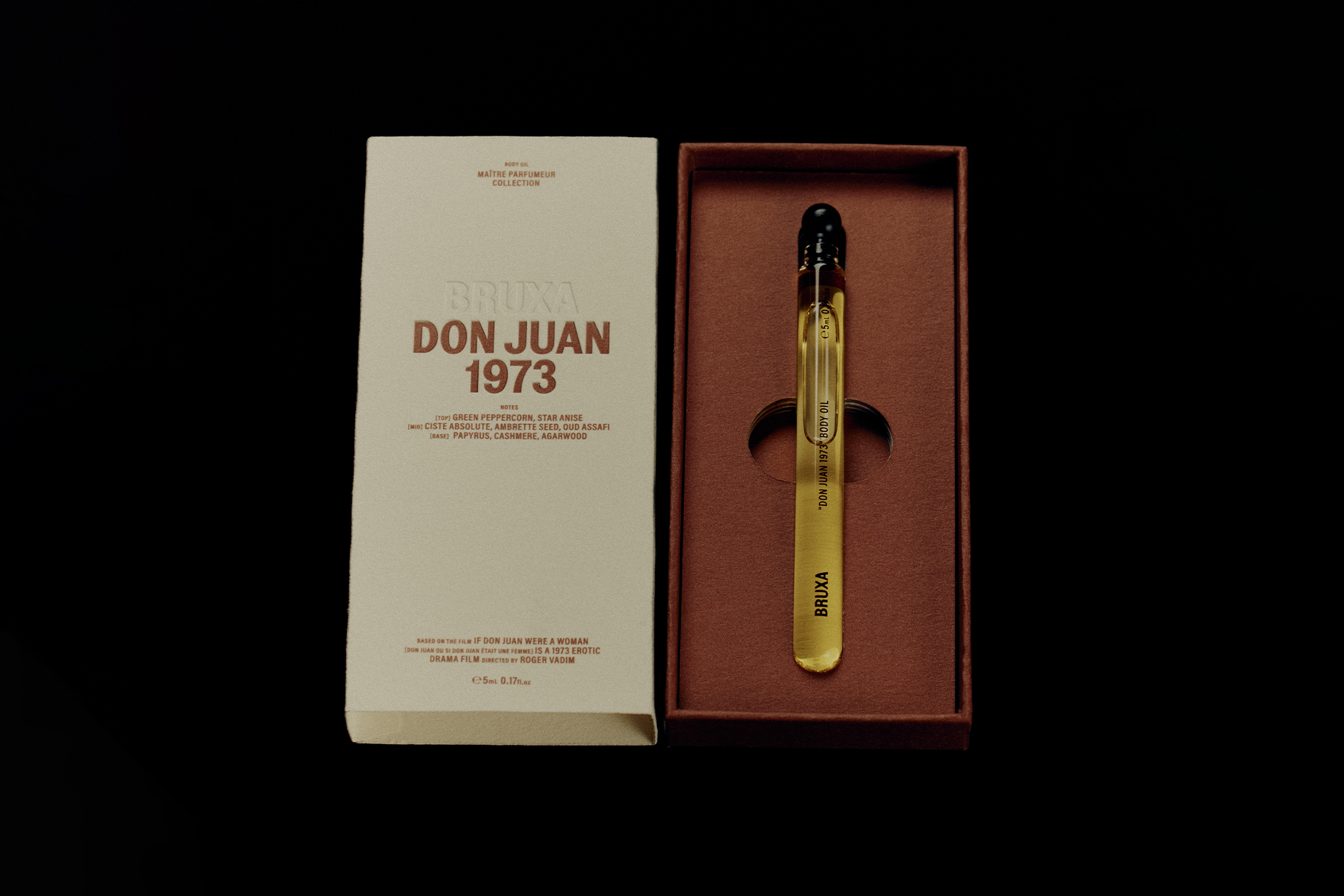
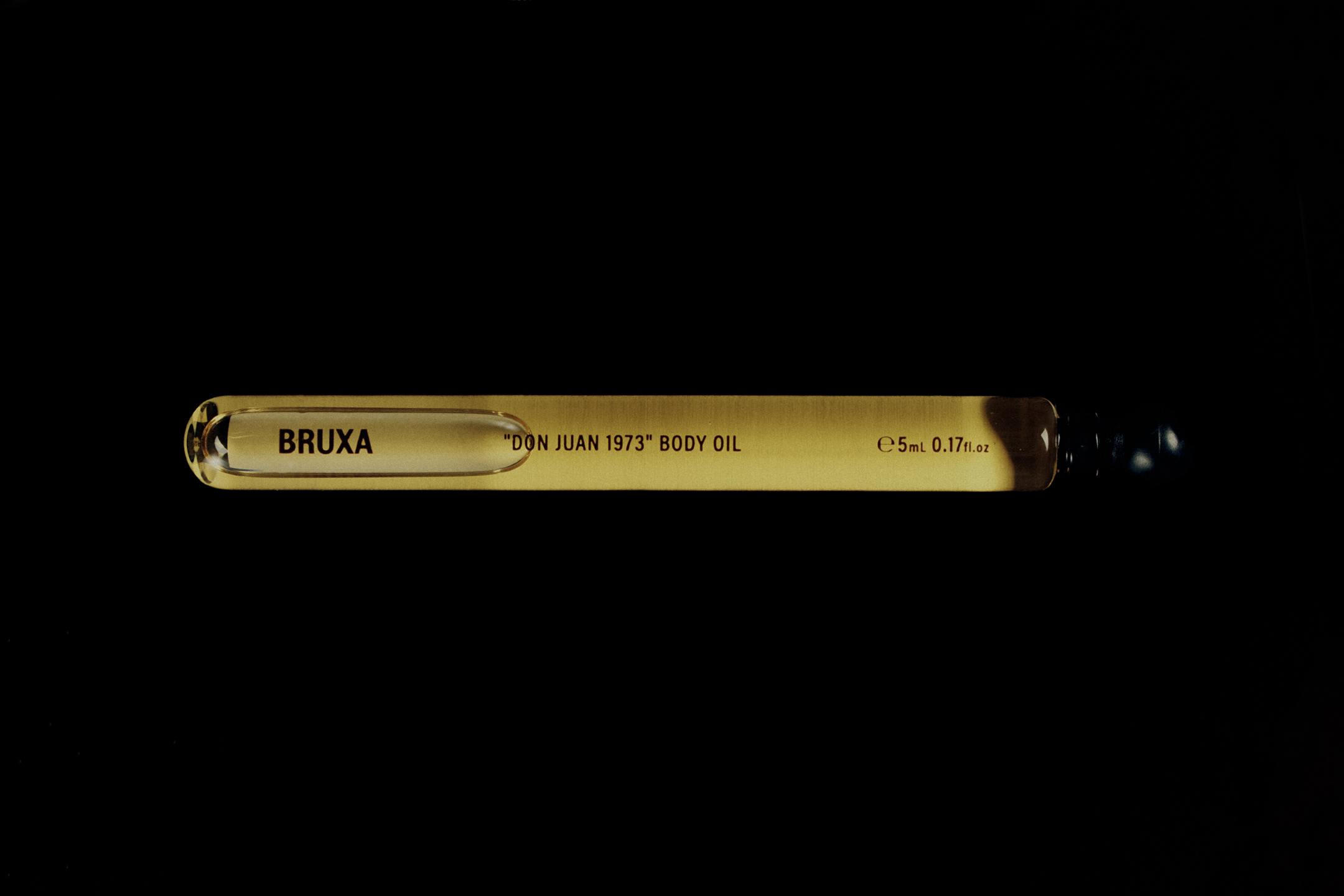
Inspired by the iconic french film, Don Juan (1973), in which Roger Vadim reimagined the myth of the seducer, Bruxa released their first body oil from the Master Perfumer Collection, in 100ml and 5ml volumes.
The typography references classic film title typesetting, blending lowercase and uppercase letterforms with centred and justified layouts, all harmoniously balanced to evoke the nostalgic aesthetic of French cinema. Each box features a film-frame still, reenacting an iconic scene from the film.
The packaging was designed create a seductive tactile experience, striping back layers to reveal the product. Upon unveiling the top layer, an immersive red, pigmented textured paper is revealed, juxtaposed by the silky glass vessel and rich oil tones.
![]()
![]()
![]()
![]()
![]()
![]()
-
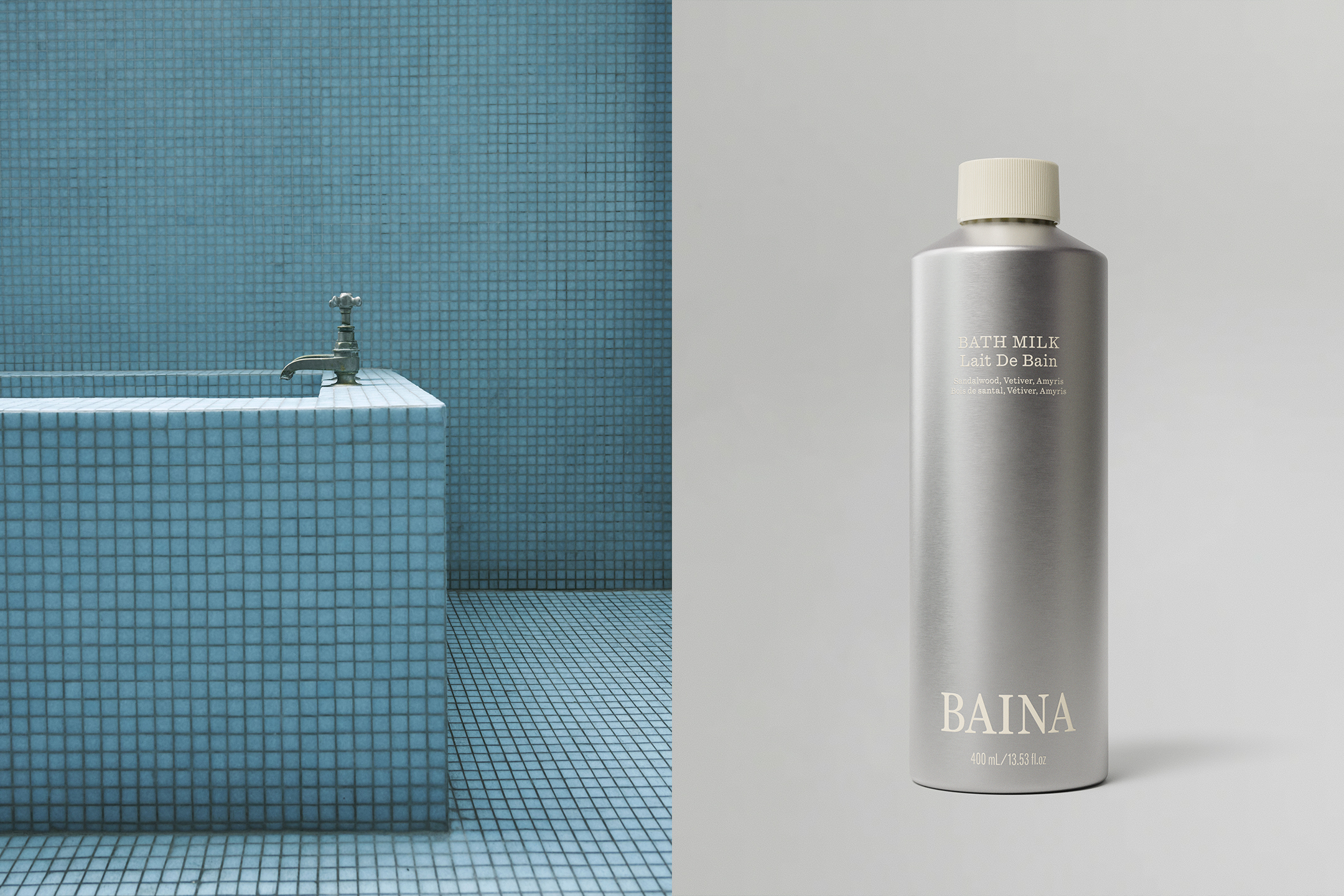
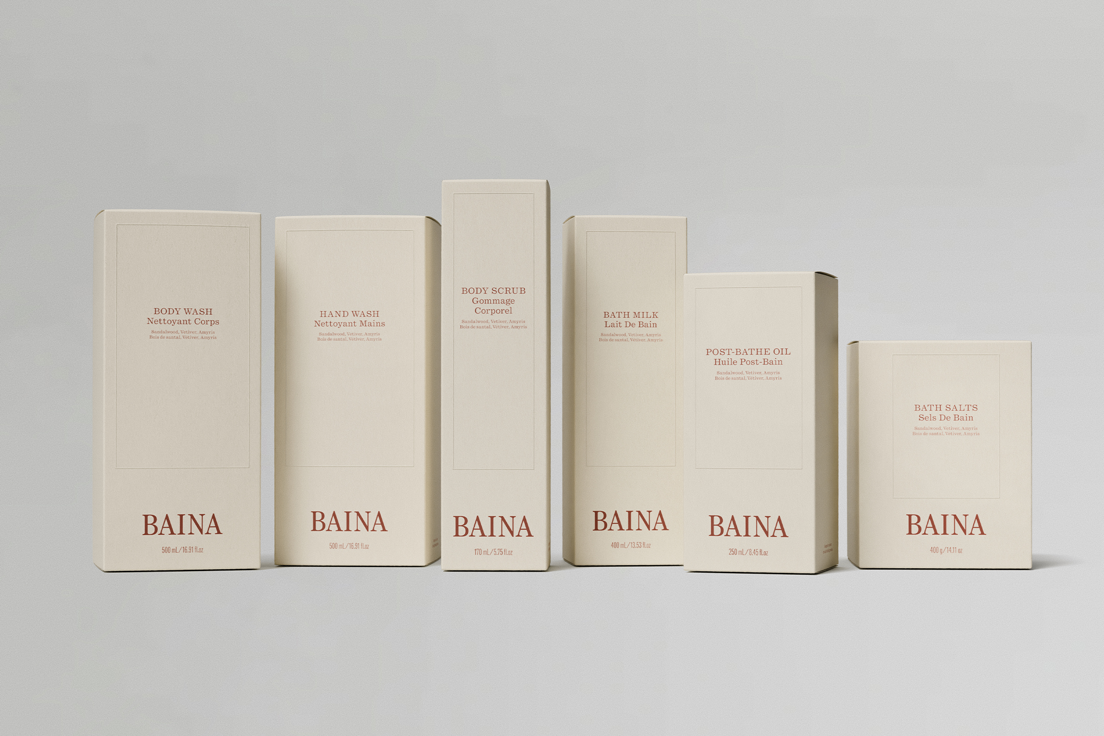
Baina
[Designed at 1/1 Studio]
Creative Director
Natasha Sawicki Mead
Designers
Alexandra Turner
Typefaces
Quadrant Text and Quadrant Text Mono
Materials
Aluminium
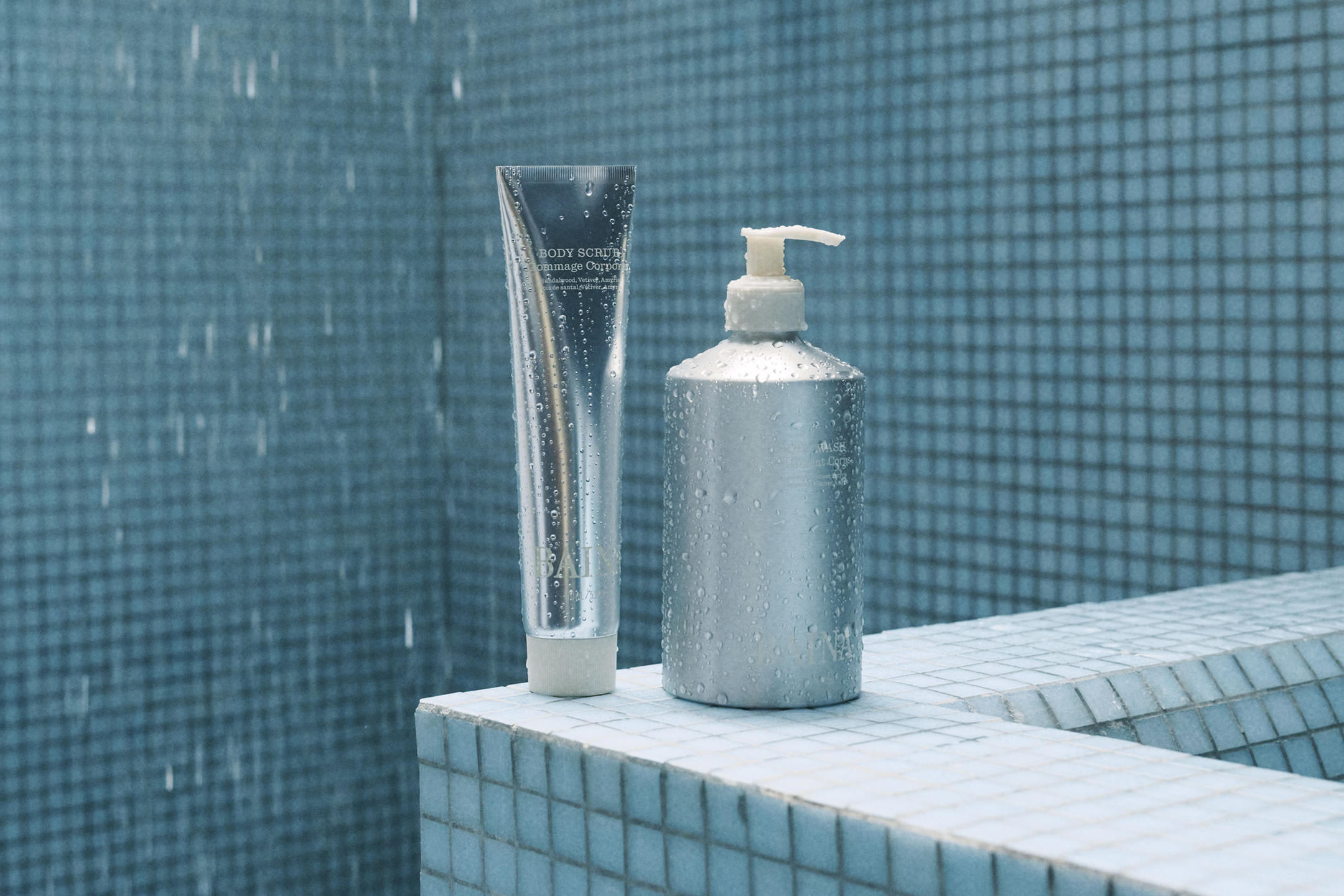
In 2025, Baina launched an apothecary line, in their first scent Ebon Veil. The range featured six bathing essential products.
Though indented to be reused, the packaing uses fully ecofriendly materials, with aluminium vessel and recyclable lids. The design touch is light to envoke a calming restorative bathing ritual.
The outer packaging uses an off-white texture stock, with subtle embossing details for a premium feel and finish.
![]()
![]()
![]()
![]()
-
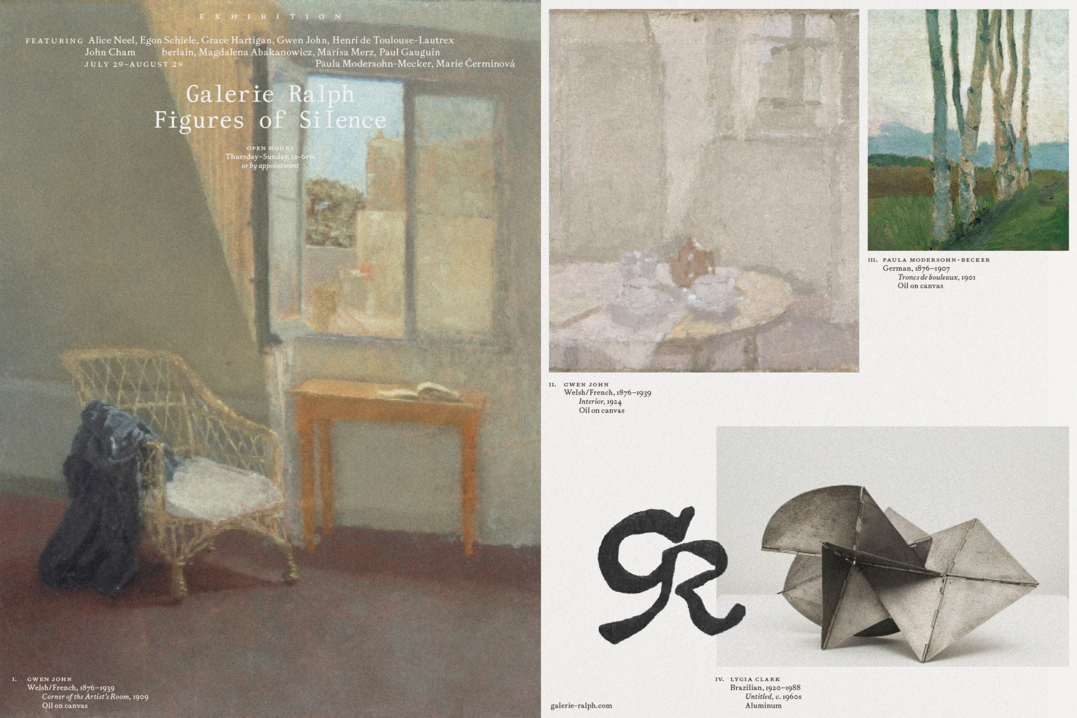
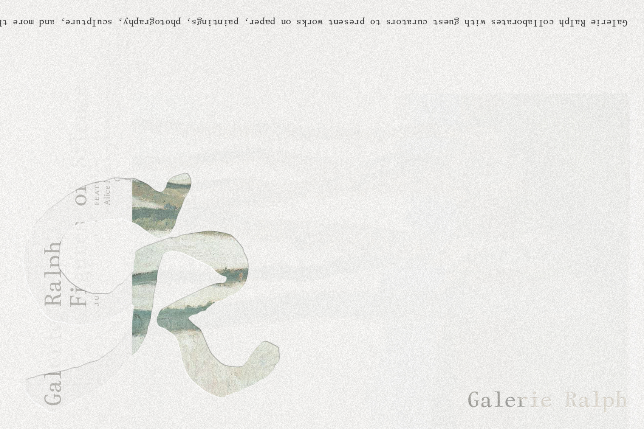
Galerie Ralph
[Designed at 1/1 Studio]
Creative Director
Natasha Sawicki Mead
Designers
Alexandra Turner
Typefaces
Gaisyr Book & Gaisyr Mono
Paper Stock
Takeo Pachica 151gsm
Finishes
Hot Stamping
Galerie Ralph is a gallery space in Paris, France collaborating with guest curators featuring solo and group exhibitions.
The poetic typesetting is an adaptive system, with highly crafted detailing. Using only two typefaces, Gaisyr Book and Mono, the graphic language provides a understated yet distinctly bespoke platform for the gallery to showcase their collection of works.
An inky monogram, referencing traditional makers marks is stamped onto printed assets. Transparent materials were used to create soft layering, combining text layers with artwork imagery.
![]()
![]()
![]()
-
The Collector, Vol. I
[Designed at 1/1 Studio]
Creative Director
Natasha Sawicki Mead
Designers
Alexandra Turner
Typefaces
Bradford & Bradford Mono
Paper Stock
Munken Print Cream 80gsm
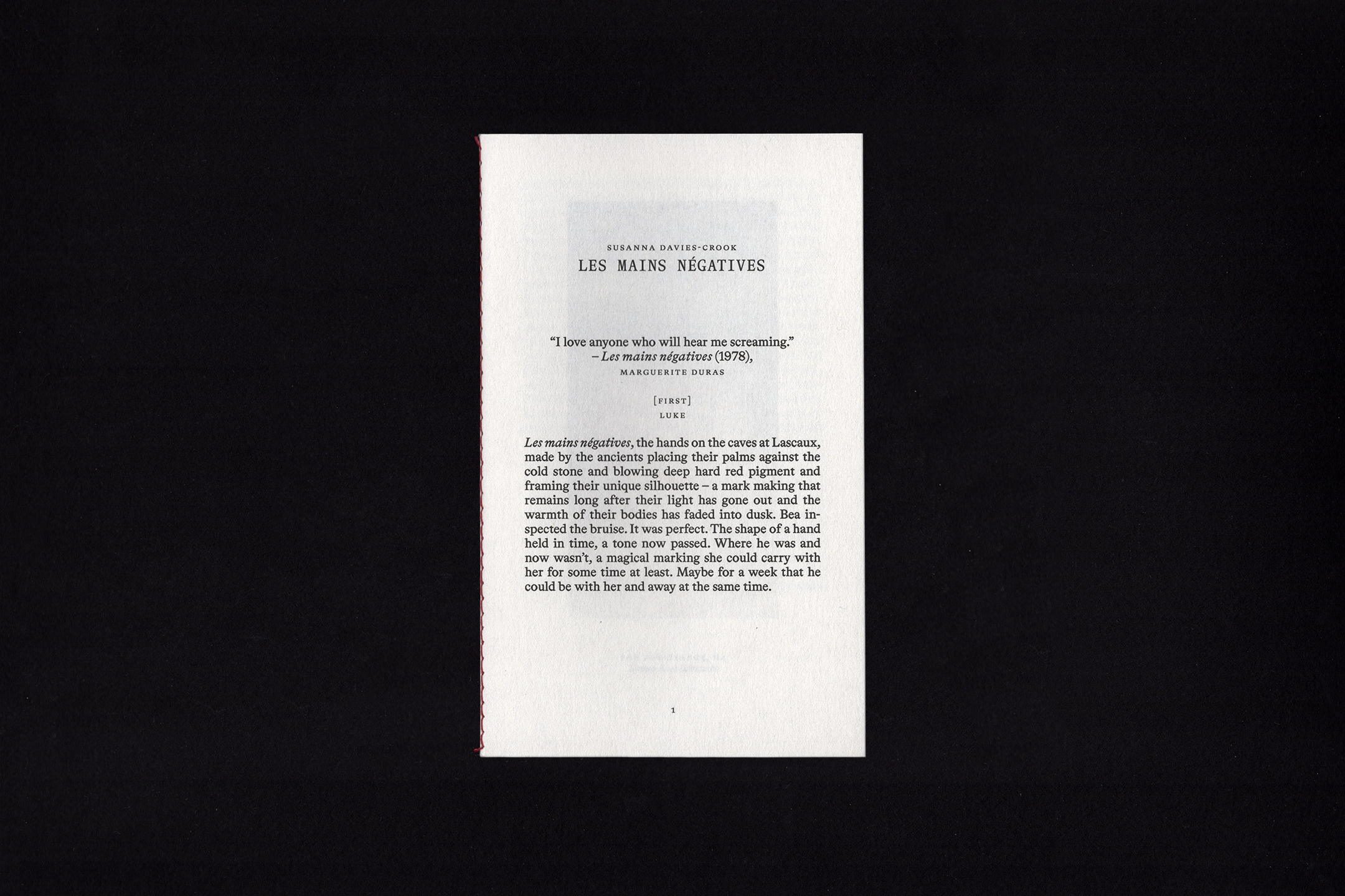
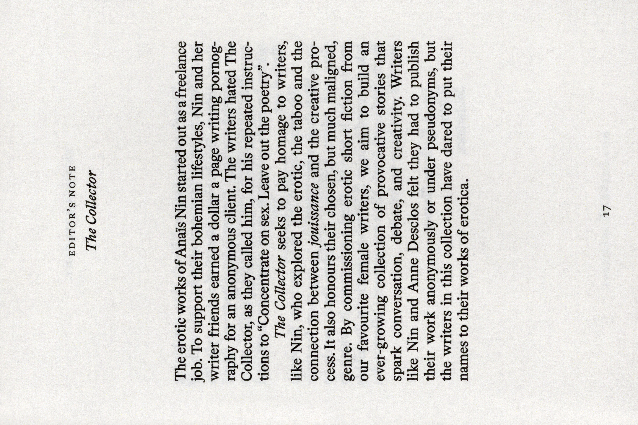
The Collector, Vol. I is the first in a ongoing series of short erotic stories, commissioned by Jouissance Parfums. The booklets are intentionally intimate, with light transparent stock, singer sewn in a red thread.
Vol. I is comprised of all four short stories: The Rebound by Natasha Stagg, Holds by Julia Armfield, House of the Sleeping Beauty by Emily Wells and Les Mains Négatives by Susanna Davies-Crook. Featuring illustrations by Emma Rose Schwartz.
A belly band was created to tie the collection together, with the volume title on the front and table of content on the reverse.
![]()
![]()
![]()
![]()
![]()
![]()
![]()
![]()
-
Handcrafted Modern
[Designed at 1/1 Studio]
Creative Director
Natasha Sawicki Mead
Designers
Alexandra Turner
Typefaces
Fournier MT & Oracle
Paper Stock
Materica Rust 540gsm
Munken Print Cream 80gsmHandcrafted Modern is a multi-brand store, based in Auckland, New Zealand, showcasing the work of artisans bridging traditional techniques with pioneering practice... "an enduring appreciation for all things made manually, patinated and perfectly imperfect."
Each touchpoint embraces imperfection, from the tactile, textured finishes down to the nuances of the typesetting. The graphic system is intentionally crafted, reflective of the brand’s ethos. Tradtional materials and printing methods are embrassed, bringing a human touch through letterpressed printed assets, handwoven yarn and handpainted signage.
A bespoke makers mark, inspired by a potter's marks, was created with the letterforms HCM, interlaced with an adaptive typographic lockup.
![]()
![]()
![]()
-
Documents 2021-2023
[Designed at Inhouse]
Creative Director
Arch MacDonnell
Designers
Alexandra Turner
Typefaces
Times Now & Helvetica Now
Paper Stocks
Youlong Pure 80gsm
ColorPlan Bright Red 120gsmDimensions
180 × 105 mm
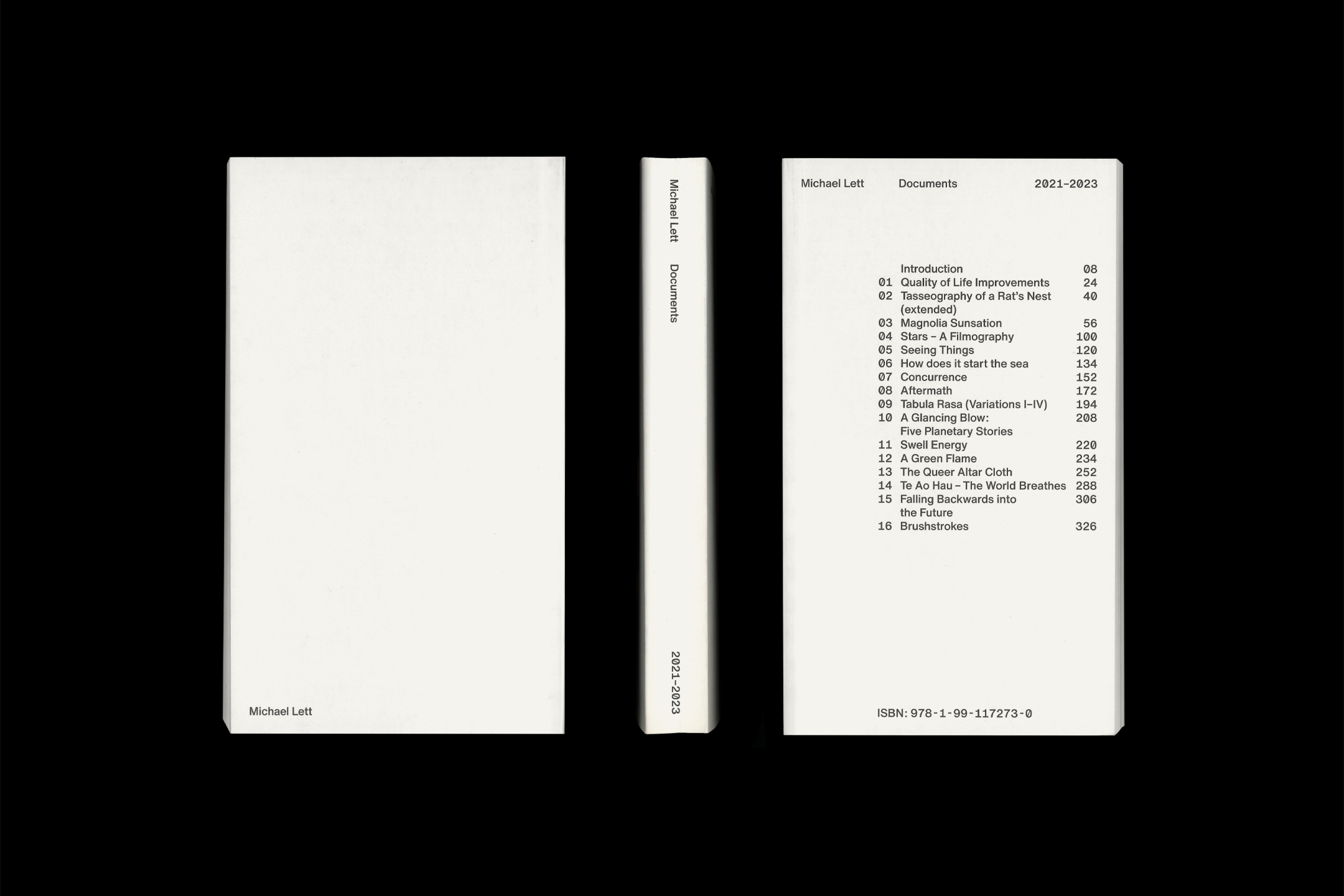
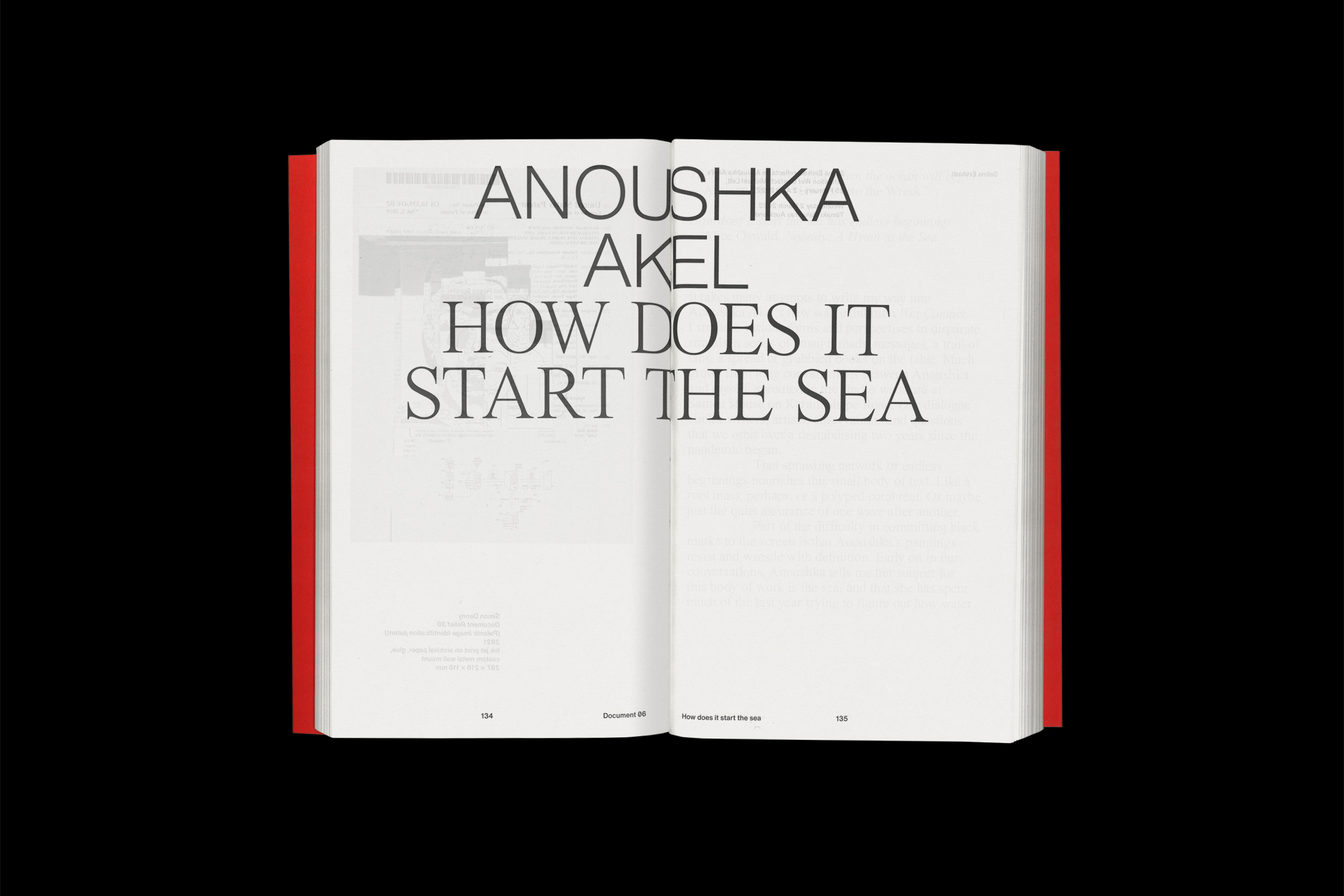
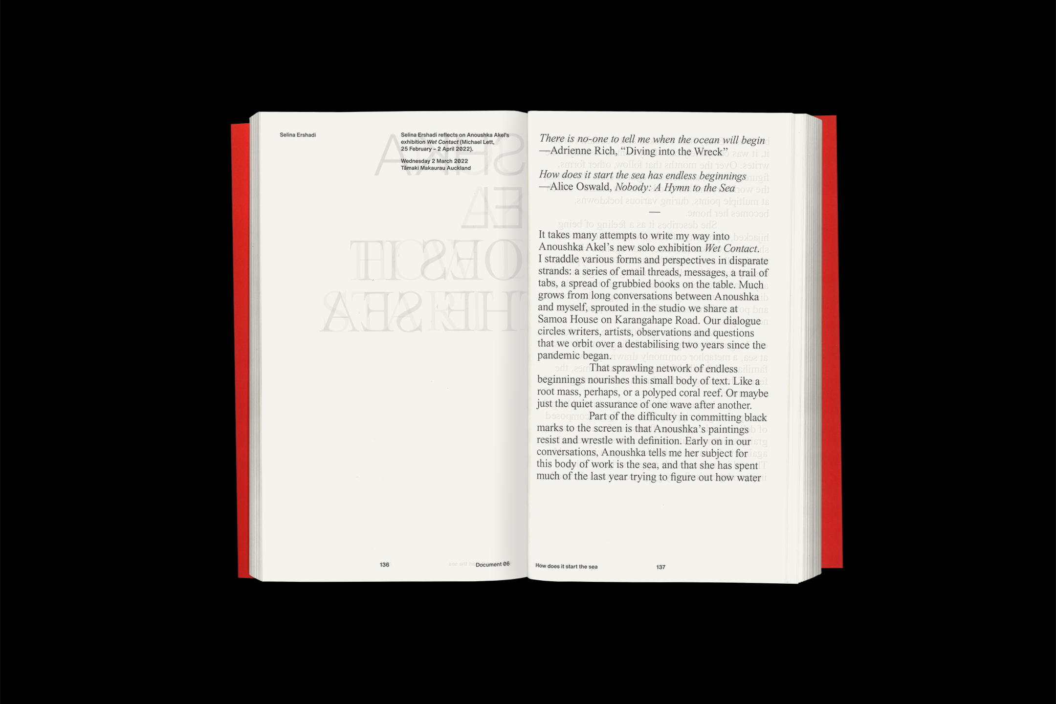
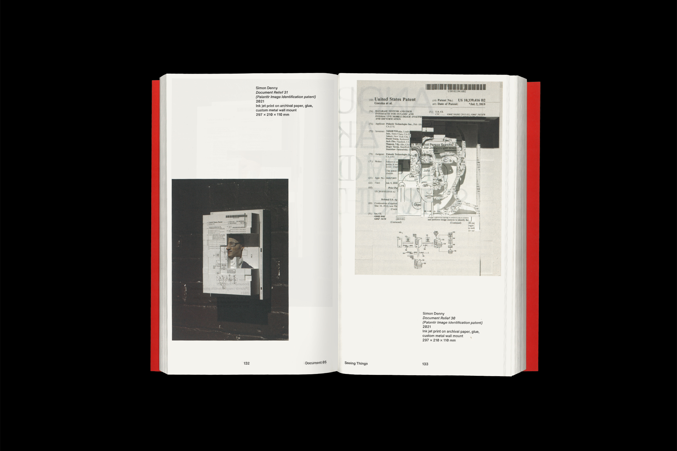
Michael Lett Gallery produce a number of short essays to accompany their exhibitions. In the first of an ongoing series of publications, the 2021-2023 edition compiles 16 documents from some of New Zealand’s acclaimed artists and art writers.
Designed to evoke the charm of classic paperback novels, this compact publication offers an intimate reading experience. Printed on a light off-white uncoated paper stock, the contents elegantly overlay the adjacent pages.
The cover features an exposed content page, foiled in black onto ColorPlan Bright Red.
![]()
![]()
![]()
![]()
![]()
![]()
![]()
-
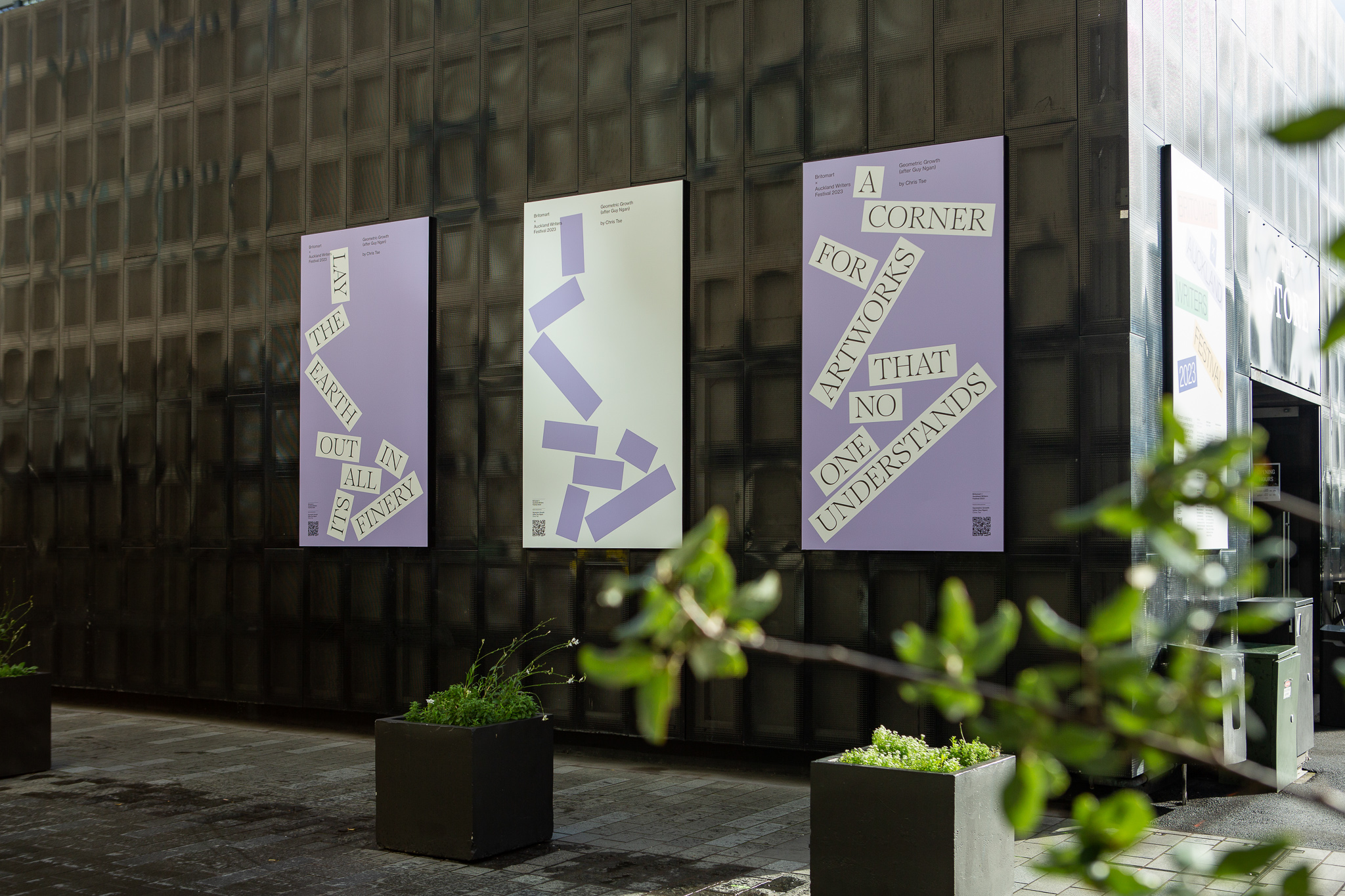
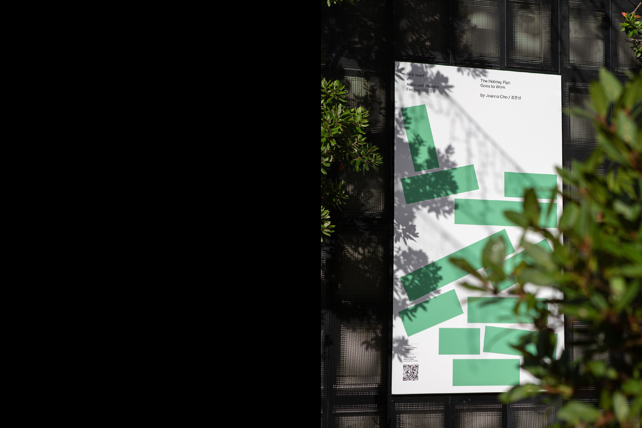
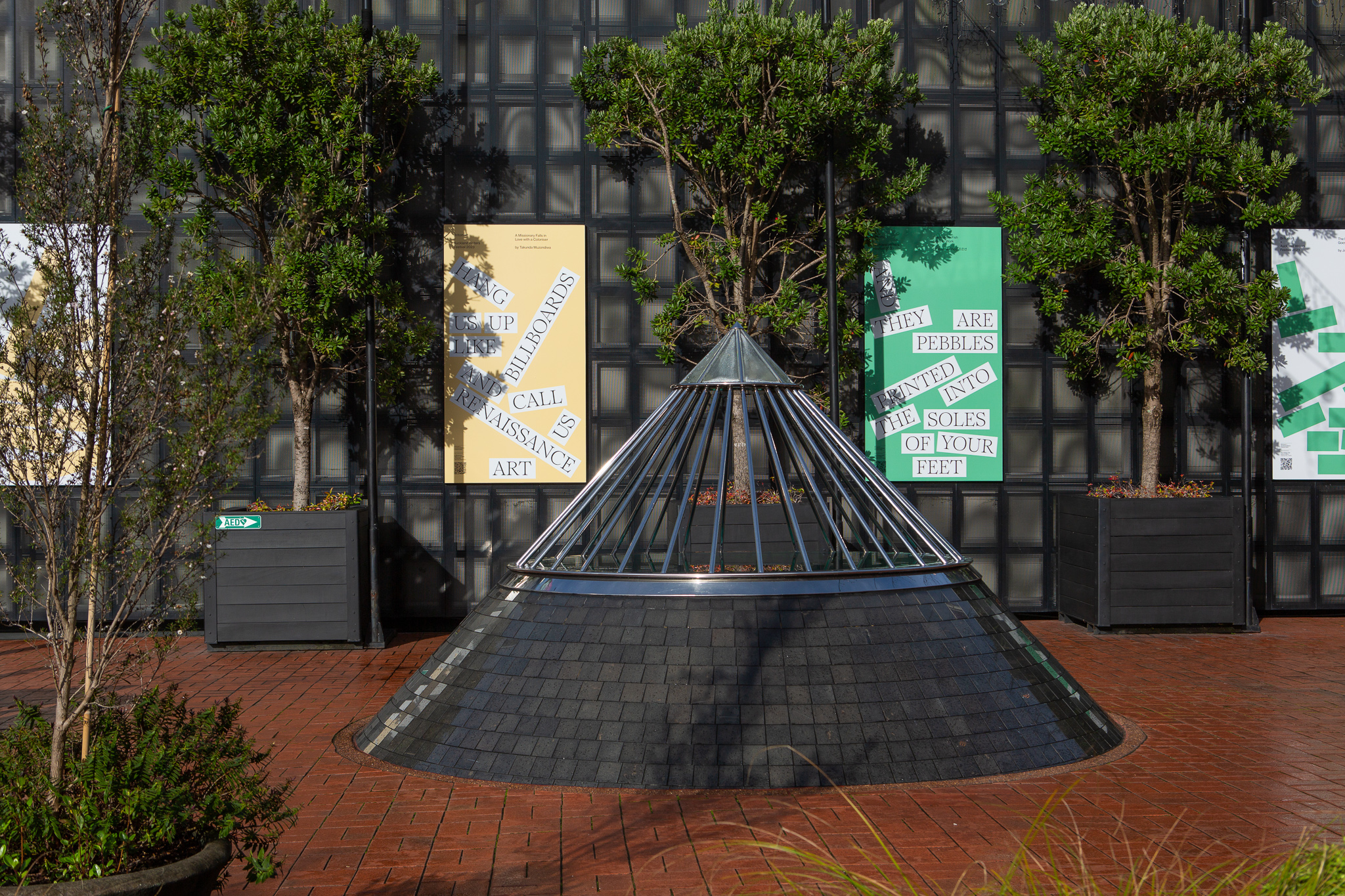
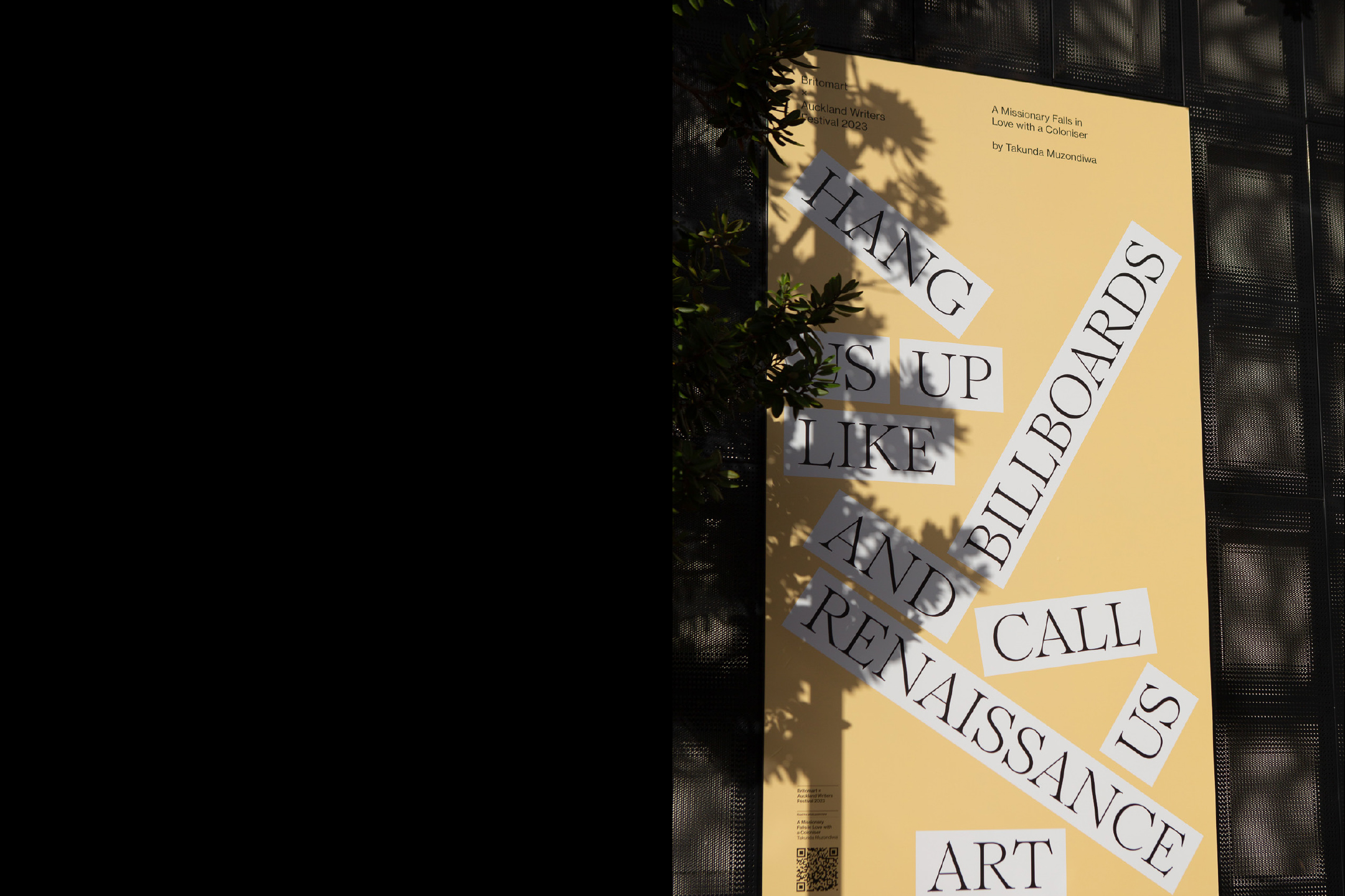
Britomart Poetry
[Designed at Inhouse]
Designers
Alexandra Turner
Creative Director
Arch MacDonnell
Photography
Samantha Totty
Typefaces
Romie & Neue Haas Grotesk
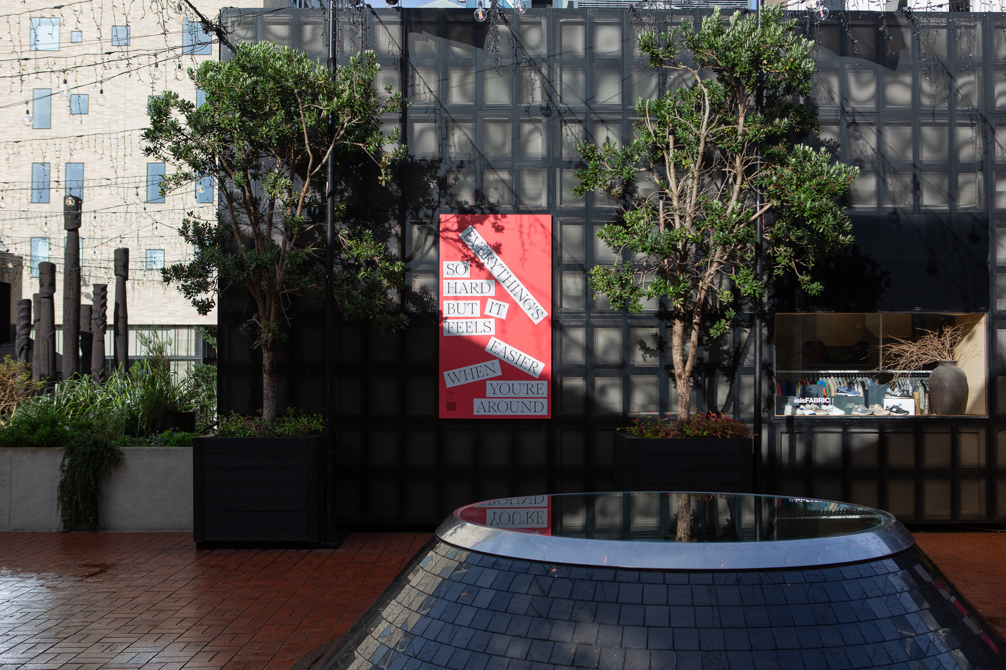
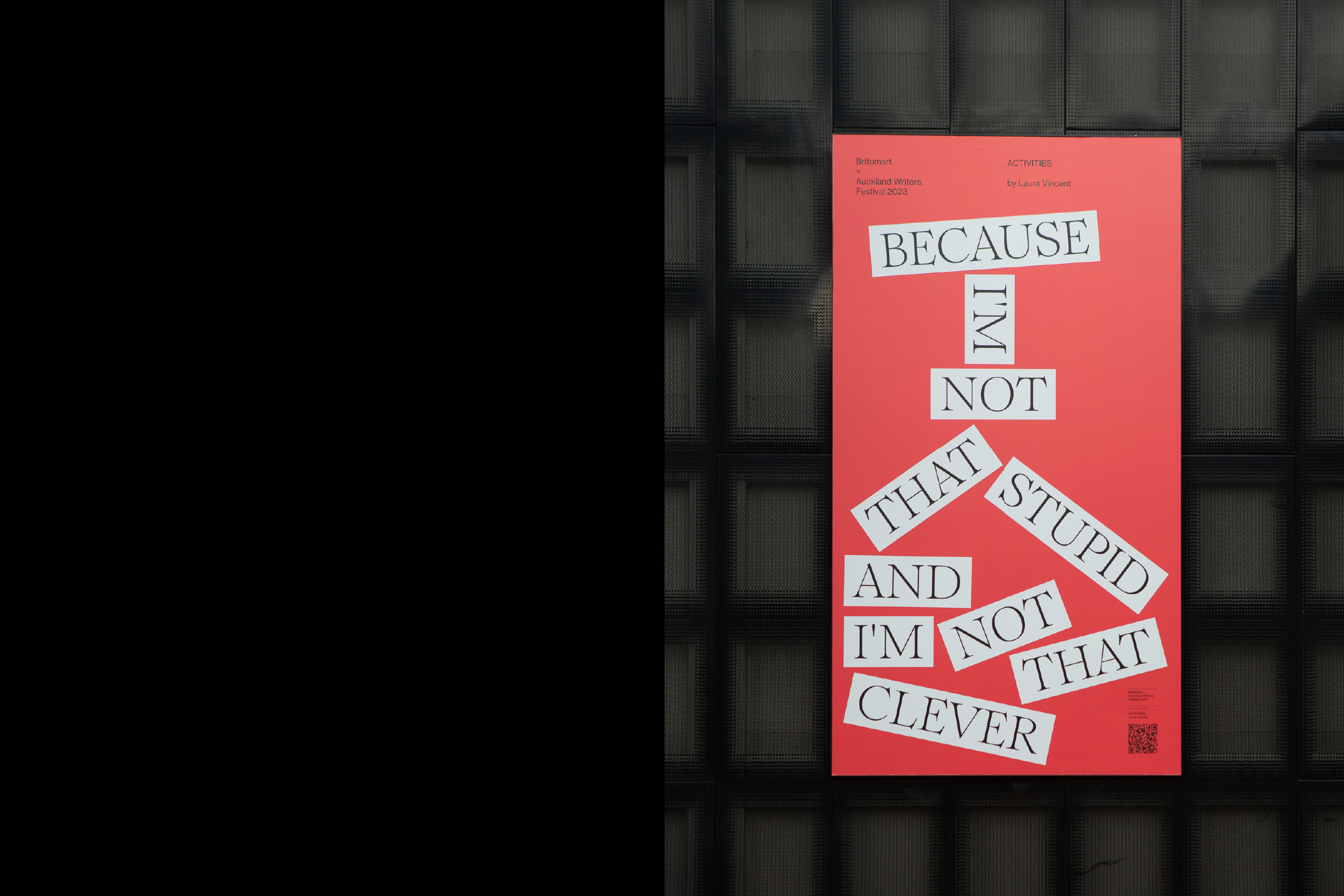
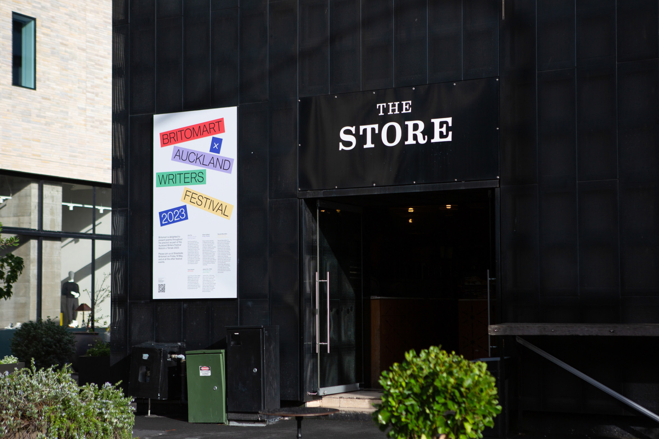
As part of the Auckland Writers Festival 2023, Britomart commissioned a poster series featuring five Auckland poets, displayed amongst the streets of the precinct.
The series is a celebration of words, a scattered arrangement of key phrases from each poets work. The project extended out into flags, banners animation and ground vinyl, immersing the precinct in colour and poetry.
![]()
![]()
![]()
![]()
![]()
![]()
![]()
-
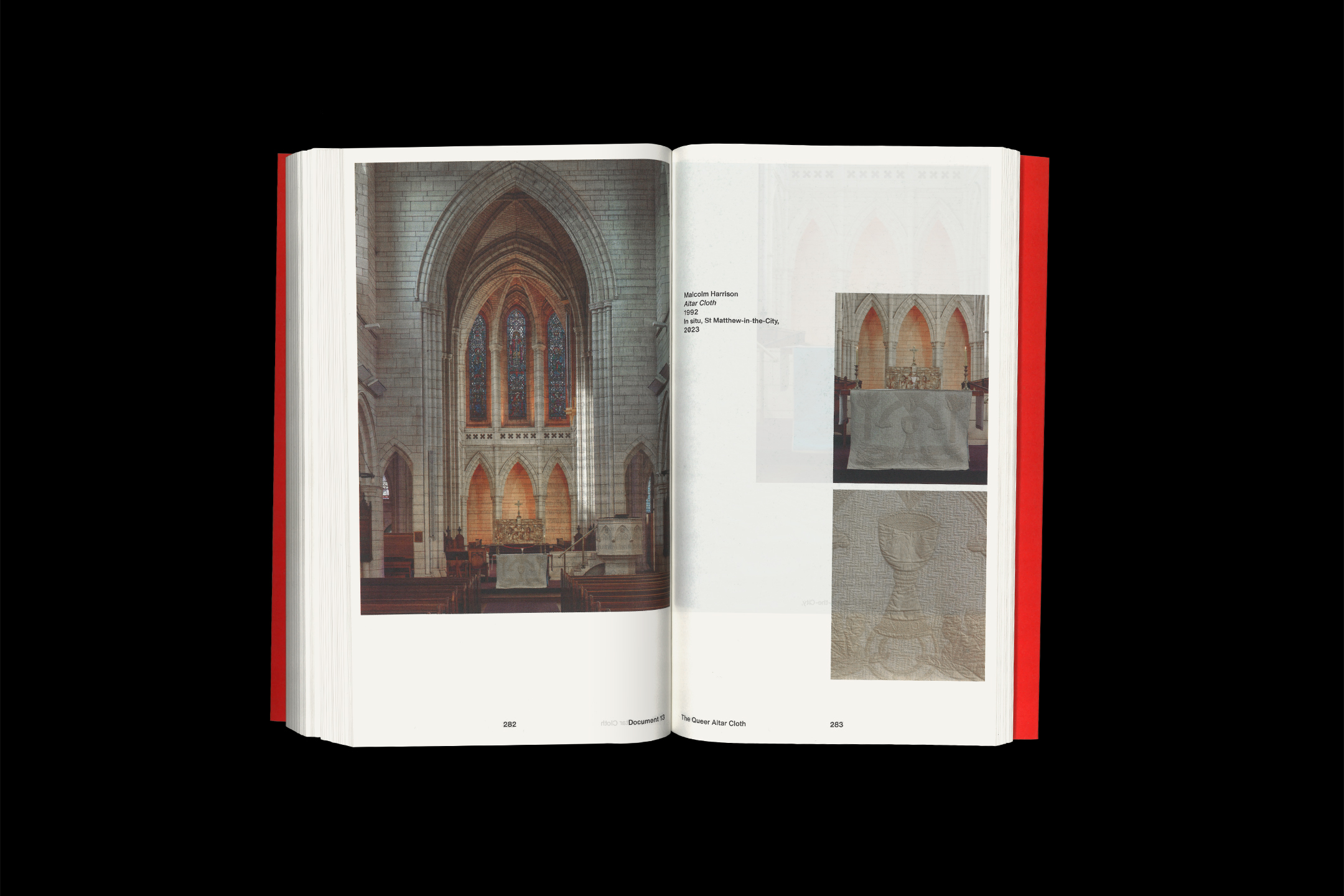
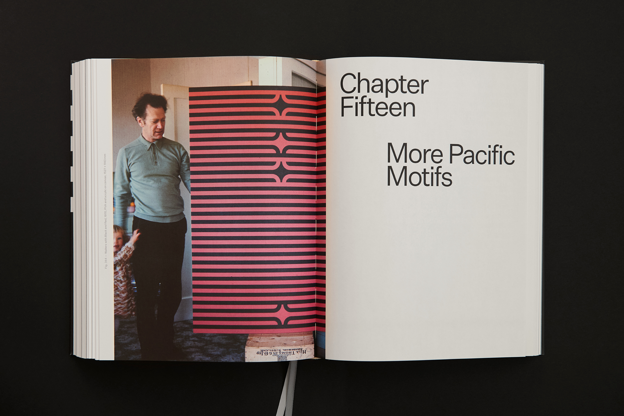
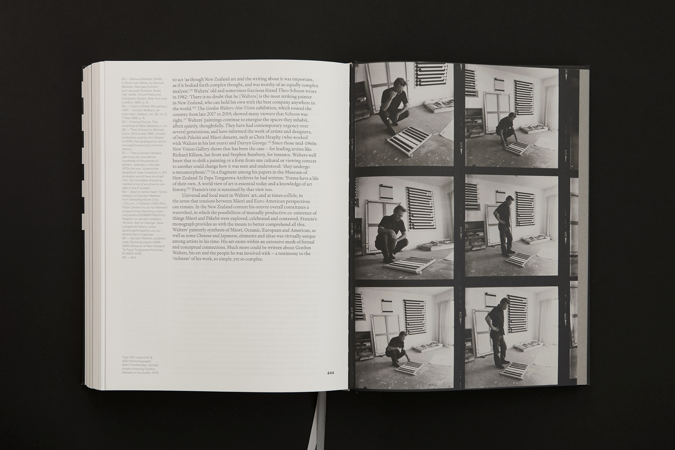
Gordon Walters
[Designed at Inhouse]
Creative Director
Arch MacDonnell
Designers
Alexandra Turner
Typefaces
Signifier & Untitled Sans
Dimensions
270 × 205 mm
In this publication by the late Francis Pound, the evolution of Gordon Walters' (1919–1995) artistic journey is meticulously traced, beginning with his student charcoal sketches in the 1930s and culminating in the revelation of his mature and iconic Koru works.
The comprehensive 464 page publication houses a 130,000 word essay accompanied by 440 high-quality reproductions. The cover features a detail of Te Whiti, one of Walters most renowned works, with blind de-bossed text onto a rich black. The palette remains monotoned as to not detract from the richness of colour within Walters works, whilst referencing his prominent contrasting black & white pieces.
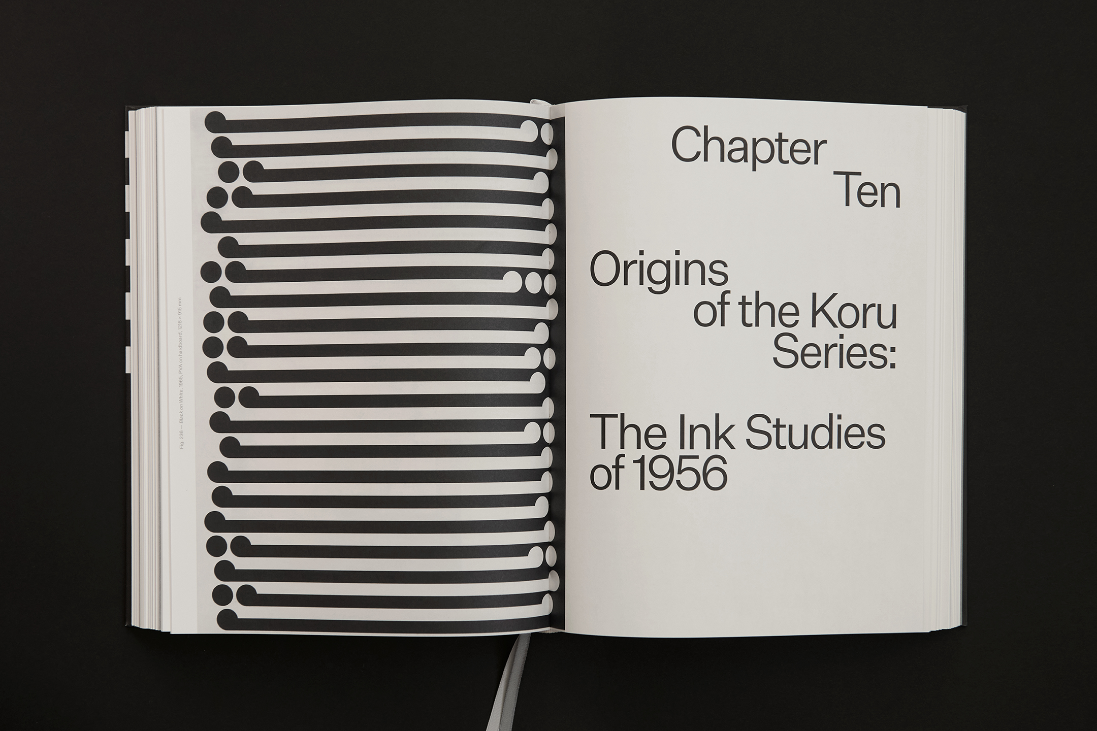
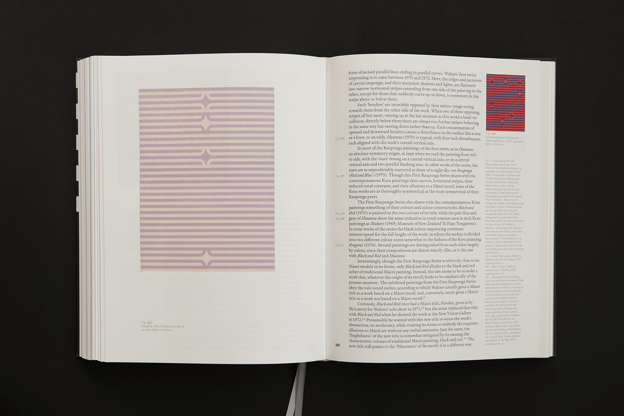
The grid system is based on the structure of a work by the artist, providing a robust balanced layout, created by the artist himself. The essay is set in Signifier & with Untitled Sans set for footnotes and captions. The section opener typesetting references modernist mid-century design, prominent during Walters career.
![]()
![]()
![]()
![]()
![]()
![]()
![]()
![]()
![]()
![]()
![]()
![]()
-
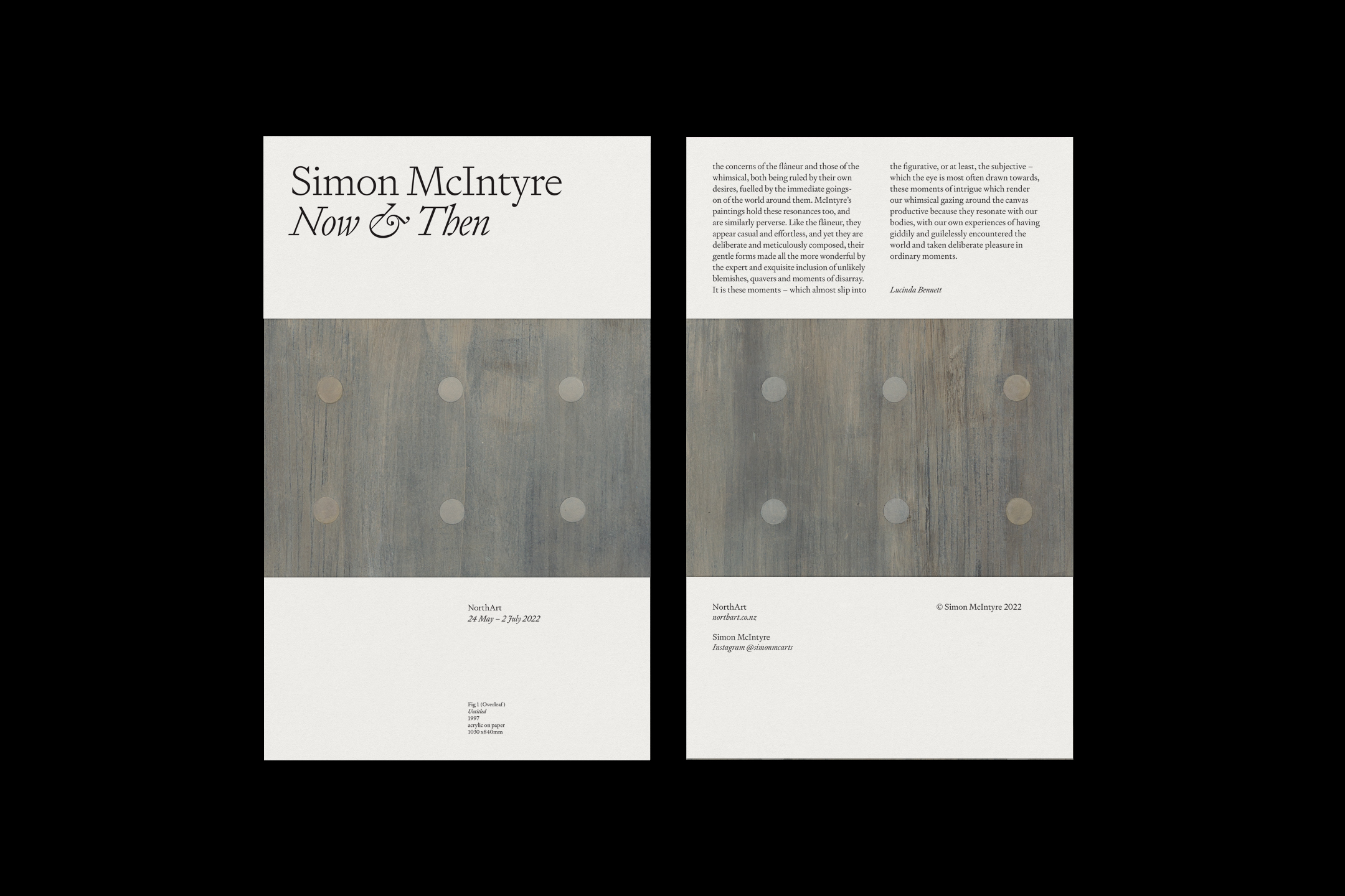
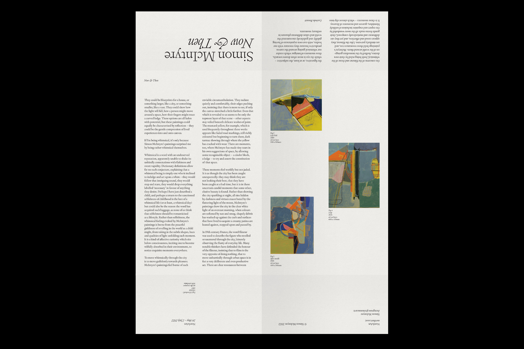
Simon McIntyre: Then & Now
[Designed at Inhouse]
Designers
Alexandra Turner
Creative Director
Arch MacDonnell
Typeface
Signifier
Paper Stock
Munken Print Cream 80gsm
Simon McIntyre’s Now & Then exhibition featured works current and historical of the acclaimed artist. Dual catalogues accompanied the exhibition, using two key artworks from an early and recent work.
Printed on to Munkin Pure 80gsm, the inverted fold allows the poster artwork on the reverse to show through on the cover.
A digital invite animation was created, to give a preview of the works on show.
![]()
![]()
![]()
-
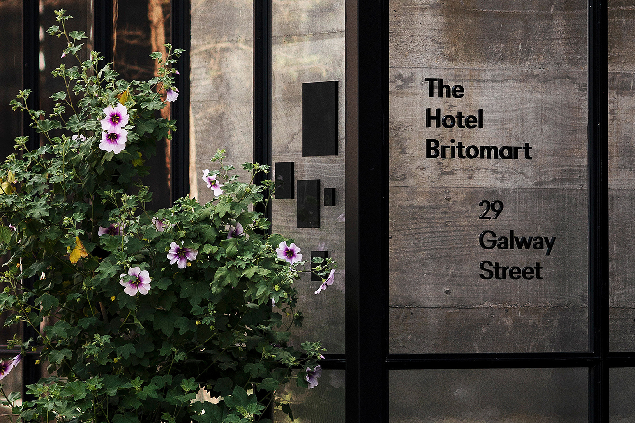
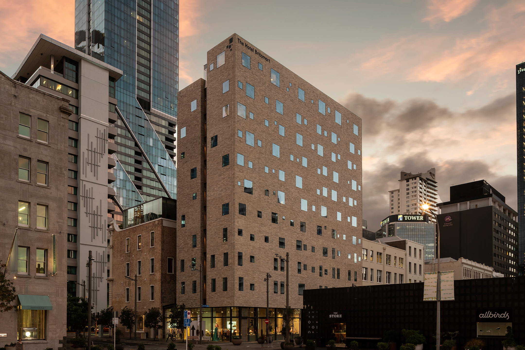
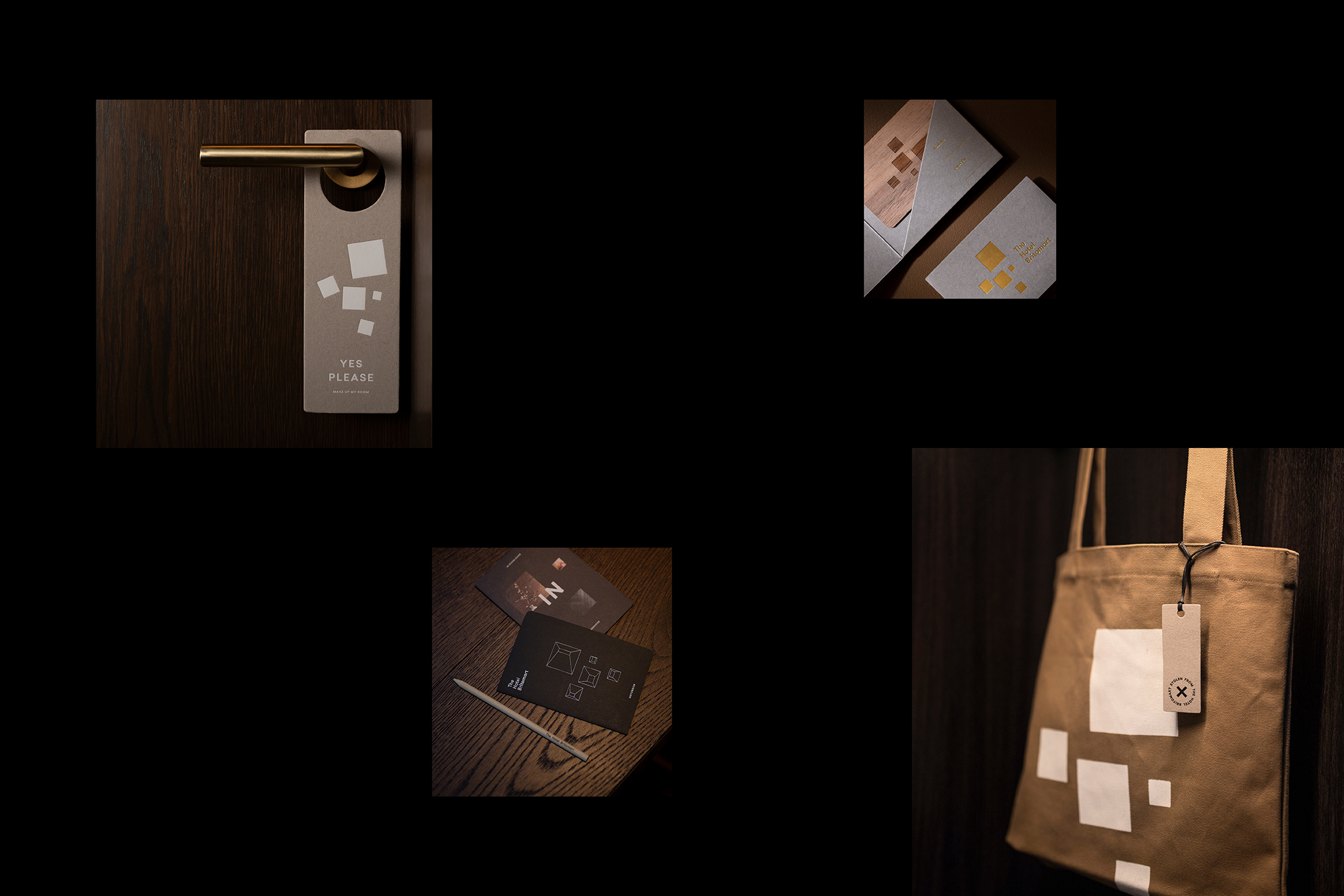
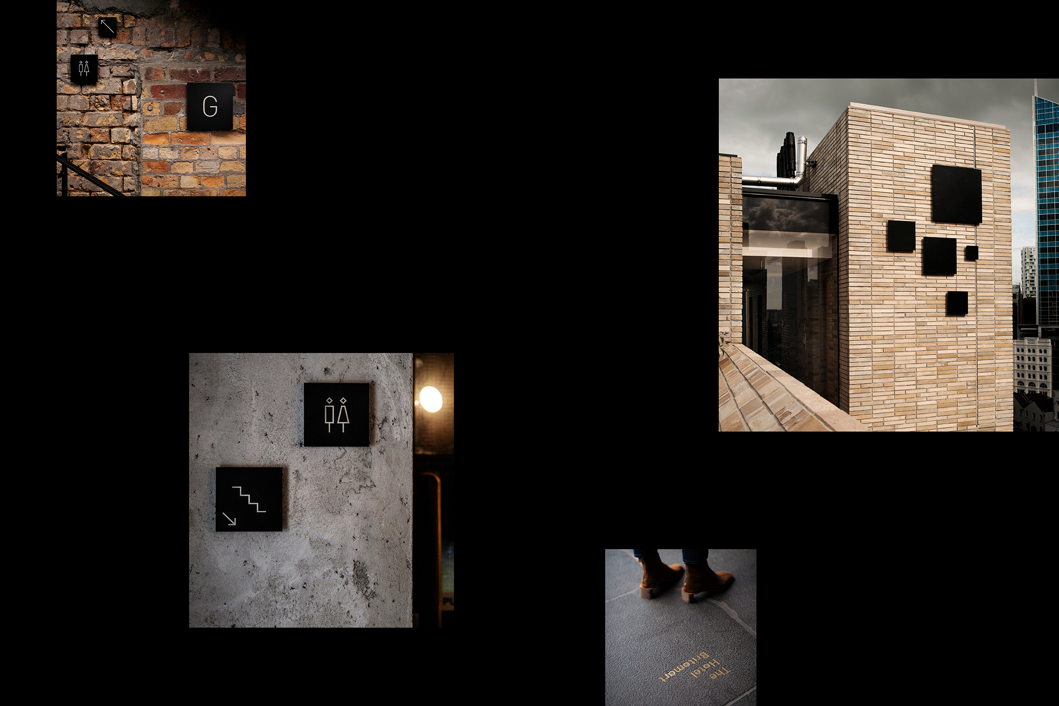
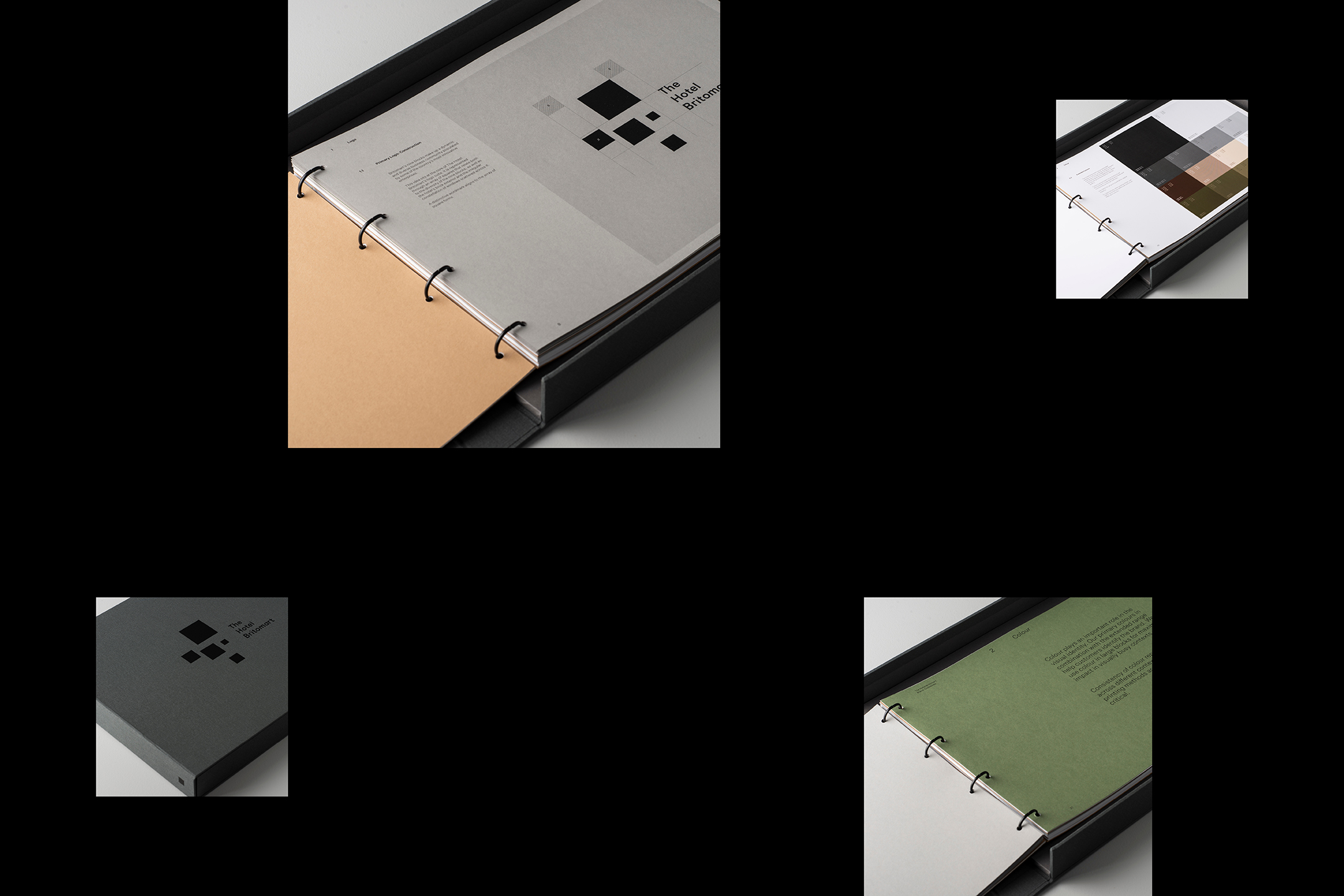
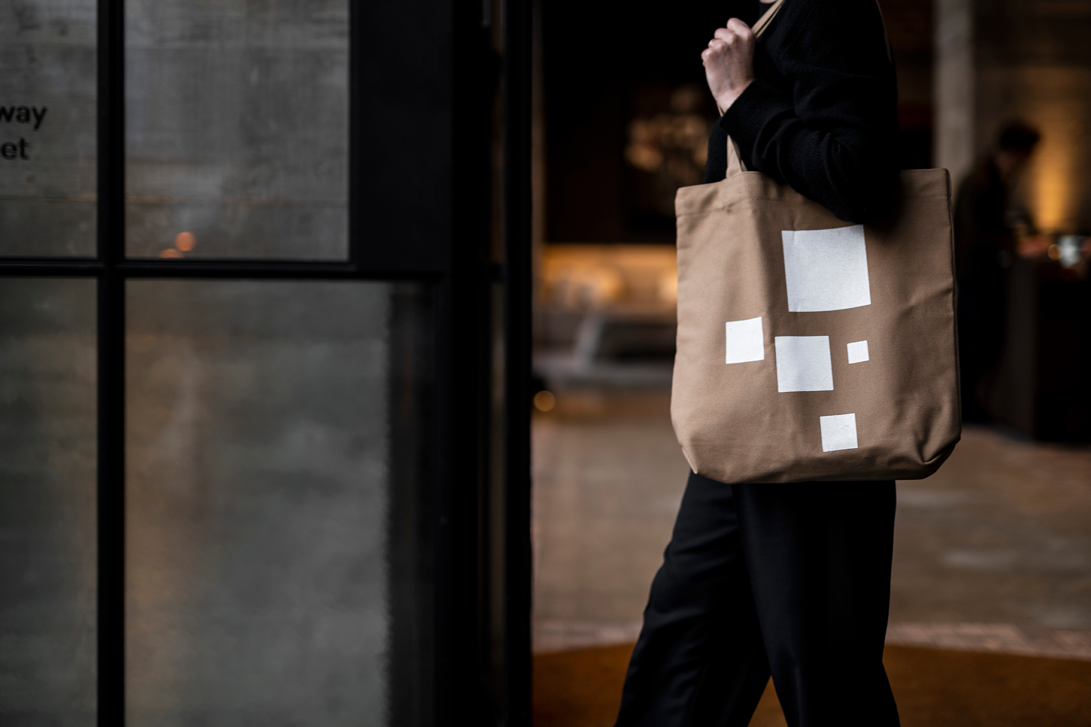
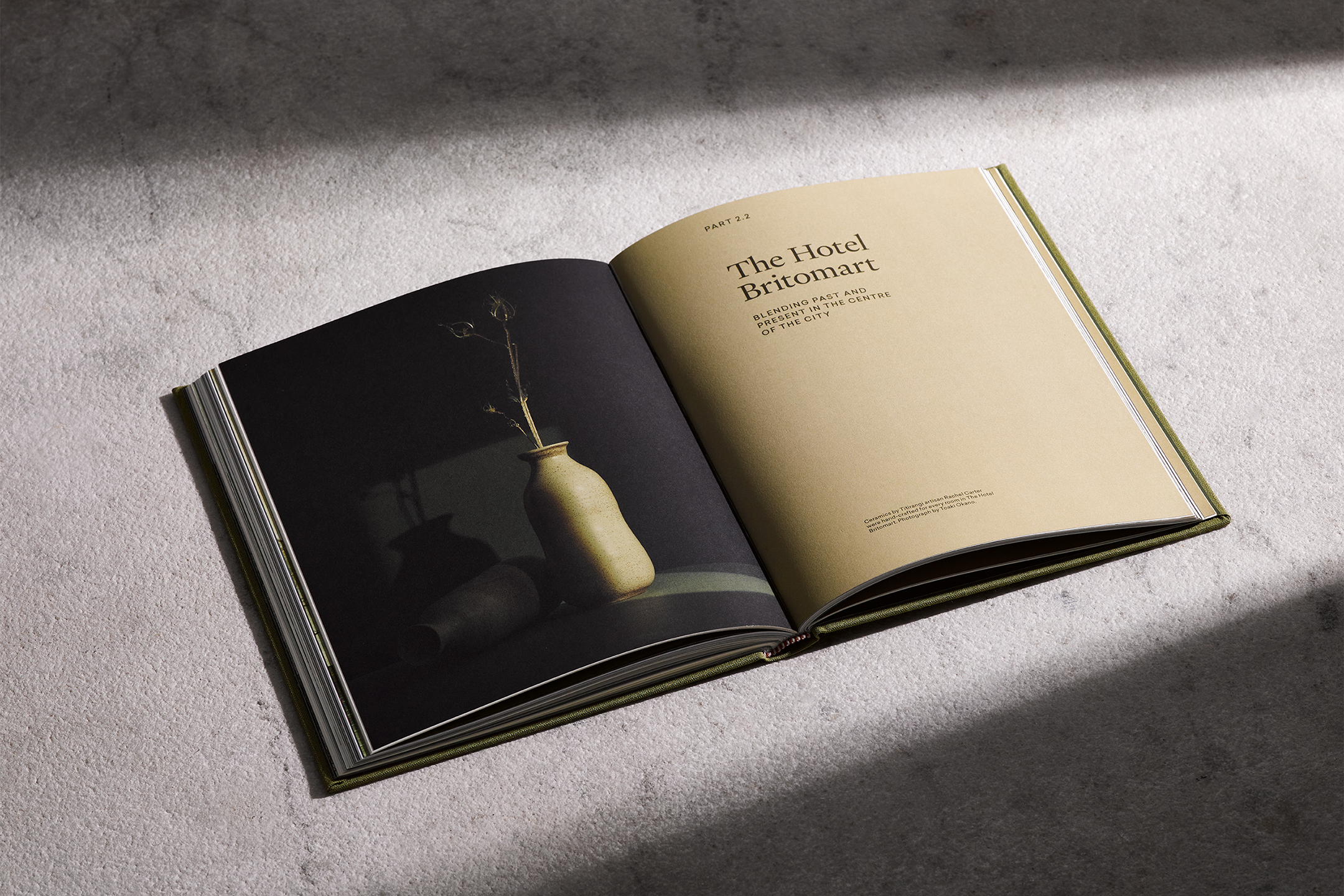
The Hotel Britomart
[Designed at Inhouse]
Creative Director
Arch MacDonnell
Design Director
Toby Curnow
Designers
Alexandra Turner
Alistair McCready
Typeface
Sailec & Heldane Text
Paper Stocks
ColorPlan Mid Green, Harvest & Stone
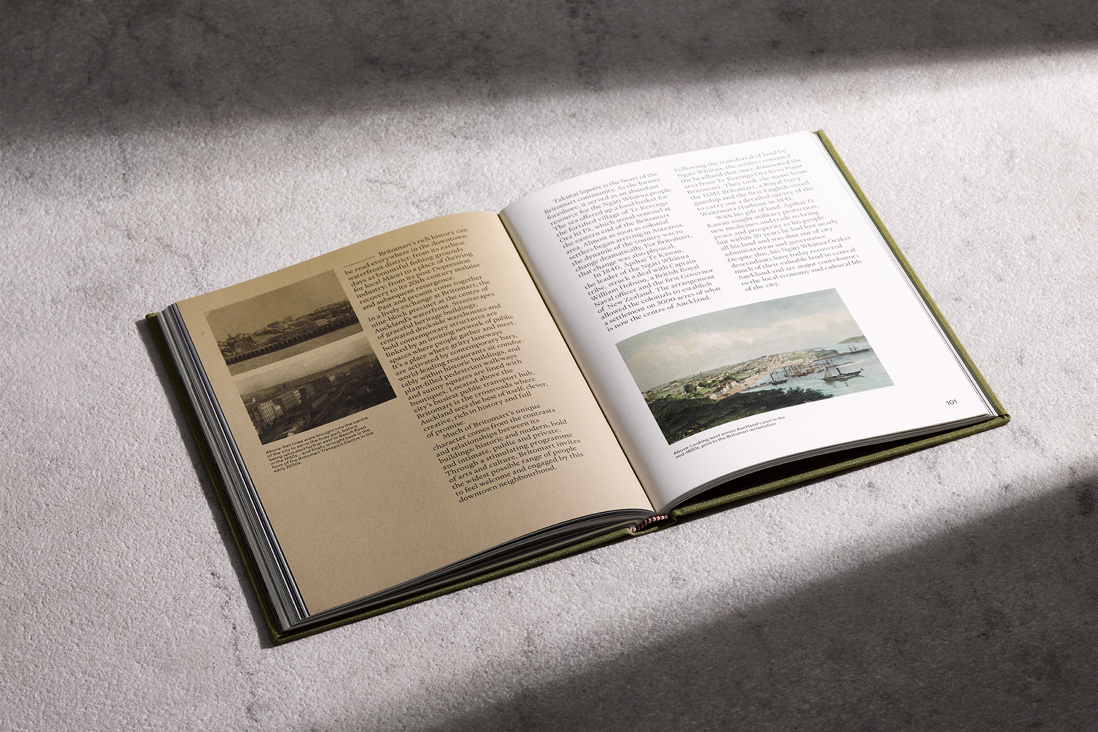
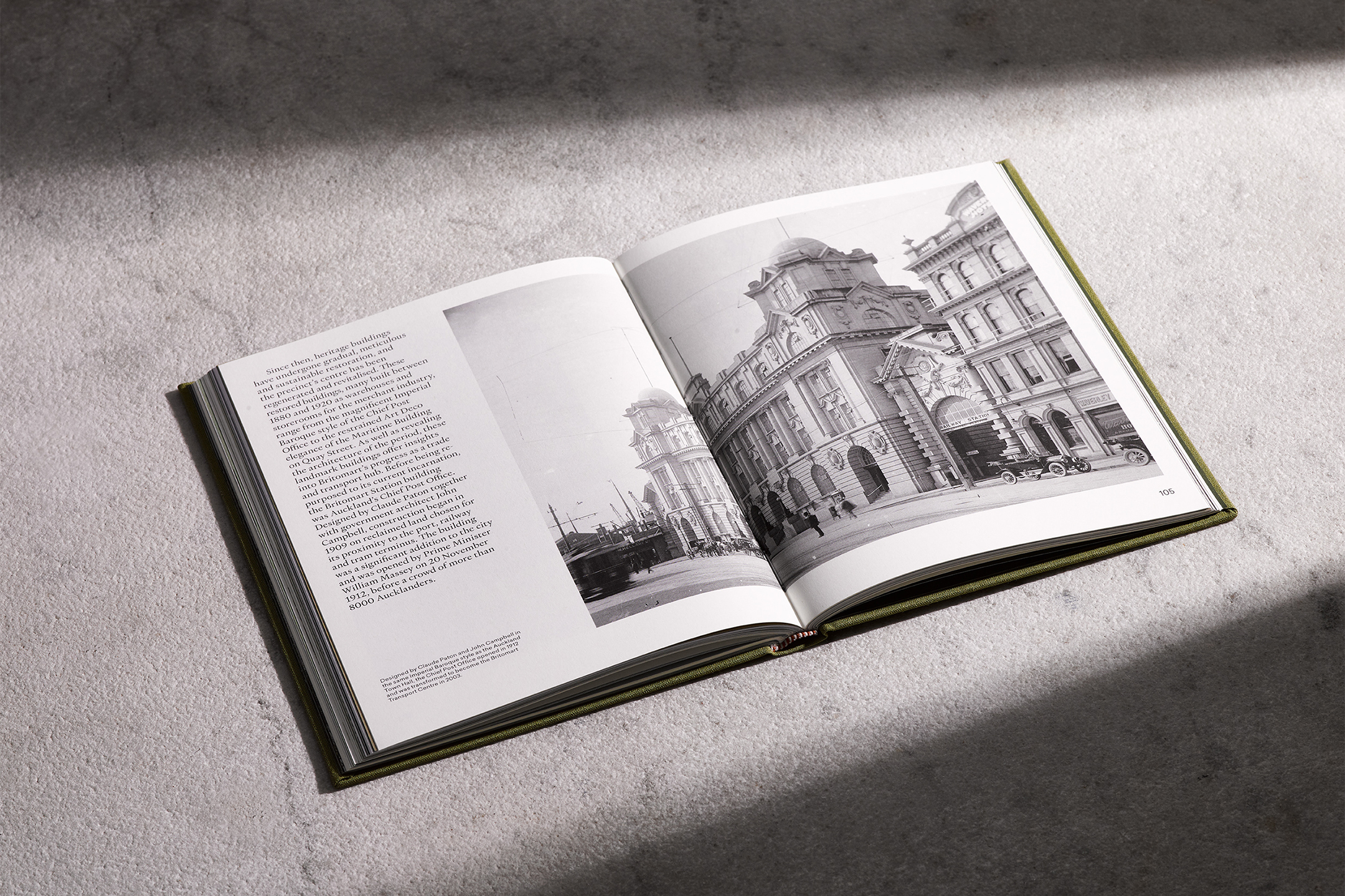
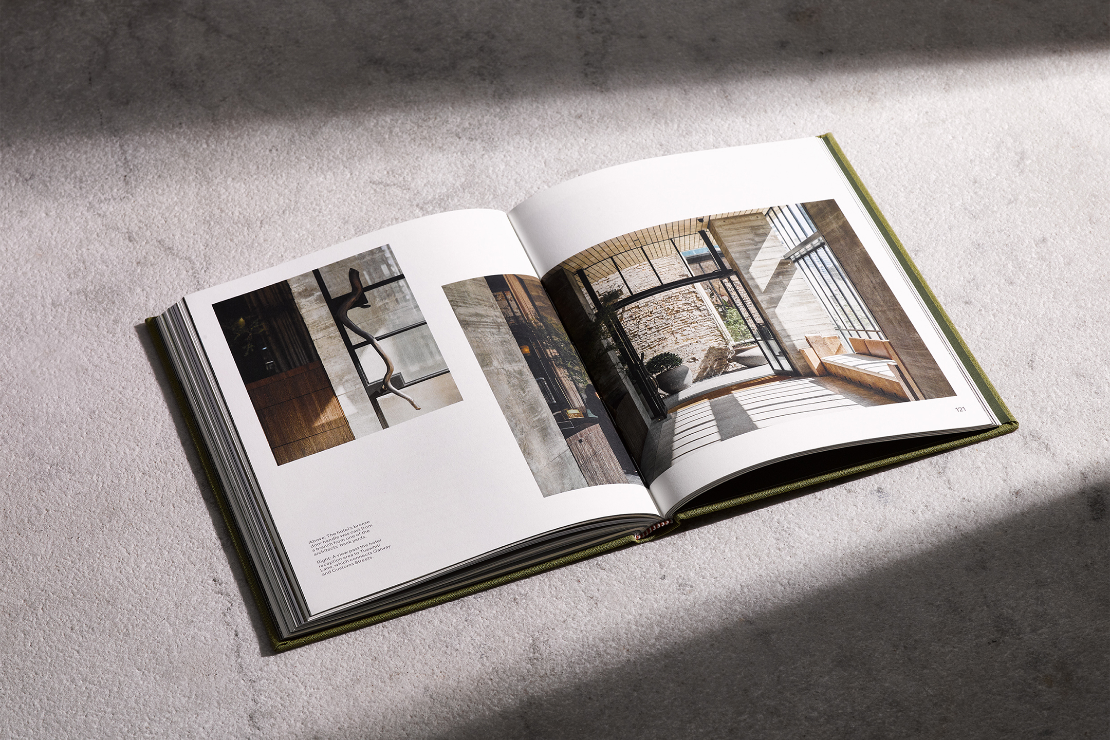
The Hotel Britomart, a cornerstone of Auckland’s most vibrant downtown neighbourhood is located within a nine-block precinct, bustling with energy and contrasts that make up a dynamic and diverse business community.
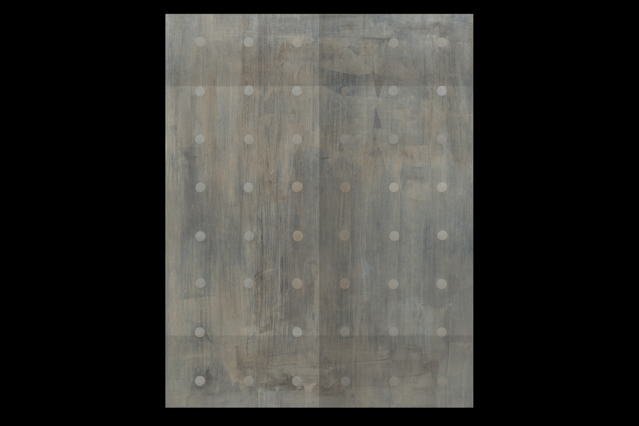
This idea sits at the core of The Hotel Britomart’s logo suite. It is represented through an array of squares that relate to the nine blocks’ diversity, the hotel’s brick exterior, and the irregular constellation of windows scattered across it. The logo mark is the most visible element of The Hotel Britomart visual identity. It is a universal signature across all brand touchpoints. It is a versatile graphic element that can be used in various ways; an image mask, a housing device for images, a housing for abstract graphics, and a visual metaphor.
The identity is far-reaching and embedded into the building, from wayfinding signage systems to branded pencils and notebooks. The hotel collateral features a mix of hi-fi and lo-fi materials, a signature feature of the Britomart precinct. Foil finishes on raw boxboard, one colour letterpress printing on luxurious coloured stocks. The identity is purposefully understated with attention to details that symbolically embody the hotel’s standards, quality, and future goals.
![]()
![]()
![]()
![]()
![]()
![]()
![]()
-
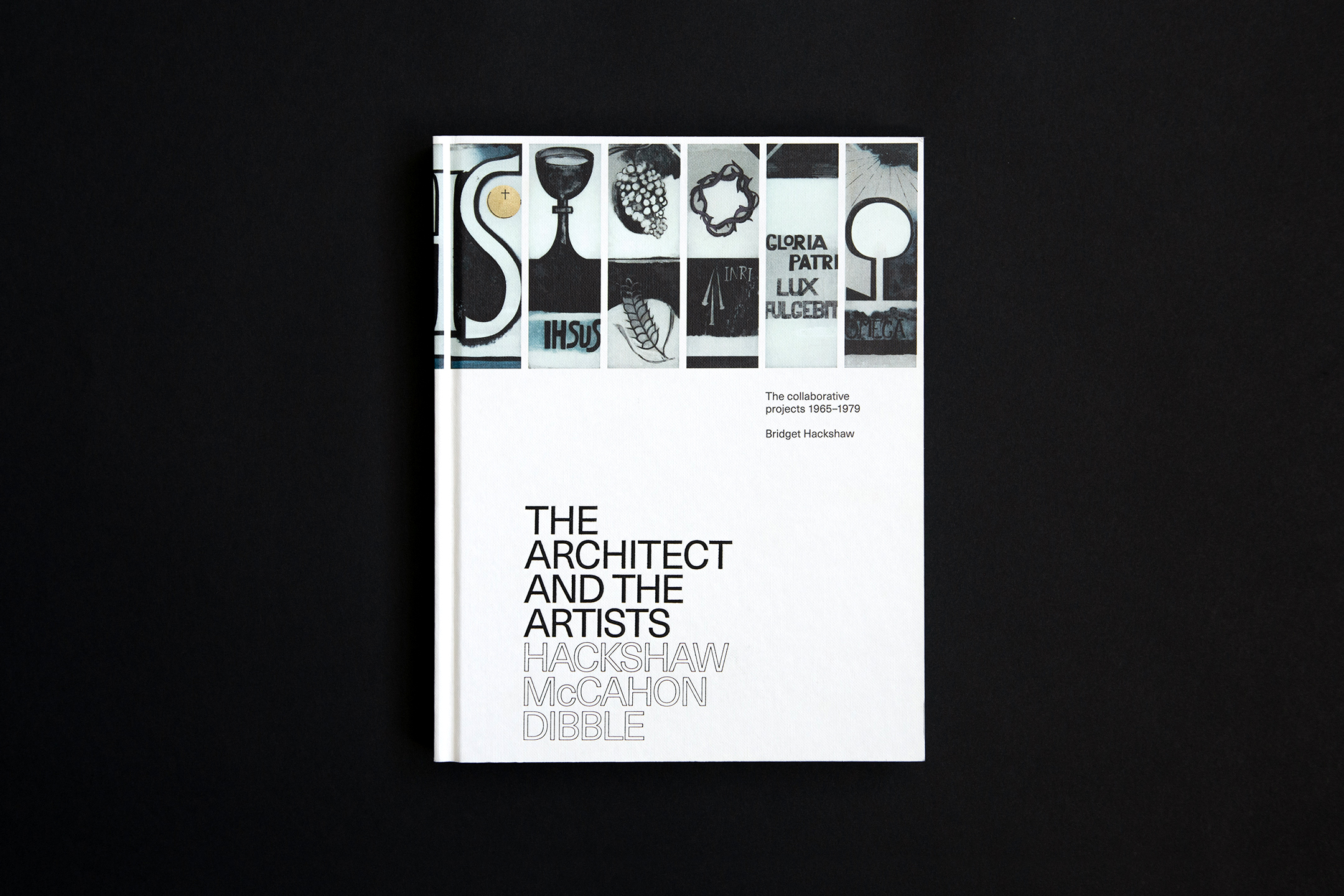
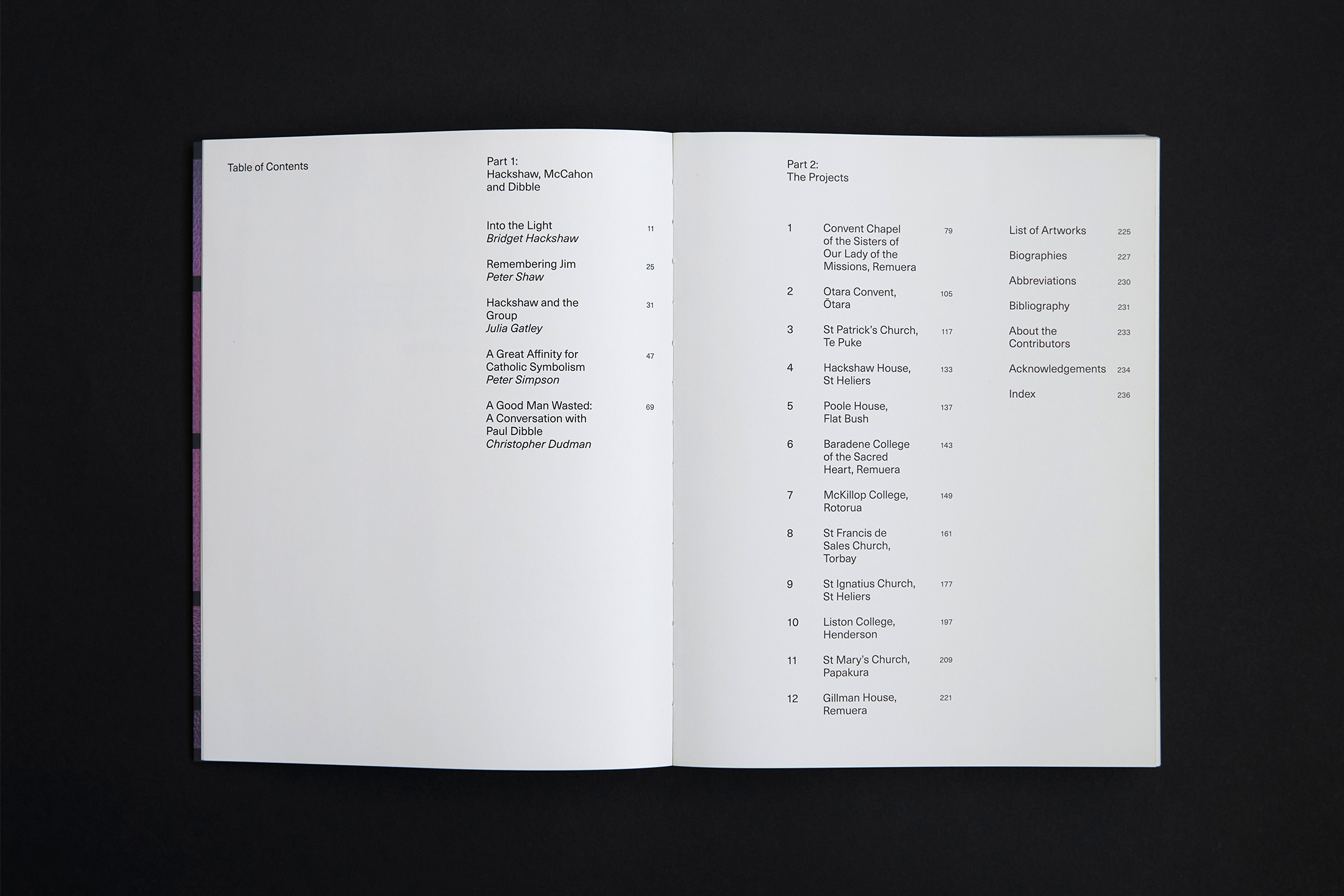
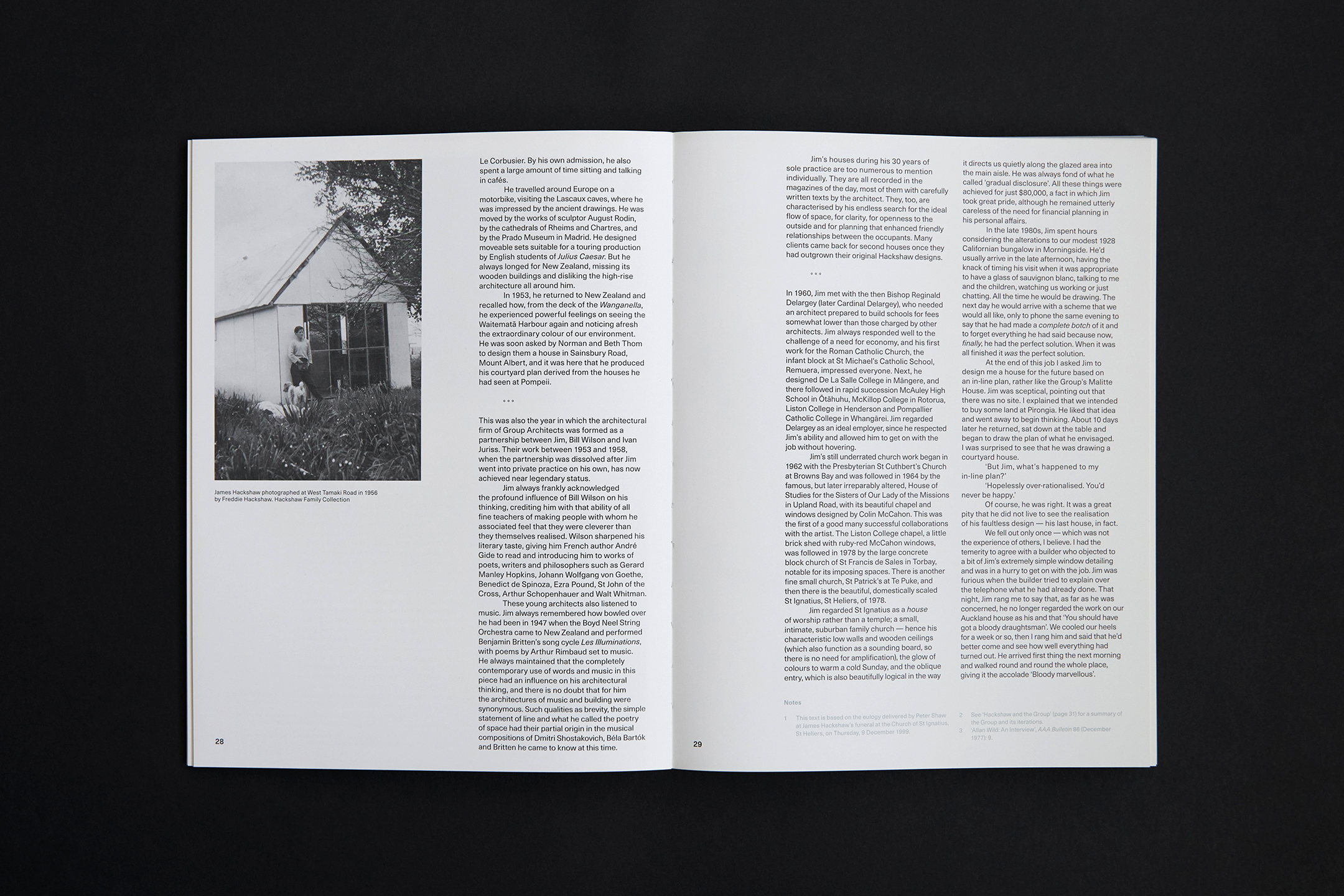
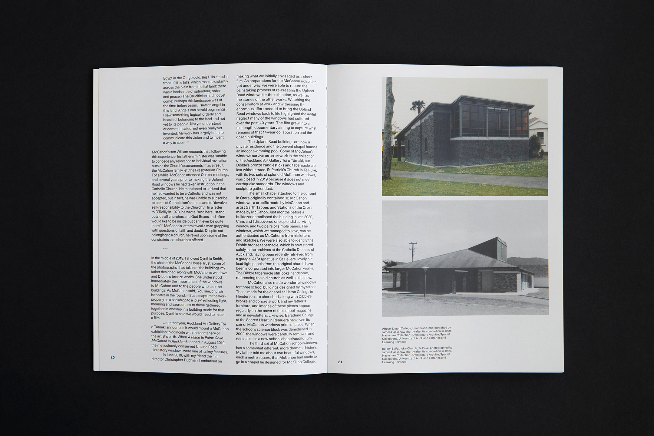
The Architect and the Artists
[Designed at Inhouse]
Creative Director
Arch MacDonnell
Designers
Alexandra Turner
Typefaces
Neue Haas Unica Pro & Pitch
Dimensions
260 × 200 mm
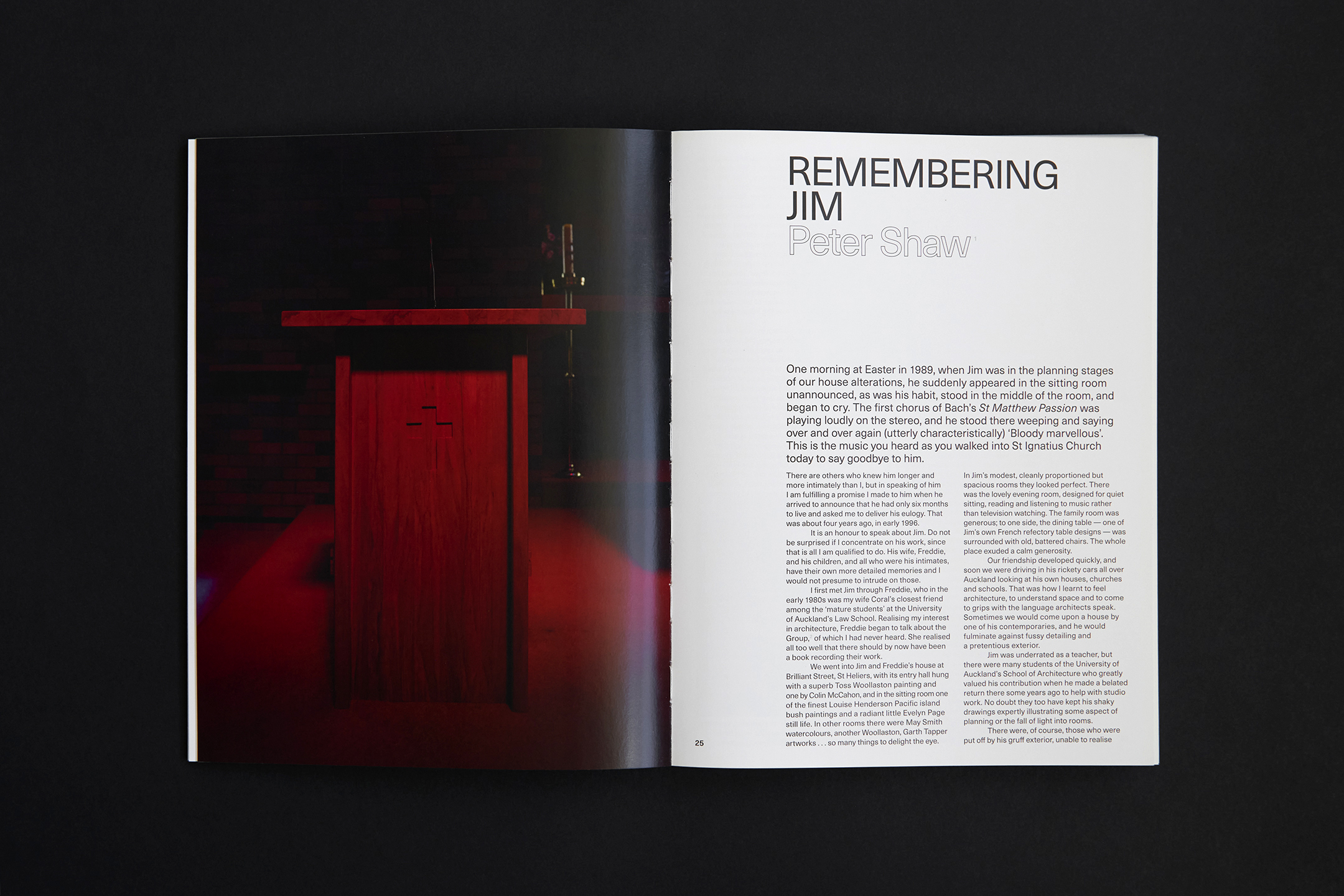
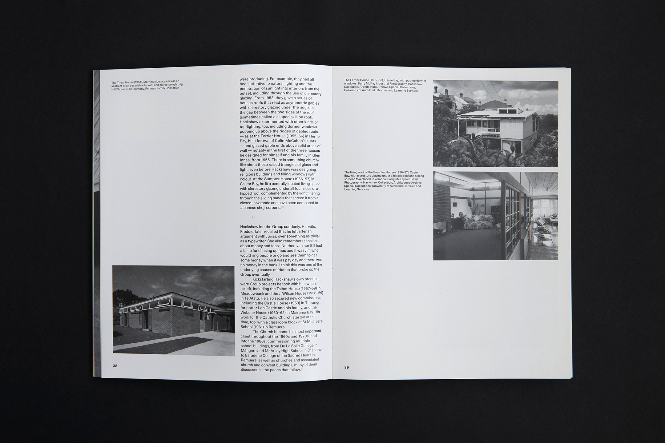
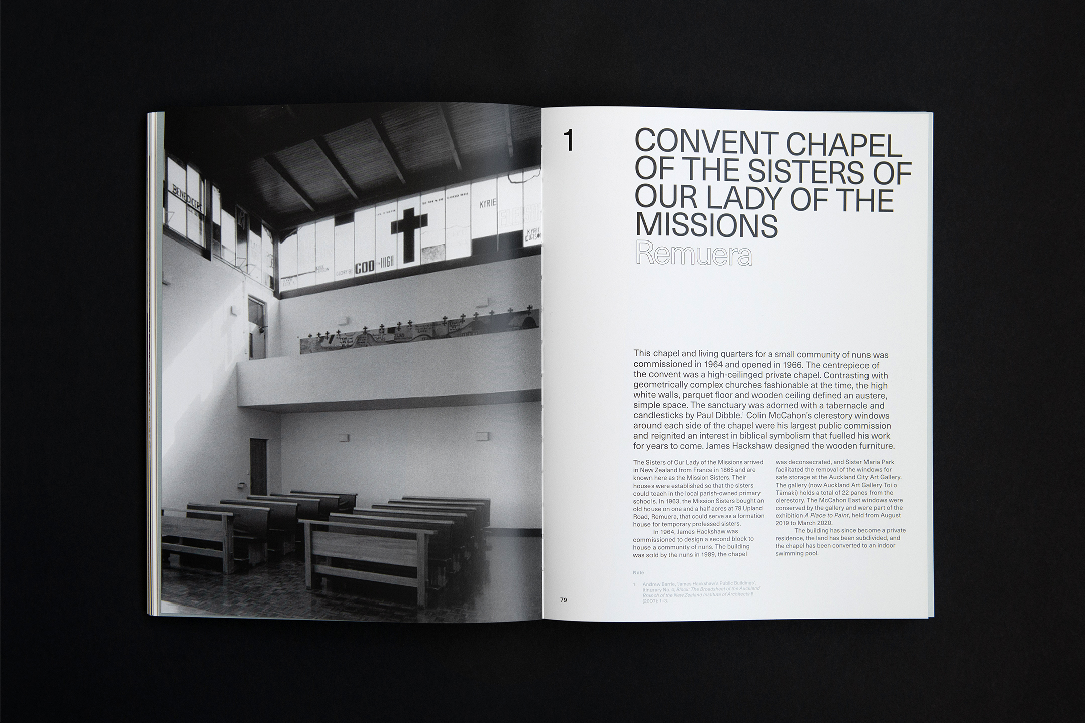
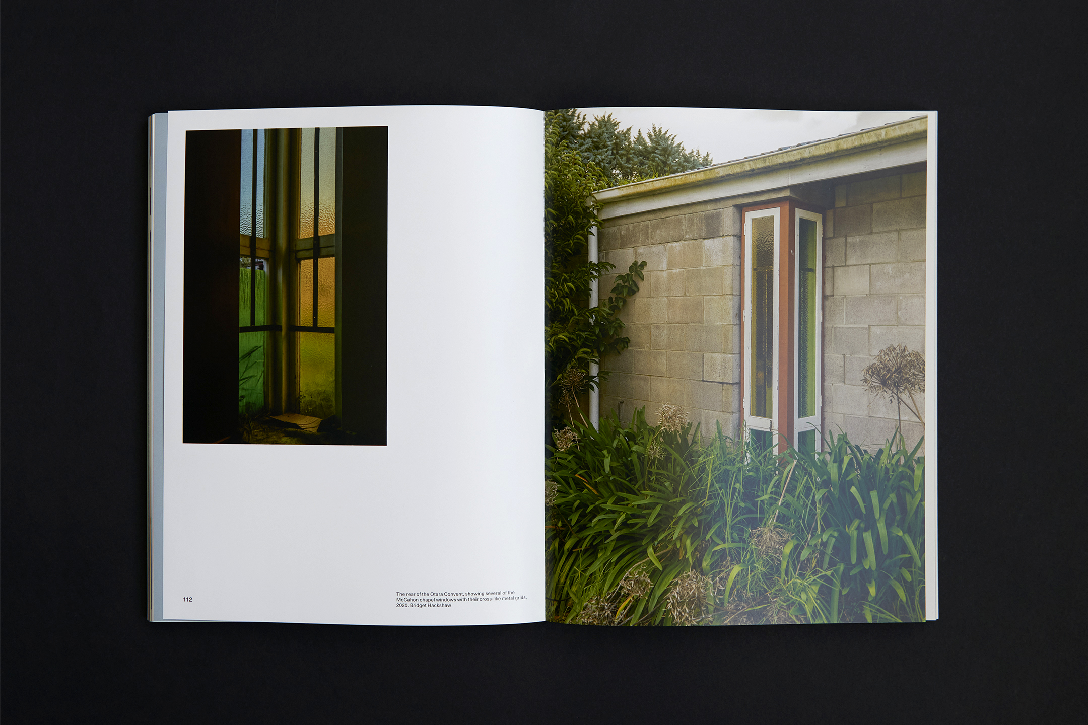
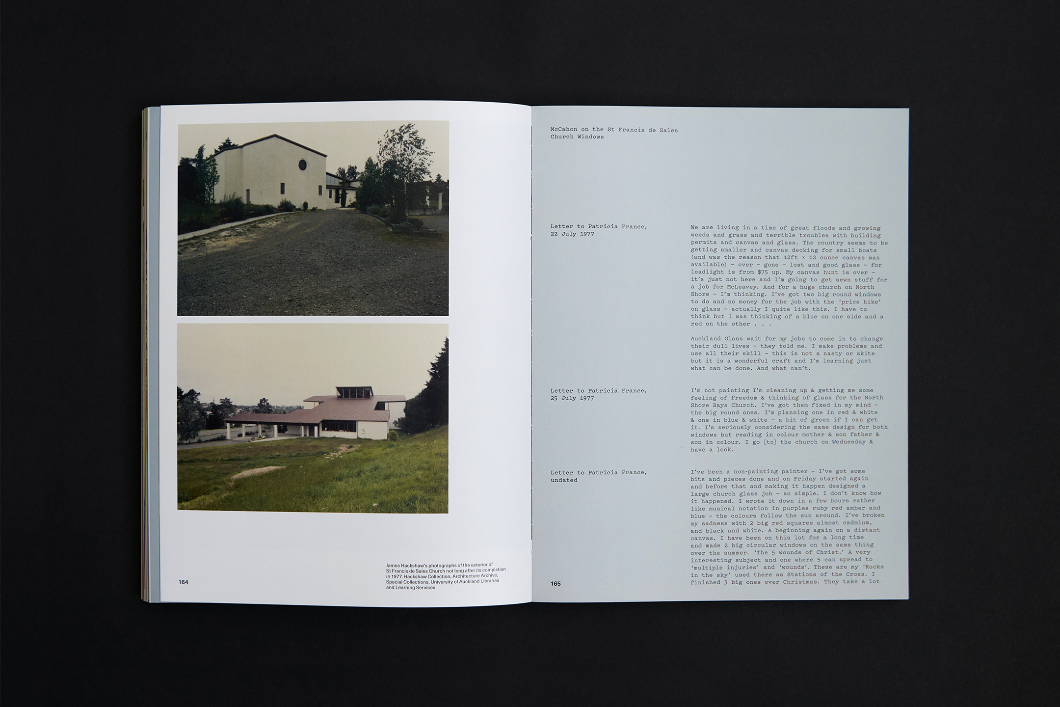
The Architect and the Artists documents the relatively little-known collaboration between modernist architect James Hackshaw, painter Colin McCahon and sculptor Paul Dibble.
It is richly illustrated with Hackshaw’s plans, McCahon’s drawings, letters and journal entries, and photography by Bridget Hacksaw of the surviving buildings, artworks and sculptures.
This 240pp publication has singer-sewn sections on a coated stock and buckram blunt-cut hardcover with matt black foil.
![]()
![]()
![]()
![]()
![]()
![]()
![]()
![]()
![]()
-
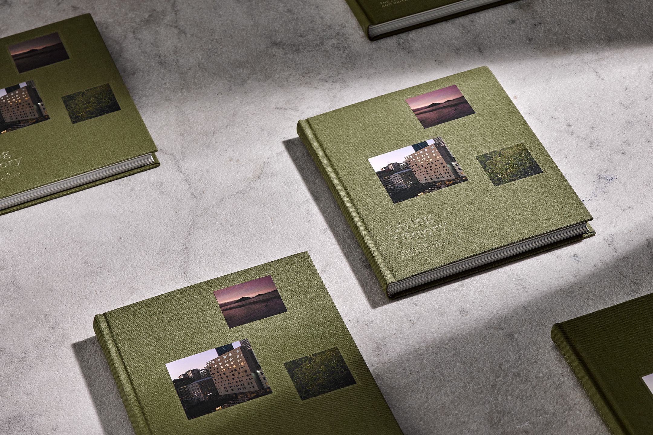
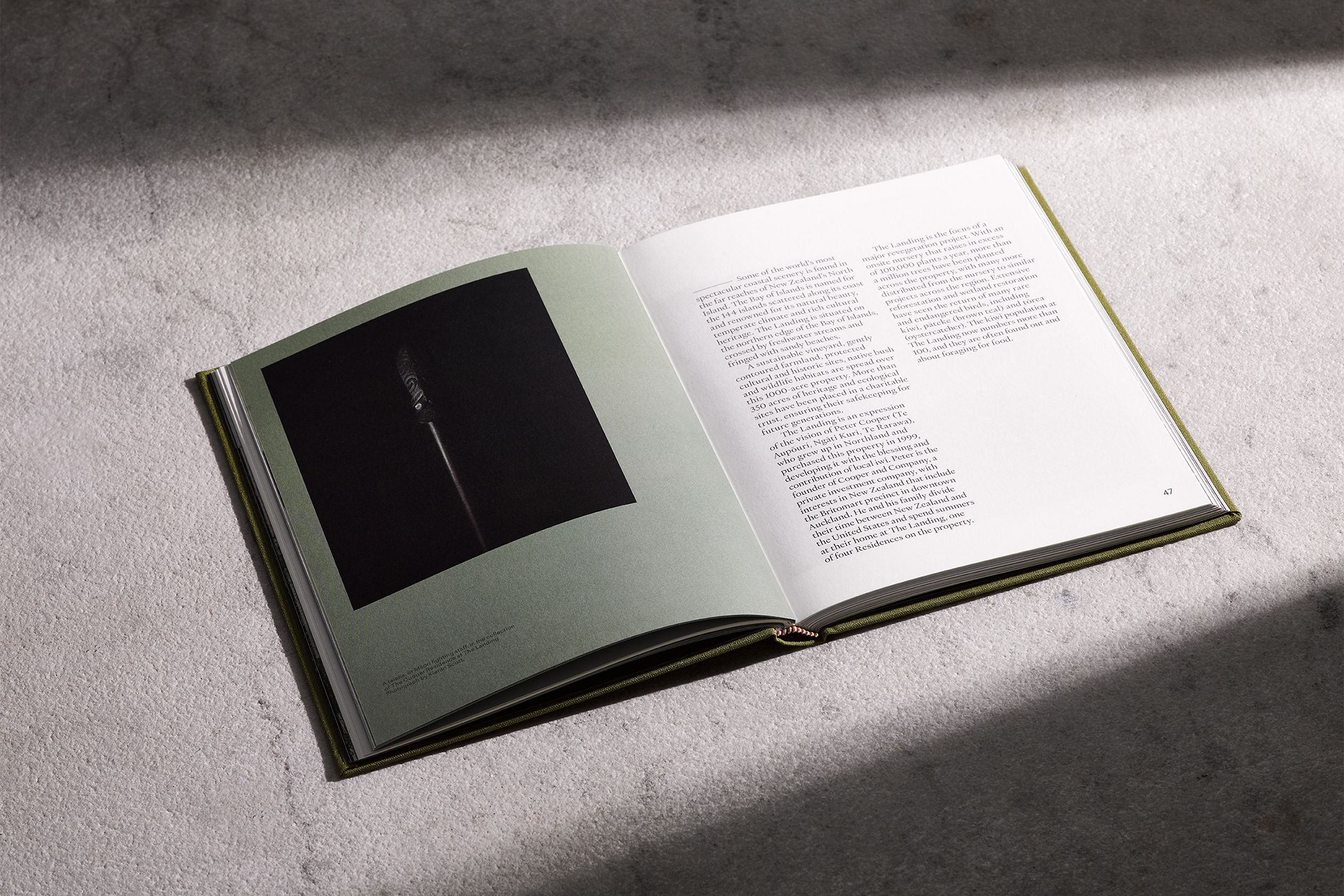
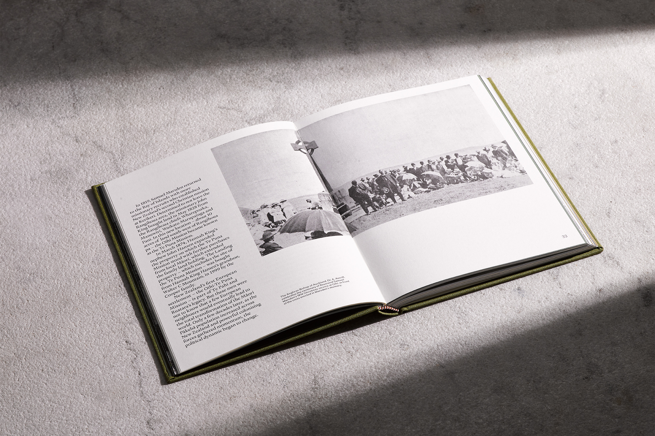
Living History
[Designed at Inhouse]
Creative Director
Arch MacDonnell
Designers
Alexandra Turner
Typefaces
Sailec & Heldane Text
Living History is a small and intimate publication that features varied content from a historical essay to commissioned suites of photographic artworks.
The Hotel Britomart’s luxury suites named after Bay of Islands resortThe Landing required a promotional publication to give guests as a gift at both venues. The book needed to establish that the two properties are linked and tell the stories from both. A place steeped in cultural significance, The Bay of Islands was one of the first regions in New Zealand settled by early Māori voyagers from Polynesia. Whilst Britomart and the hotel are a prominent feature, the book’s primary focus is The Landing; its history, its taonga, and the residences and winery there today.
Mixed stocks were used, and the look and feel of the publication relate closely to the visual identity of the hotel; the colour palette, the typefaces and the array of square pictures emulating The Hotel Britomart logo and the constellation of windows that appear on the buildings façade.
![]()
![]()
![]()
![]()
![]()
![]()
![]()
![]()
![]()
![]()
-
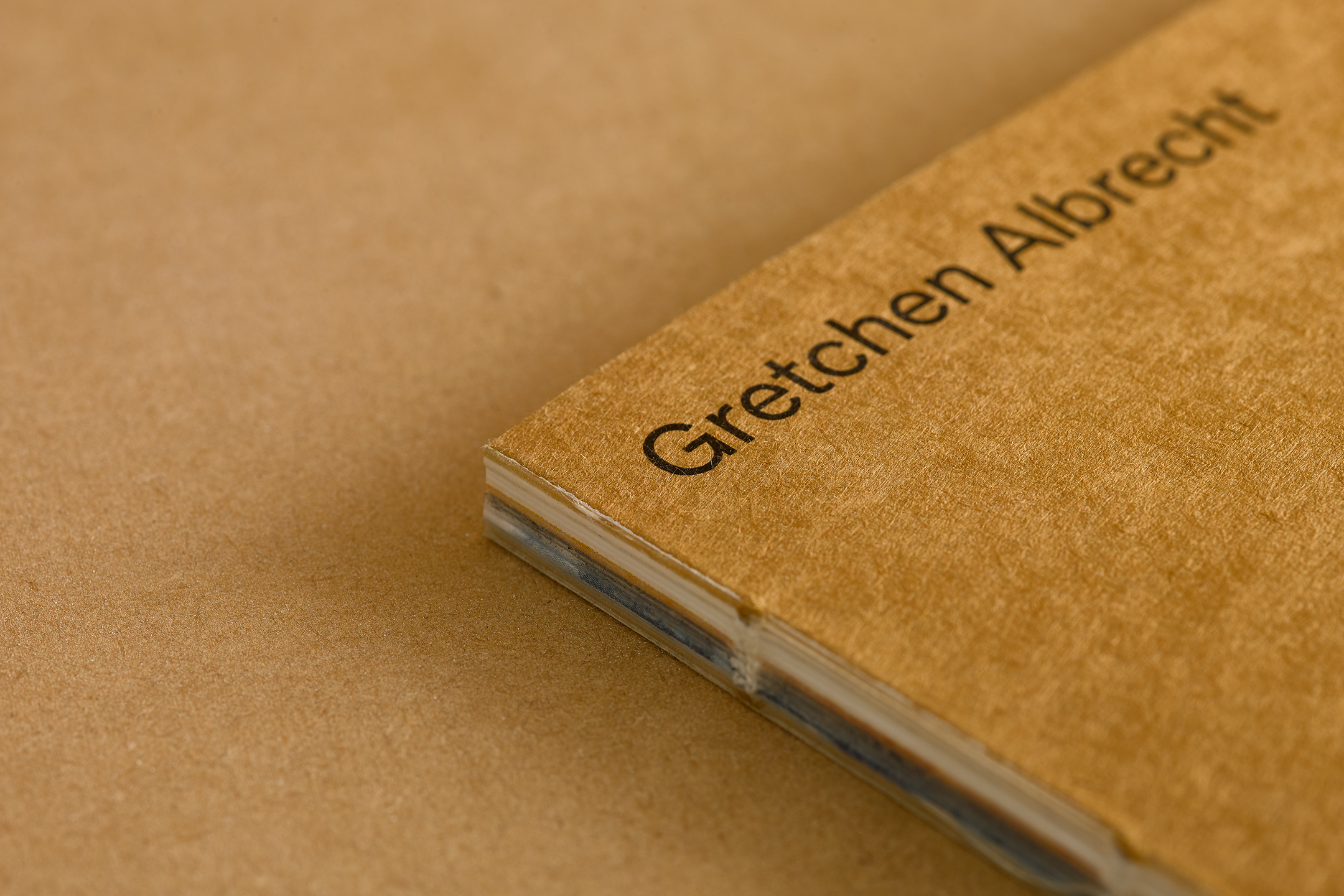
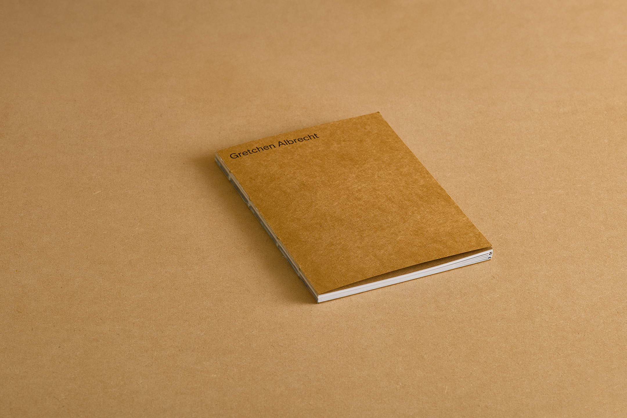
Gretchen
[Designed at Inhouse]
Creative Director
Arch MacDonnell
Designers
Alexandra Turner
Typefaces
Heldane & Söhneo
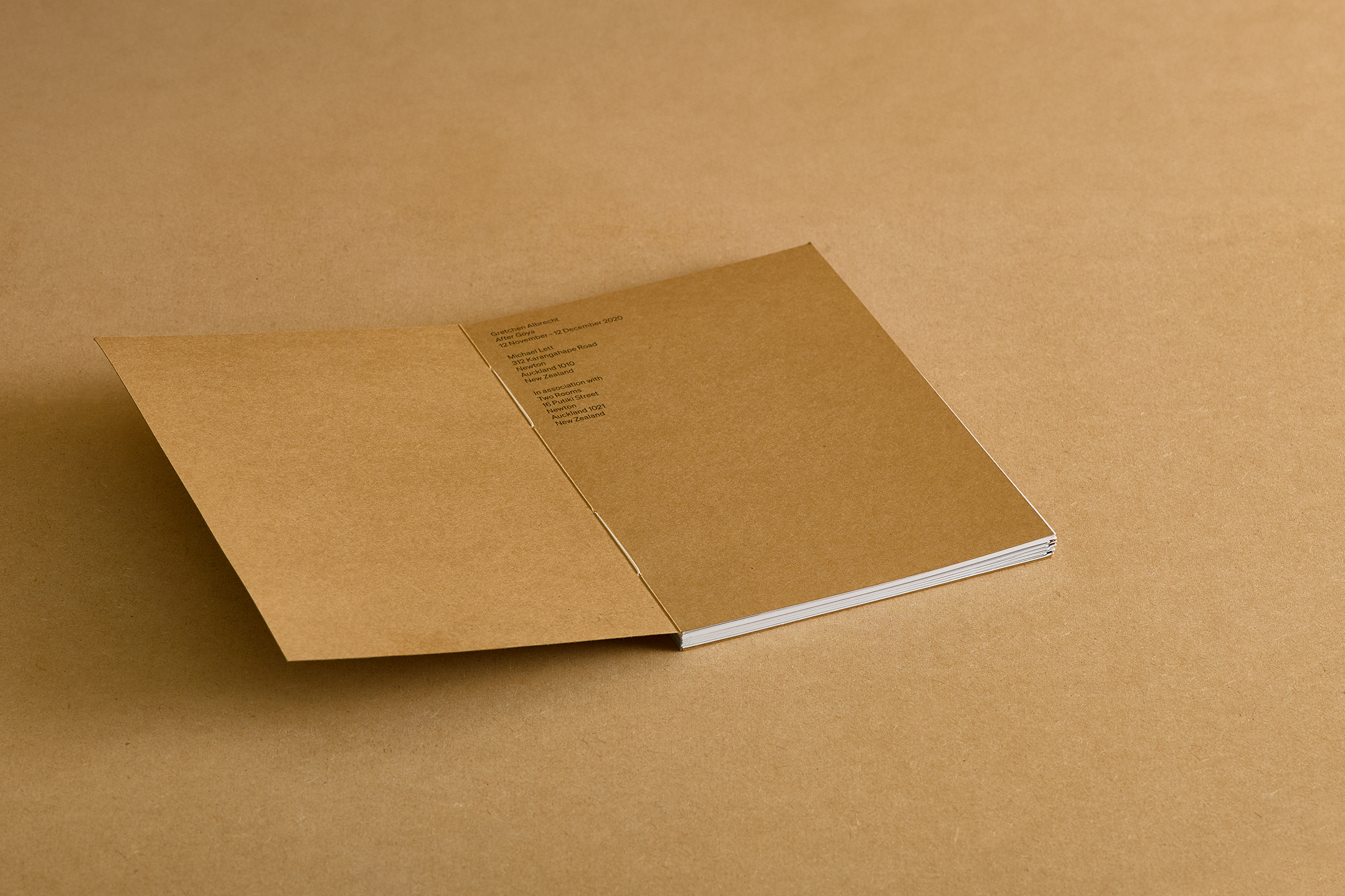
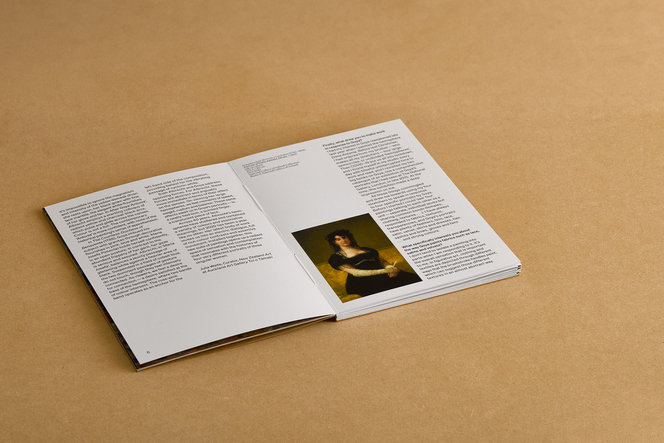
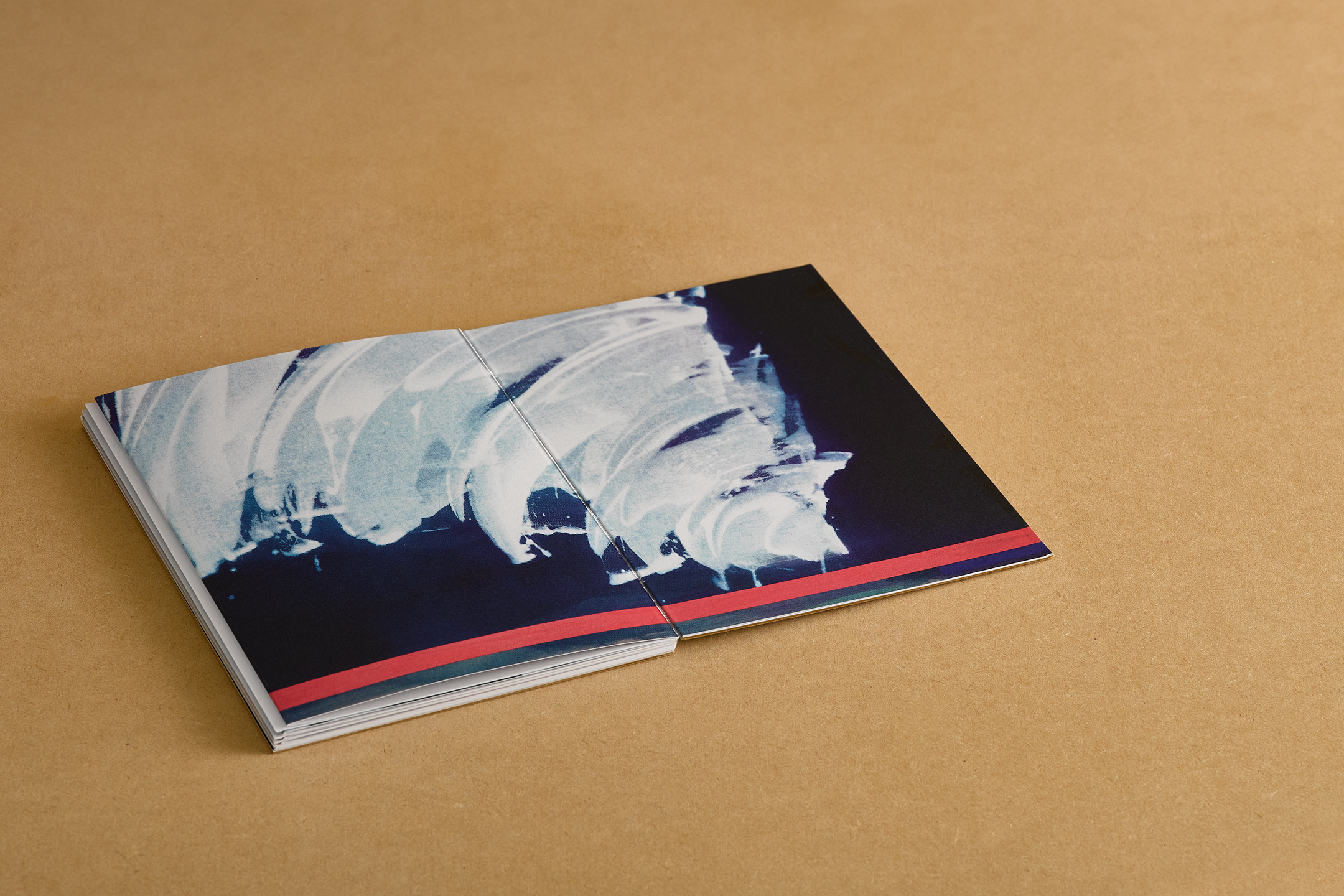
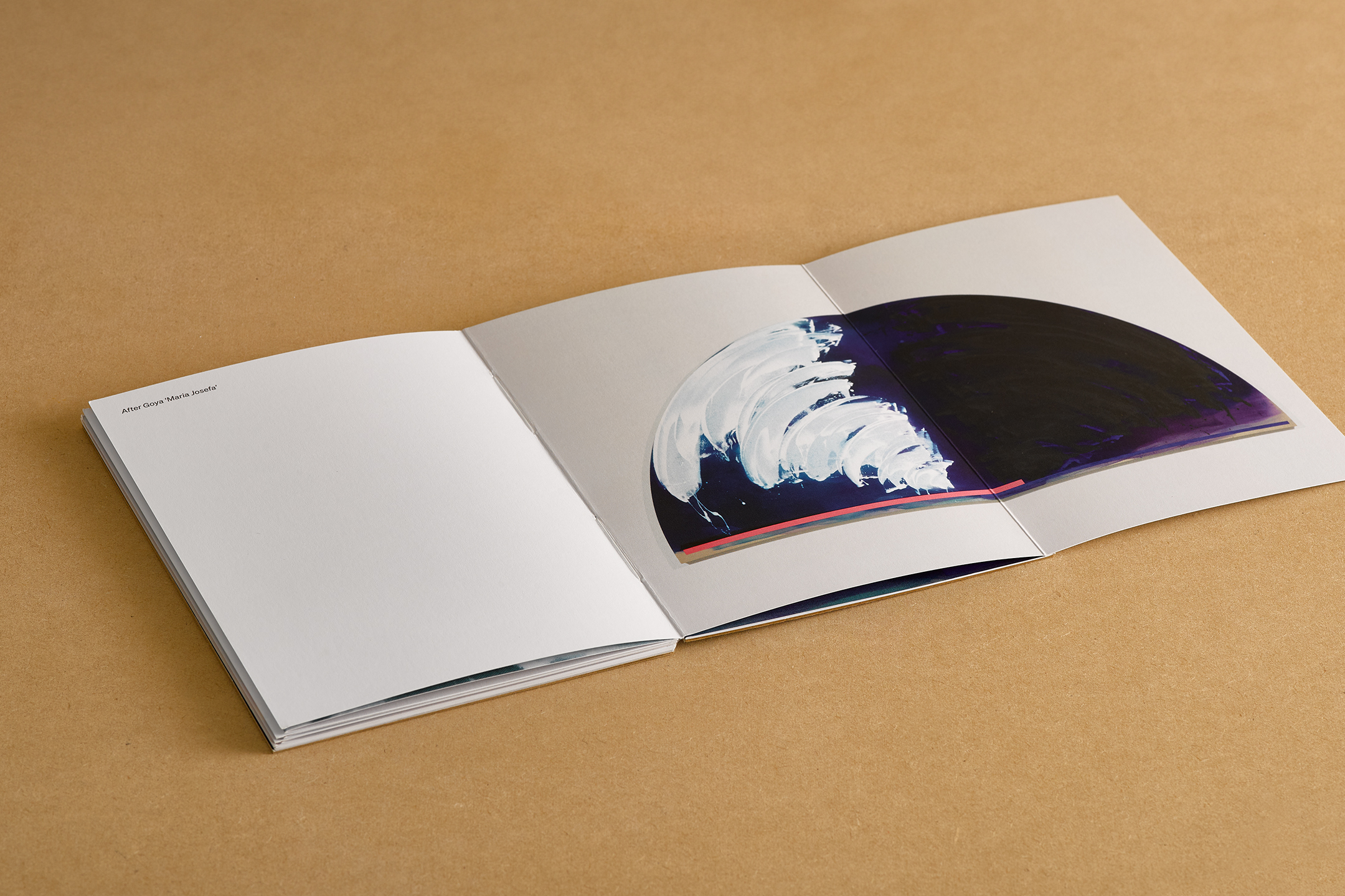
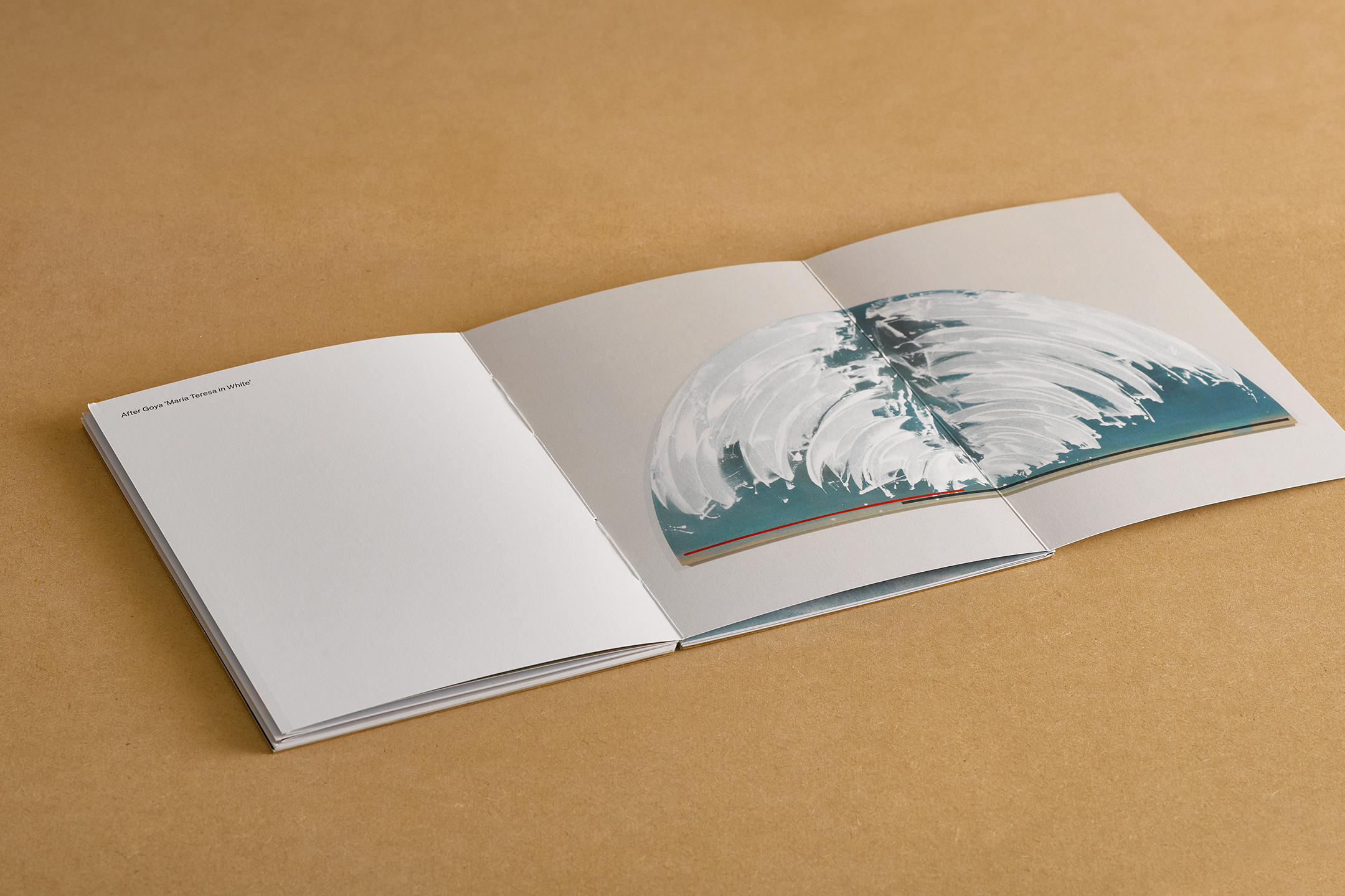
To accompany Gretchen Albretch's exhibition After Goya, a small scale publication was created to display the four feature paintings on display.
A craft stock is used on the cover, with exposed binding referencing the wooded backs of Albrecht’s handmade canvases. A gatefold is utilised to allow the four artworks to be shown at a large scale without interference from the gutter.
The gatefold falls in the middle of the semicircular artworks, followed by a close-up detail to scale on the following page. The design of the book has an intentional rawness.
![]()
![]()
![]()
![]()
![]()
![]()
![]()
![]()
-
Billy Apple
[Designed at Inhouse]
Creative Director
Arch MacDonnell
Designers
Alexandra Turner
Typefaces
Futura & Untitled Sans
Dimensions
240 × 170 mm
Awards
PANZ Book Design Awards 2021
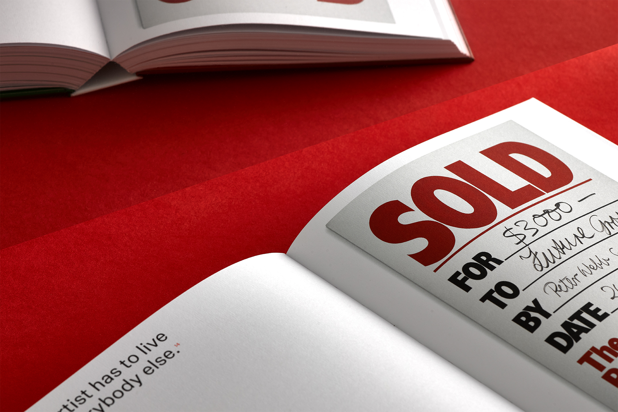
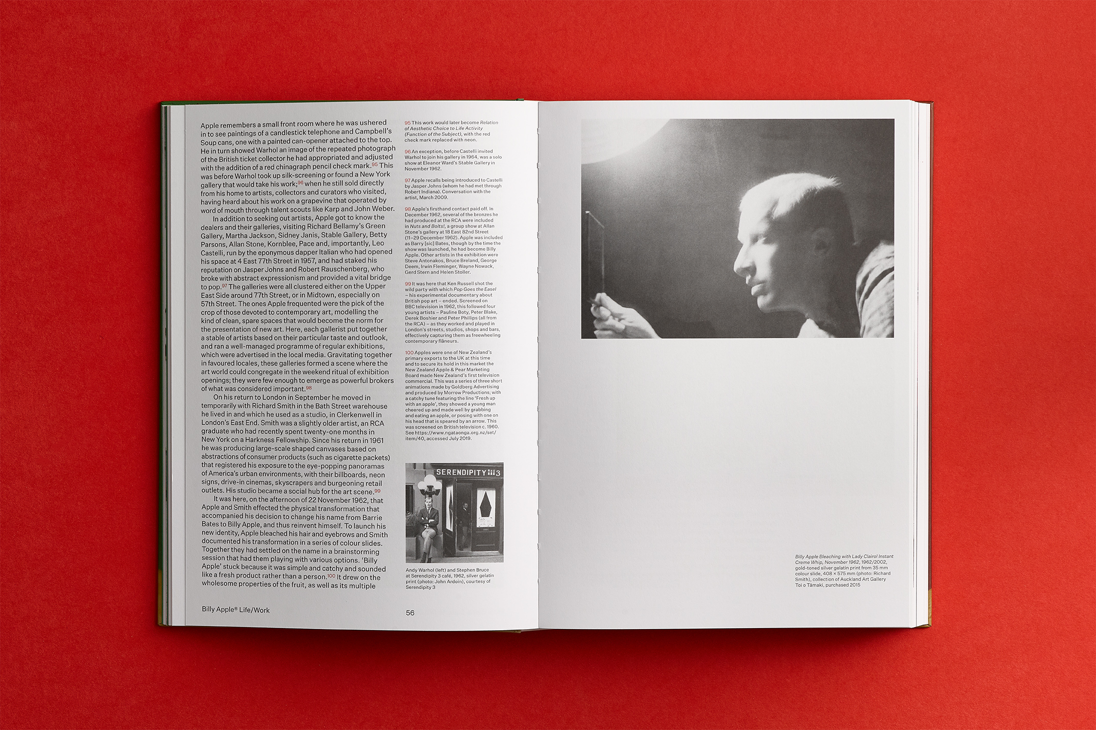
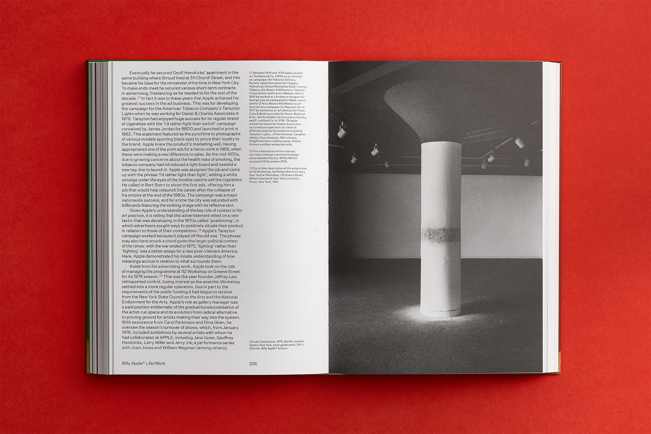
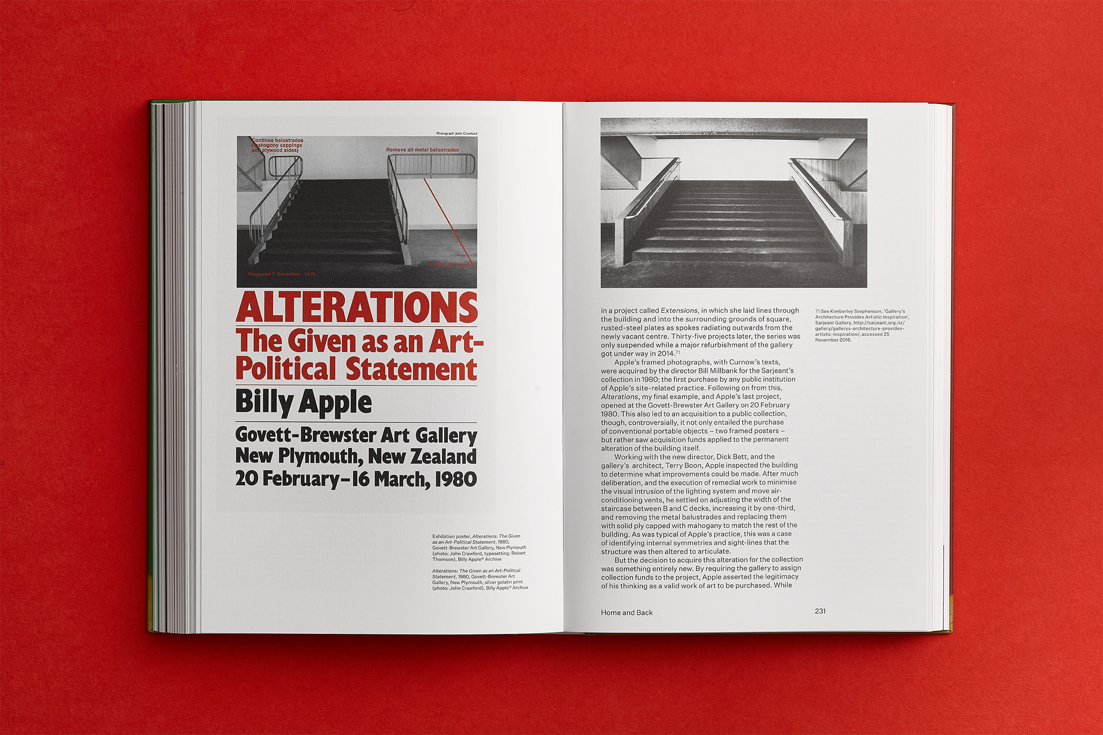
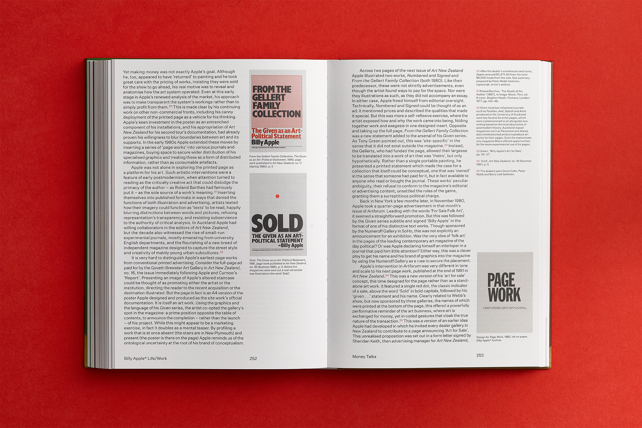
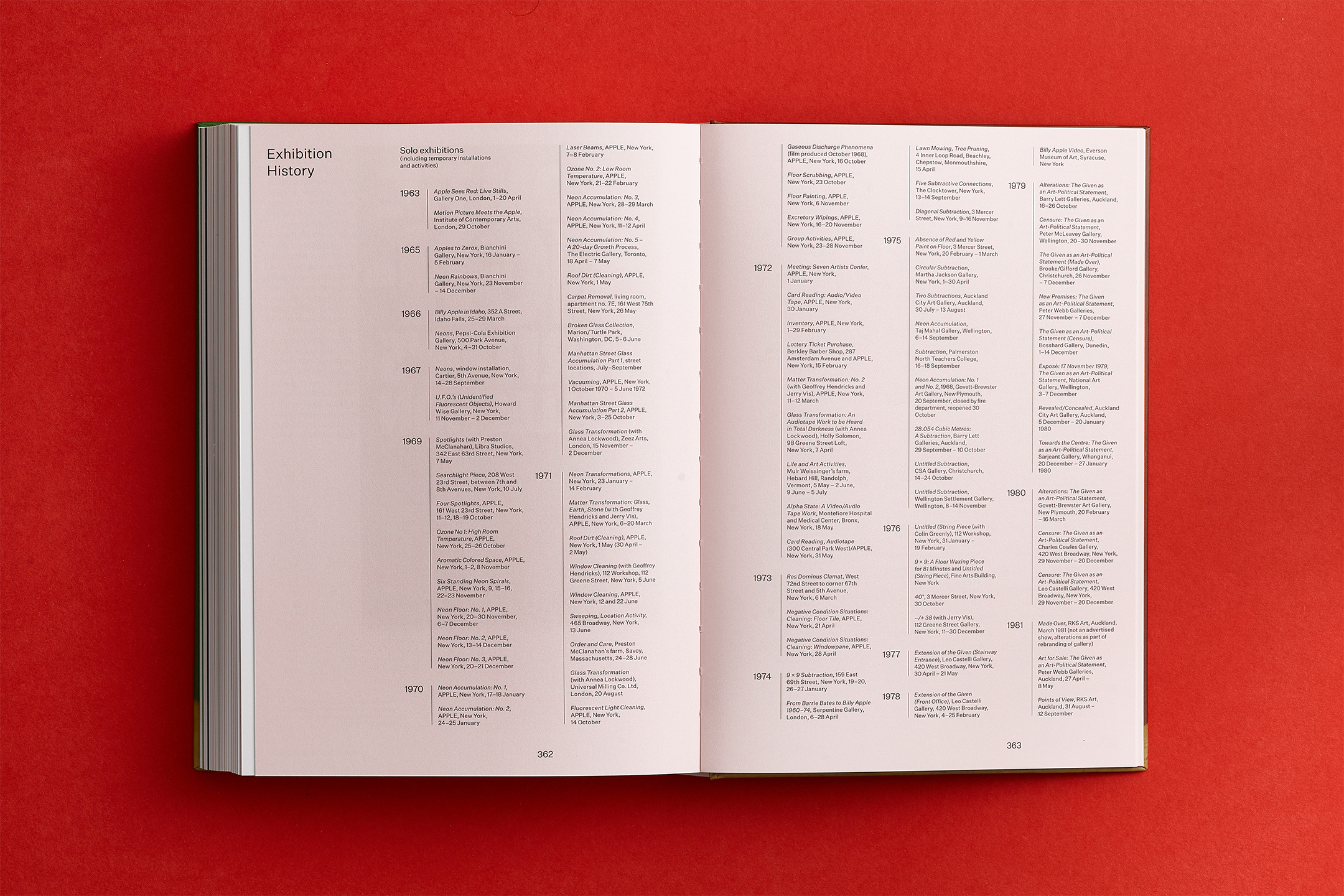
Best TypographyBilly Apple®: Life / Work is the first substantial book on Billy Apple’s career. Drawing on material from over a decade in archives worldwide as well as unprecedented access to Apple’s private archive, Tina Barton chronicles how Billy Apple has developed his art over 60 years from London to New York to Auckland.
The study includes a 130,000-word text and 200 illustrations in colour, with a generous selection of reproductions of Apple’s works plus other illustrative material. The cover features front and rearview portraits from original transparencies used in an iconic 1963 artwork and acknowledges a design construct from a series of previous Apple publications.
A single-column grid is utilised for an easy reading experience and images and marginalia are dispersed throughout the essay. Extensive footnotes are also included on the page where referenced, adding a vital layer of information for the reader. Red and green title pages demarcate transitional periods in Billy's career.
![]()
![]()
![]()
![]()
![]()
![]()
![]()
![]()
![]()
![]()
![]()
![]()
![]()
-
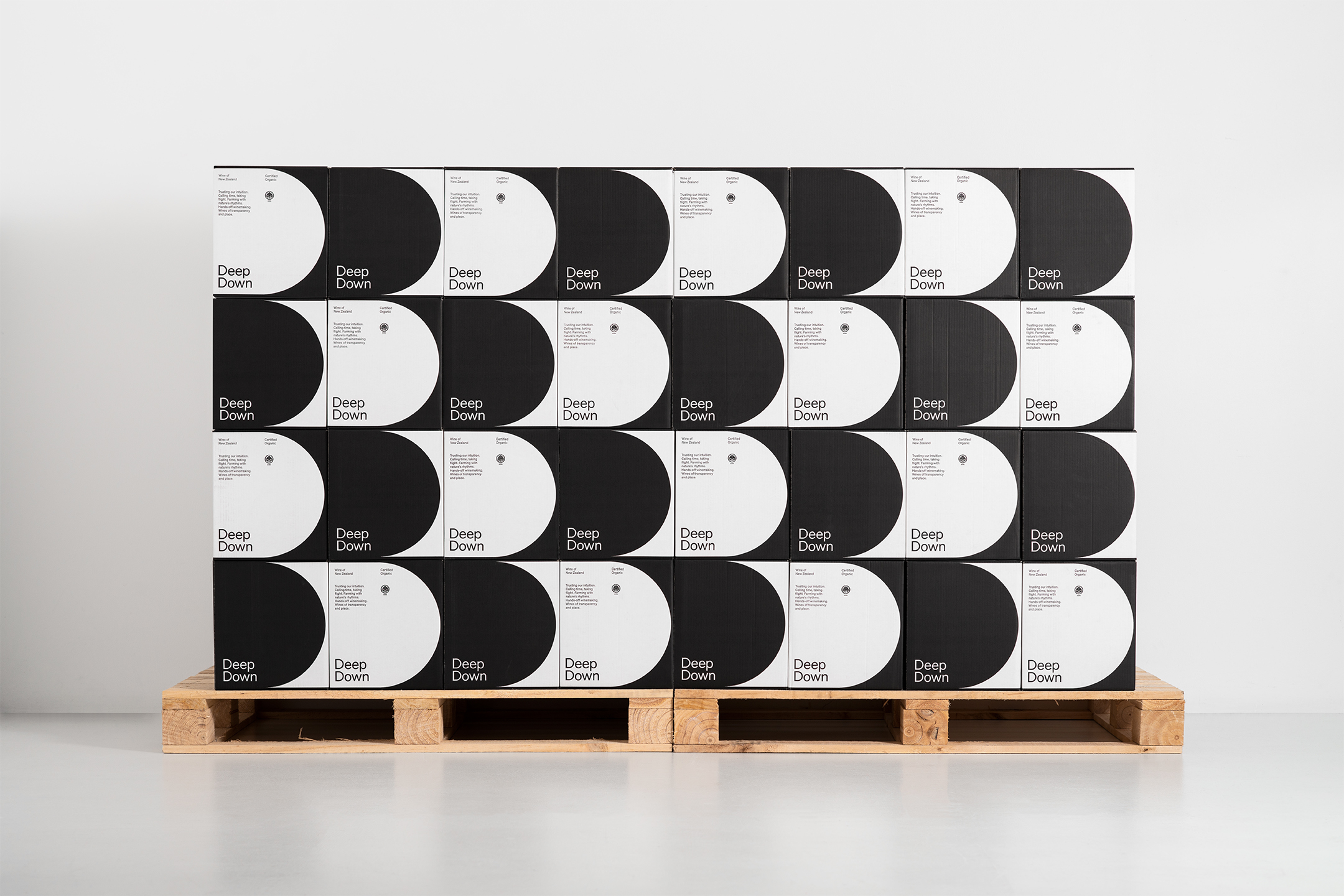
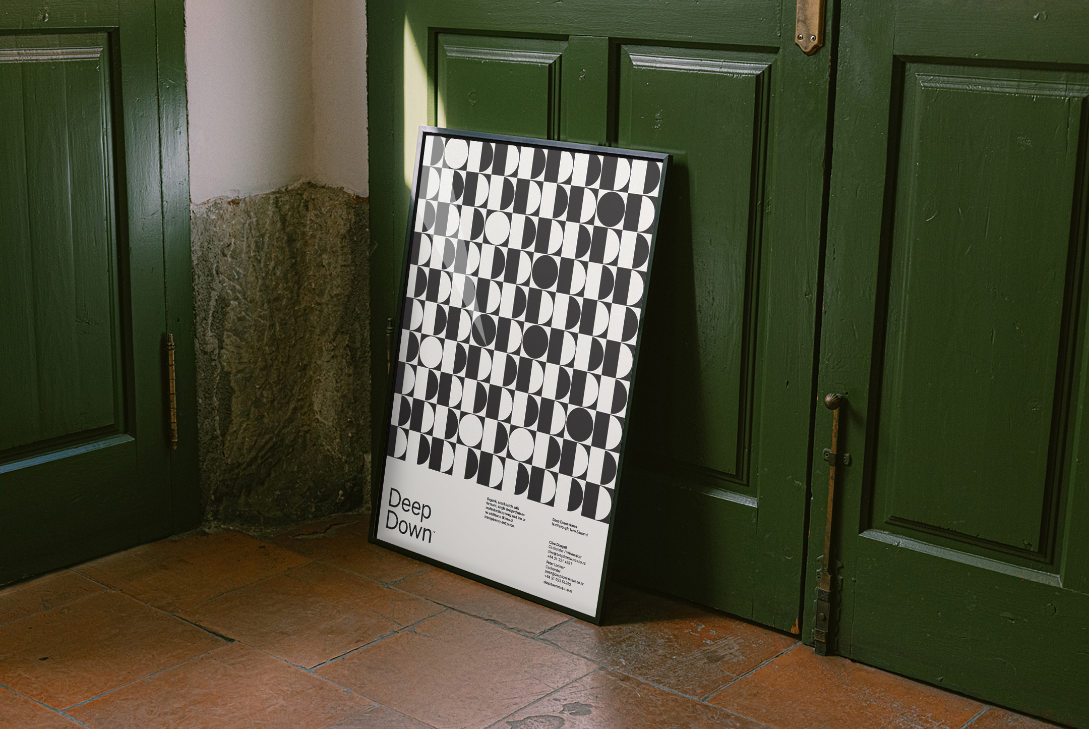
Deep Down
[Designed at Inhouse]
Creative Director
Arch MacDonnell
Design Director
Toby Curnow
Designers
Alexandra Turner
Typeface
Theinhardt
Deep Down Wines are an organic winery from Marlborough, New Zealand. The wines are a collaboration of art and conscience. Art stems from a desire to produce fine wine while conscience reflects their mutual love of organic, complex and balanced low-intervention wines.
The identity is a graphical abstraction of the wines initials, with two large semi-circles in contrasting colours that fully wrap around the bottle. The full wrap design encourages one to interrogate the bottle. Each variety runs a pastel background colour and a key colour, carefully considered to reflect the taste and undertone notes present in the wines.
The design aimed to reflect the values of the winemakers, to create ecologically conscious wine making processes that are truly sustainable.
![]()
![]()
![]()
![]()
![]()
![]()
-
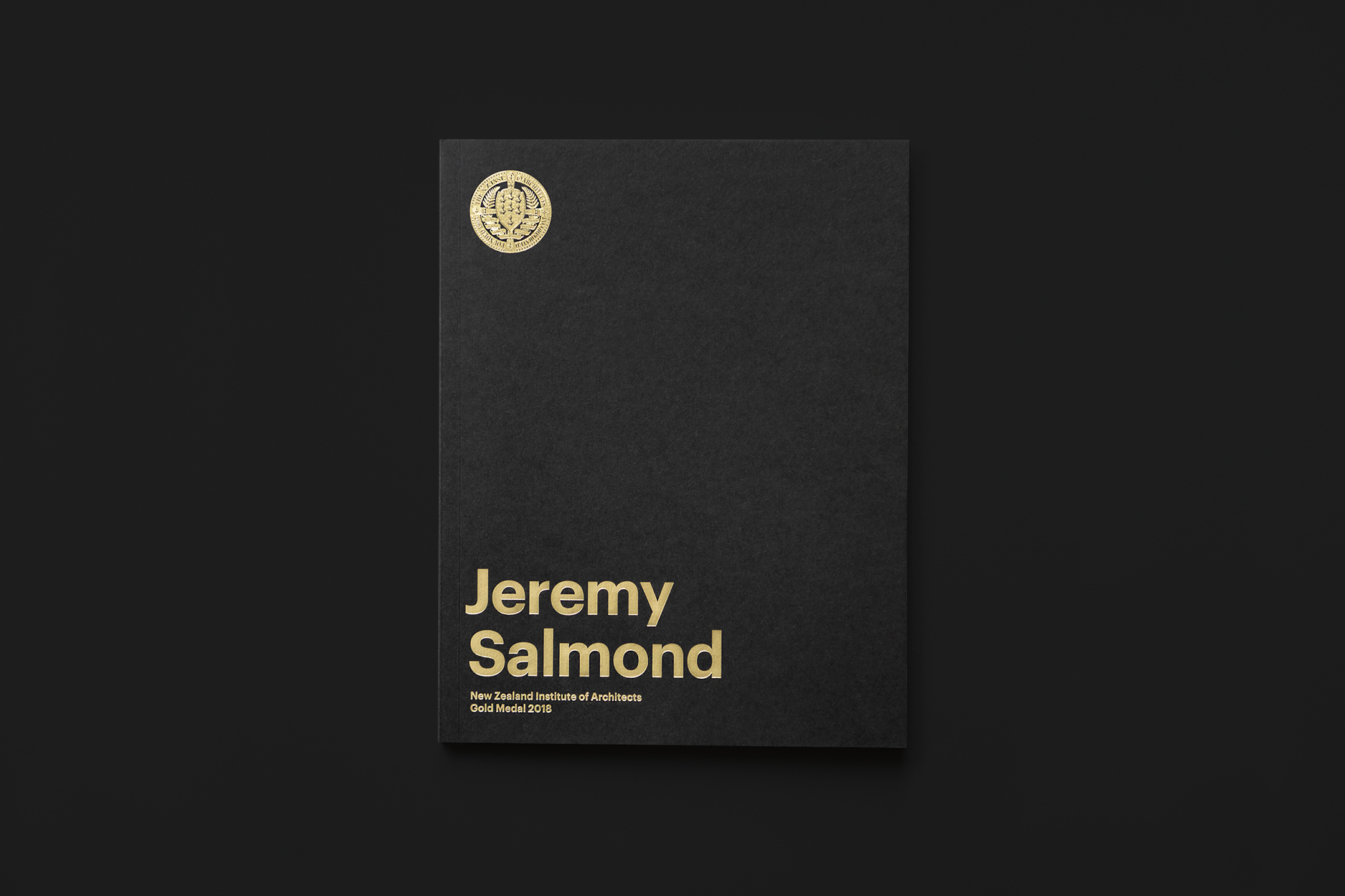
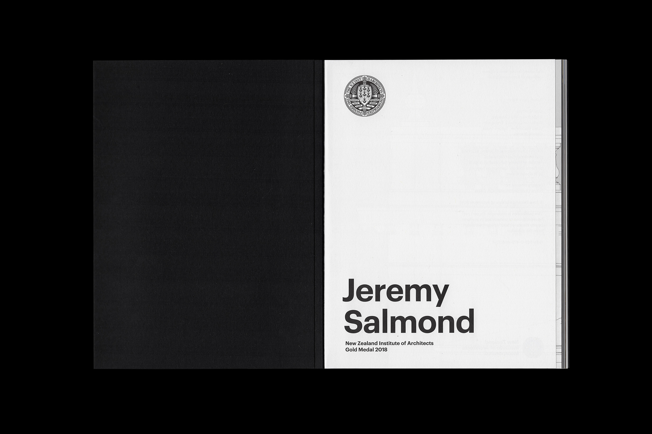
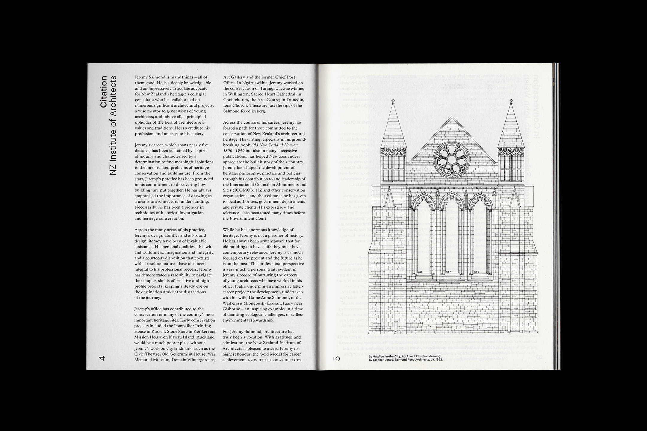
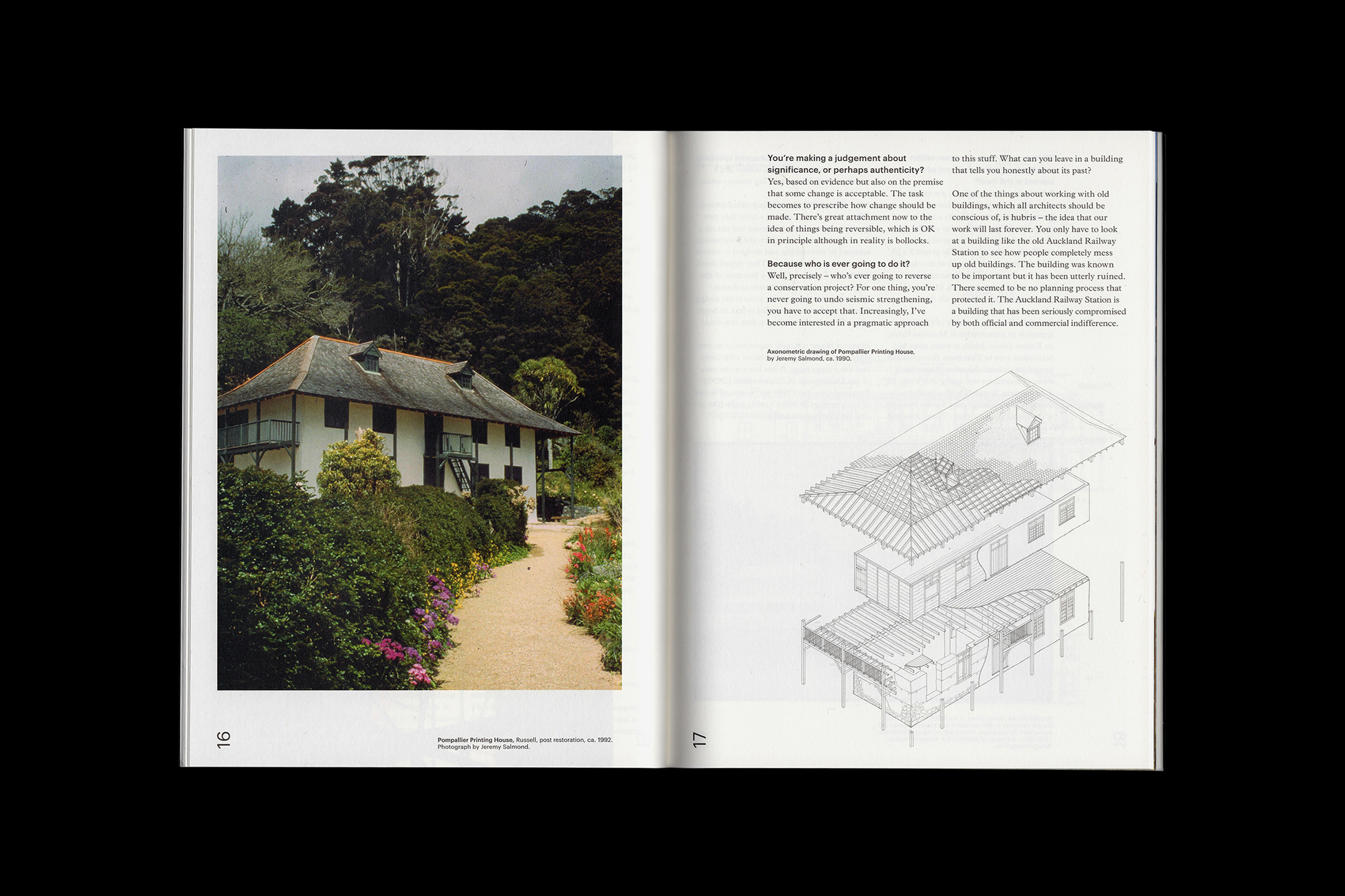
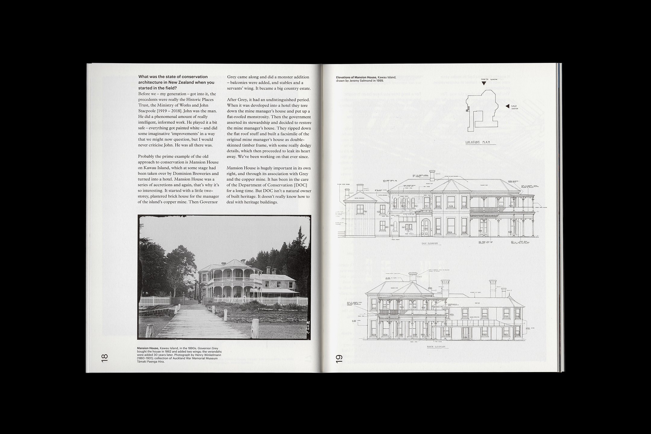
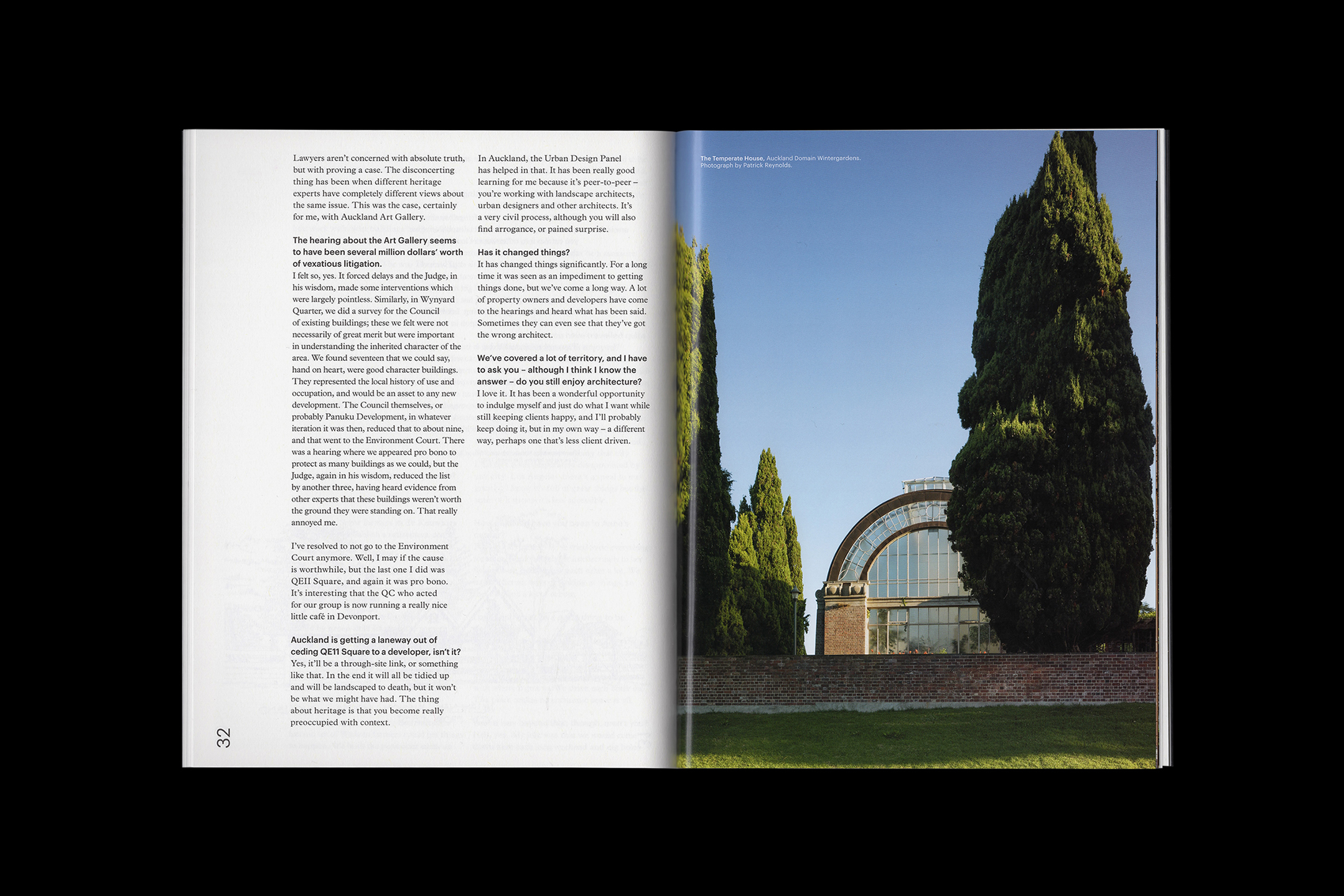
Gold Medal
[Designed at Inhouse]
Creative Director
Arch MacDonnell
Design Director
Toby Curnow
Designers
Alexandra Turner
Typefaces
Graphic & Plantin
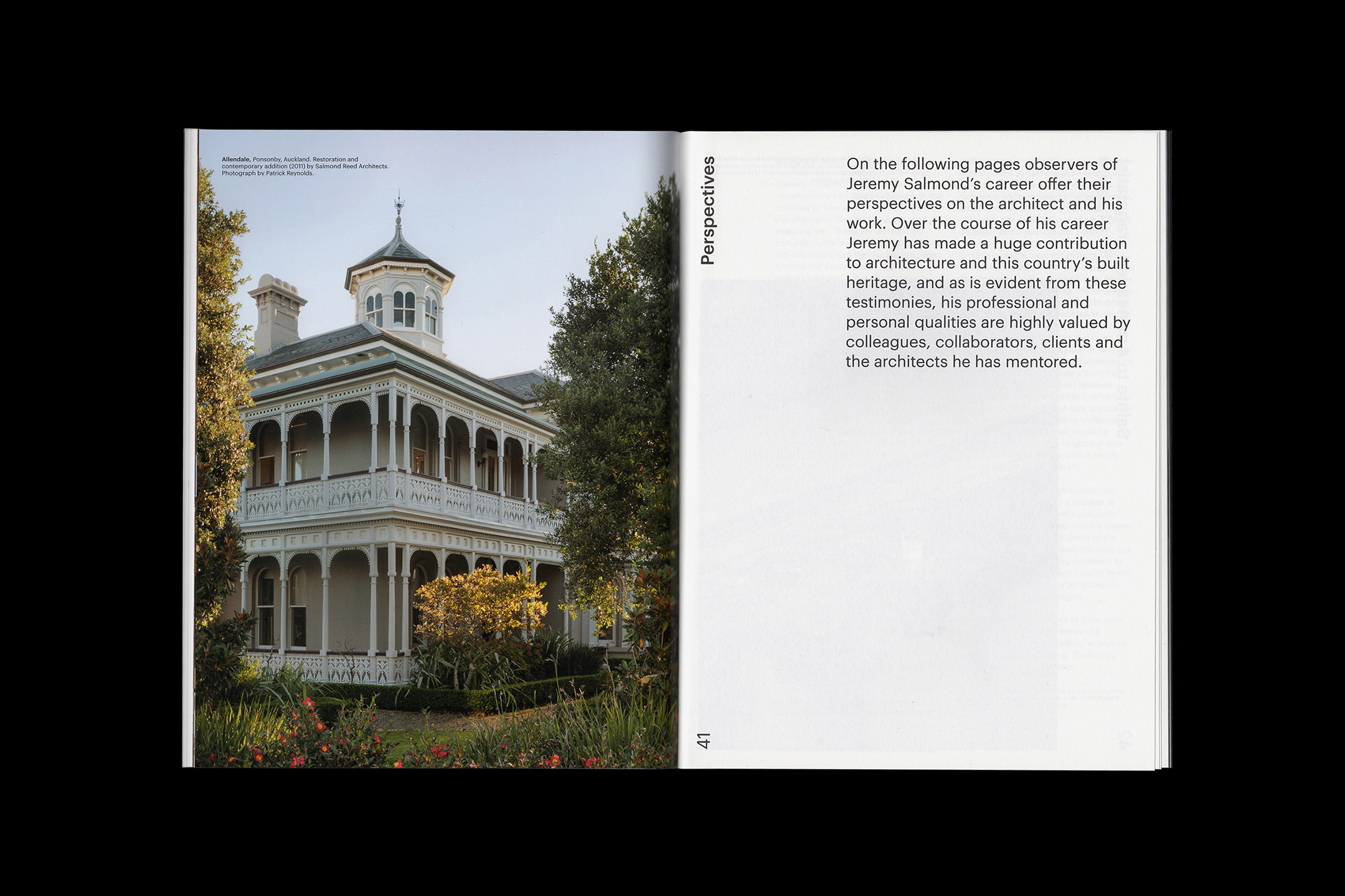
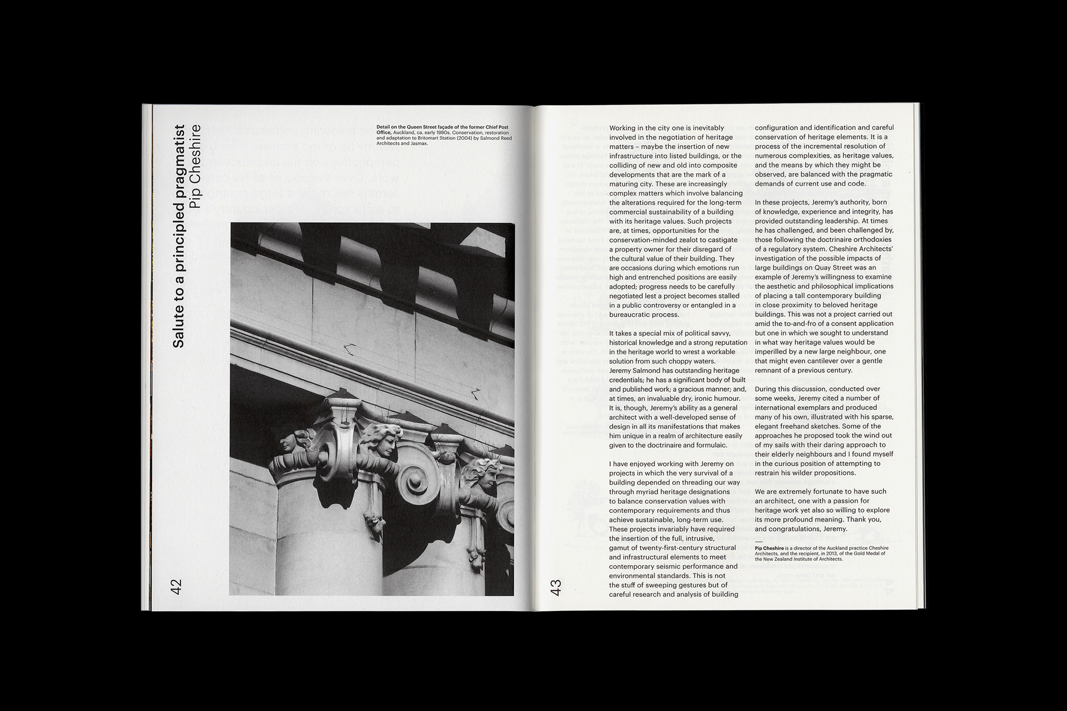
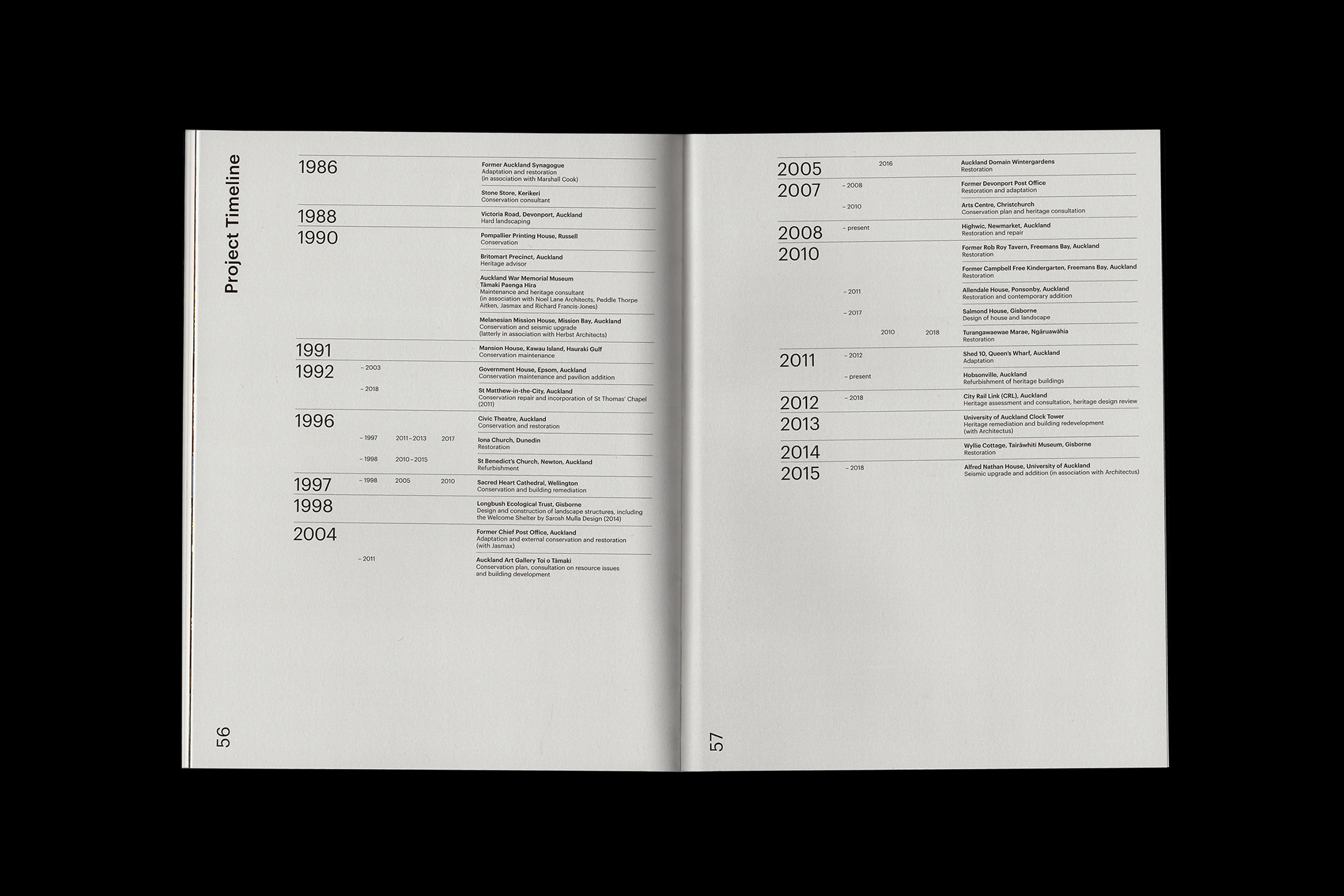
The Gold Medal publication was produced for the New Zealand Institute of Architects. It recognises the life works of Jeremy Salmond, a New Zealand architect, who’s distinguished work features on many of Auckland's historical and culturally significant buildings.
The award is given annually, along with the publication, to commemorate the architects achievements. The publication documents key projects from Salmond's career in an interview format.
The publication was printed on an off-white uncoated stock, with a coated plate section, featuring photography by Patrick Reynolds.
![]()
![]()
![]()
![]()
![]()
![]()
![]()
![]()
![]()
-
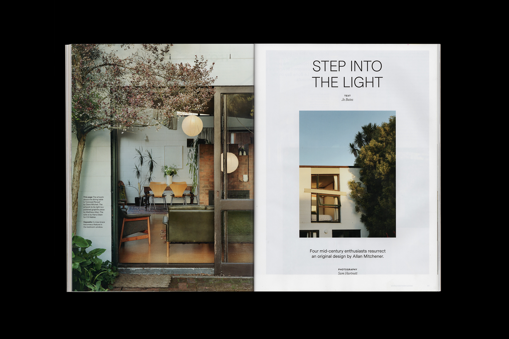
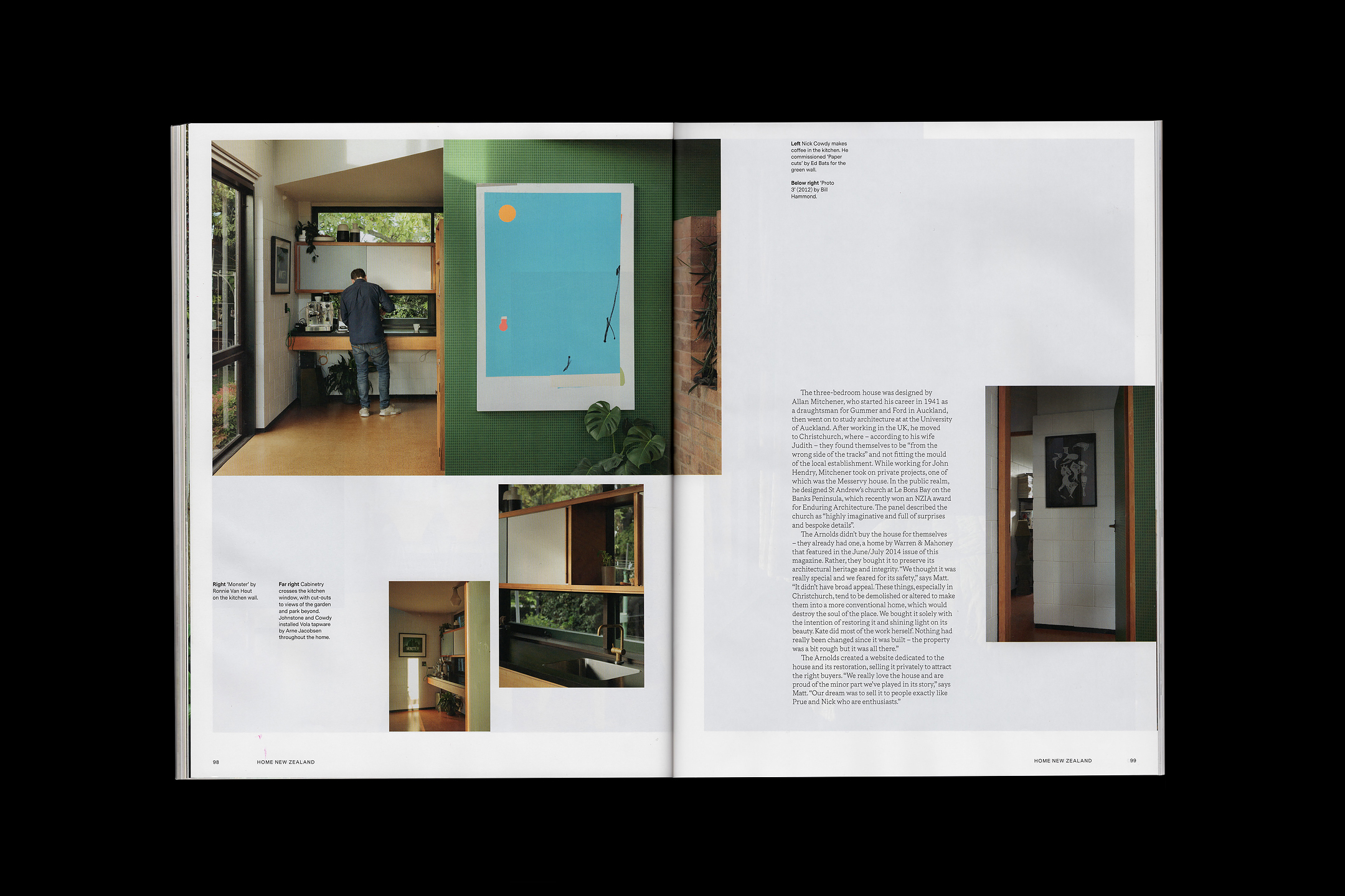
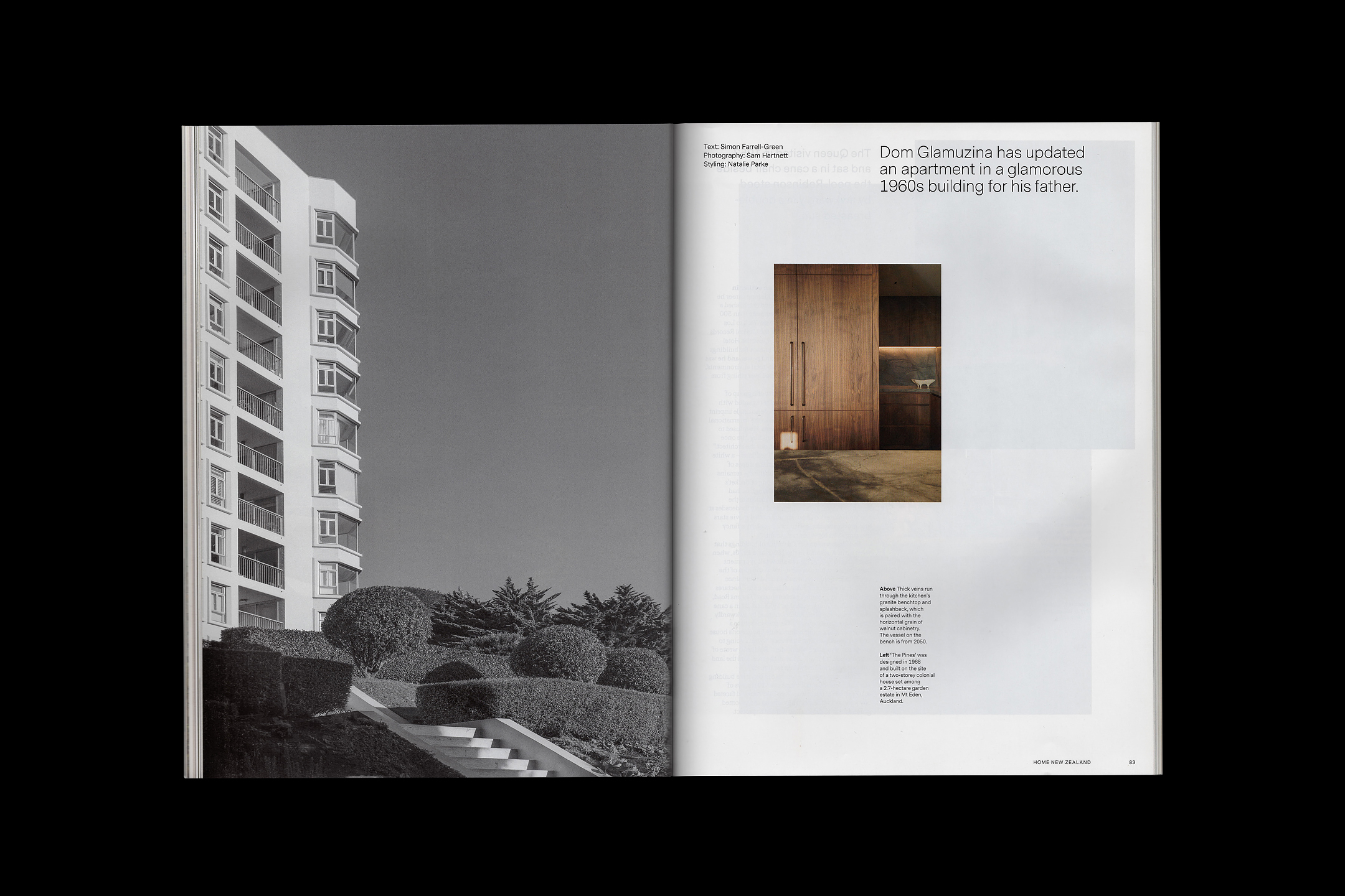
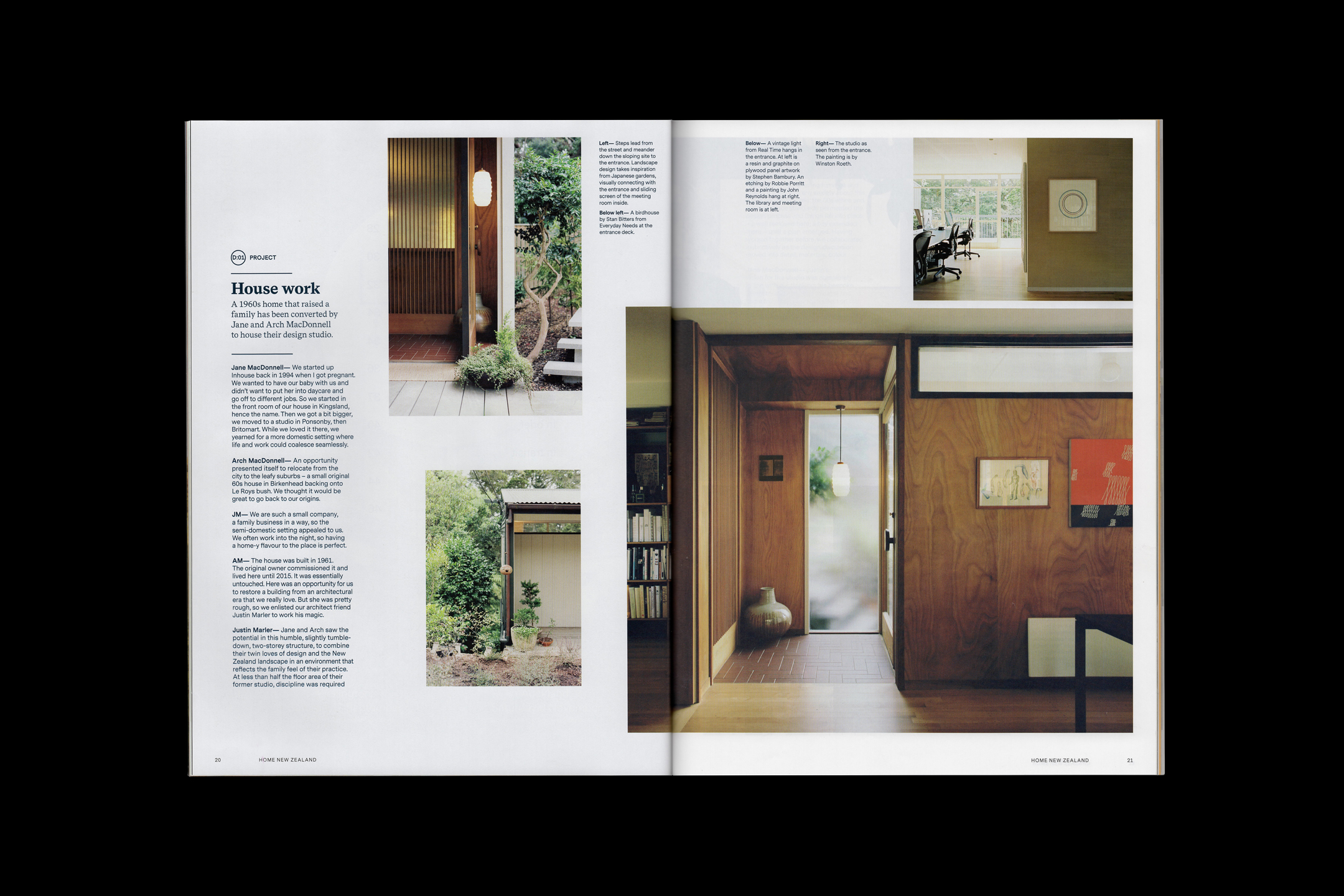
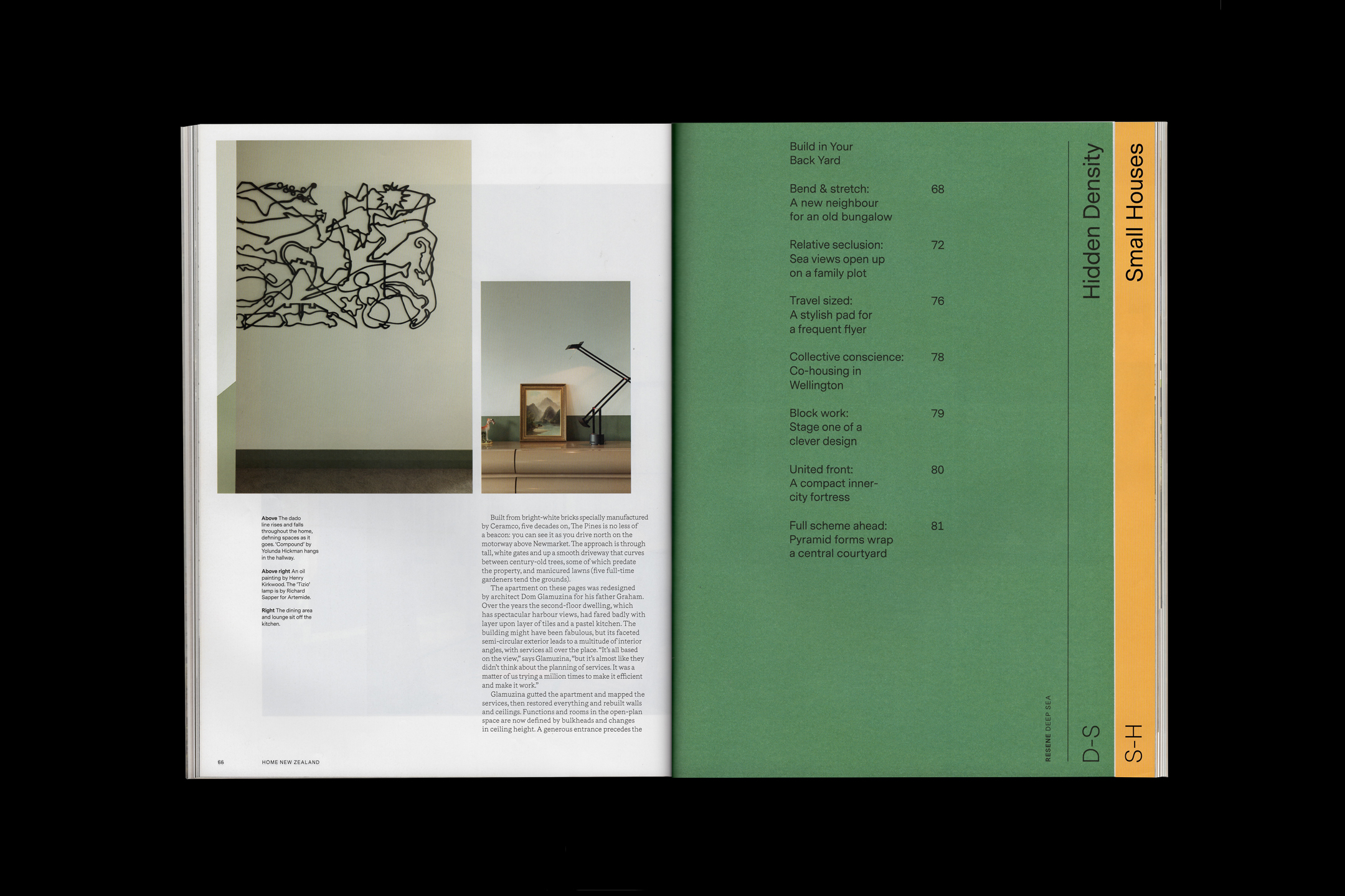
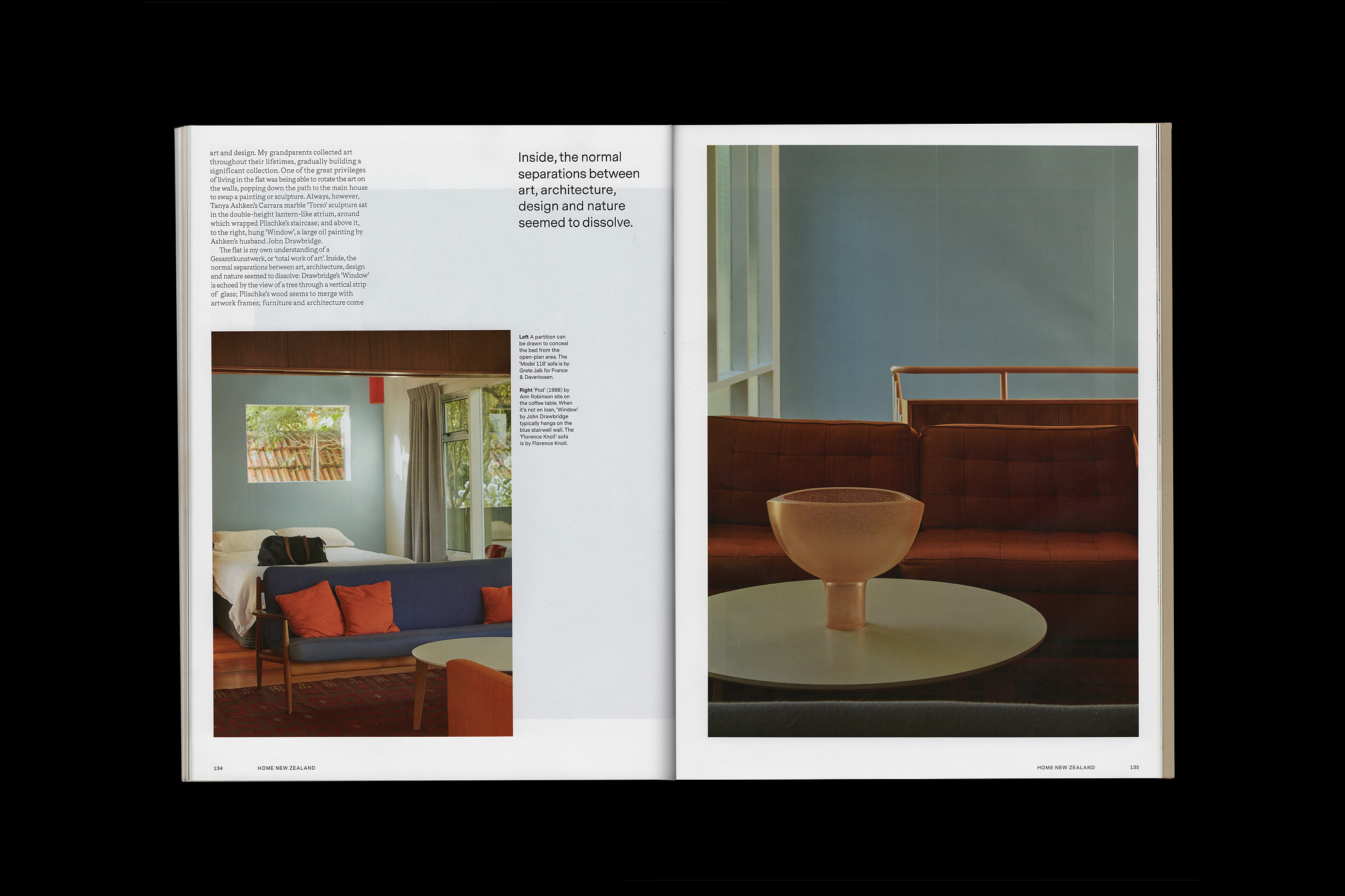
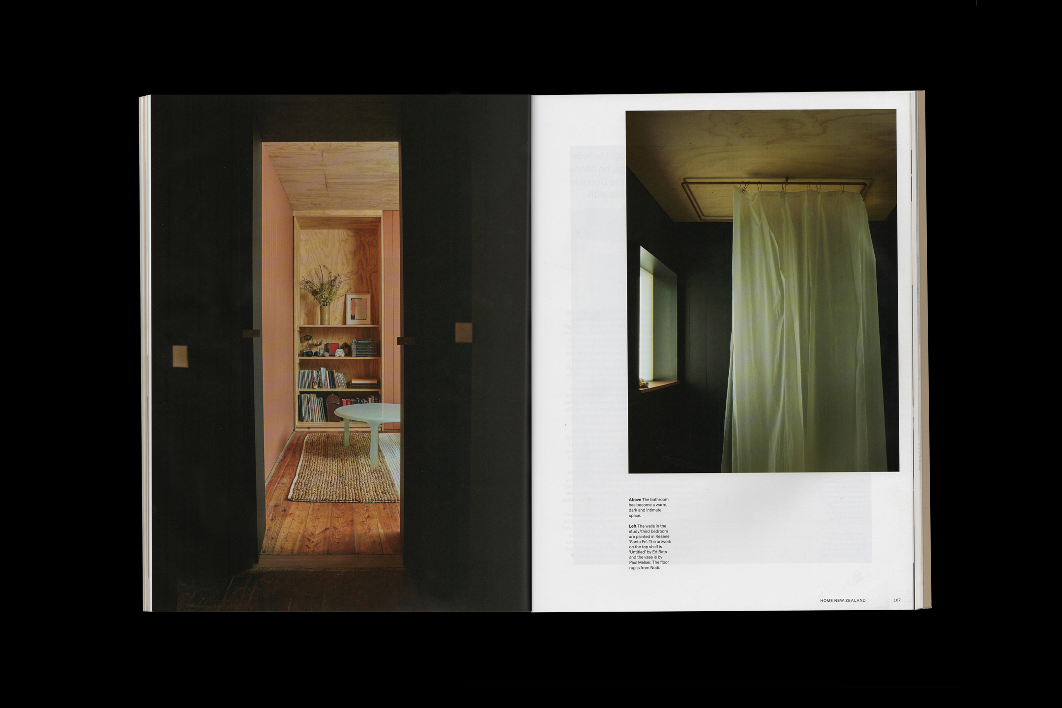
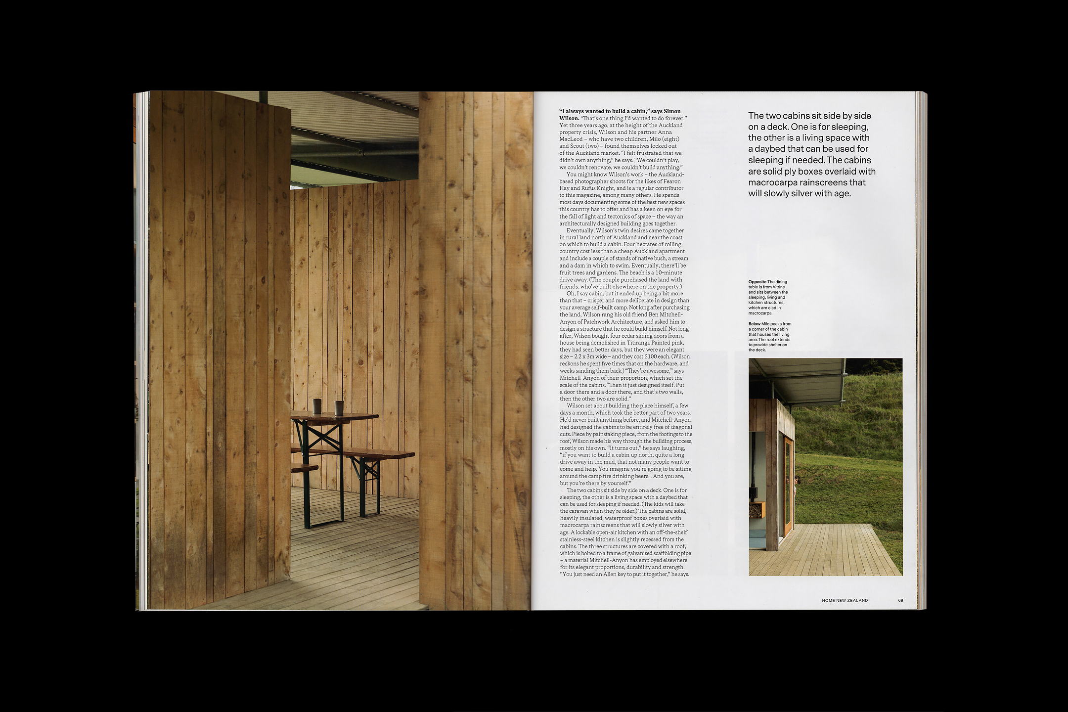
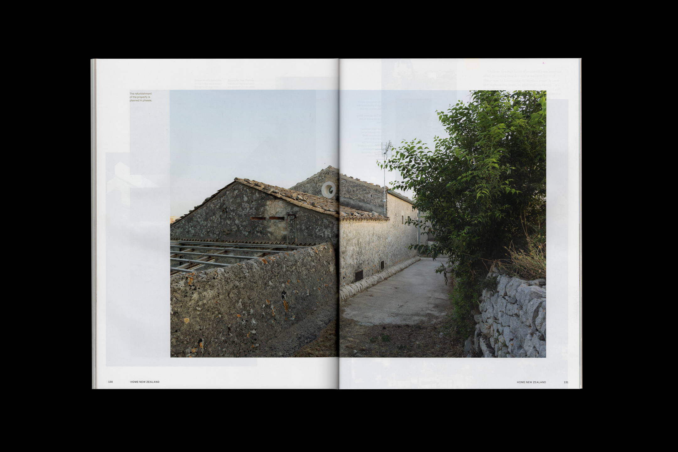
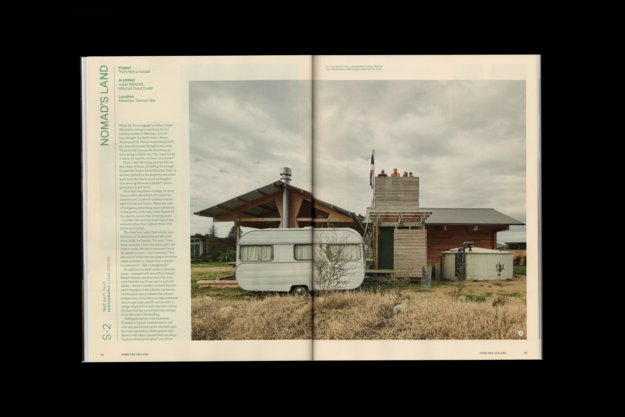
HOME
[Designed at Inhouse]
Creative Director
Arch MacDonnell
Designers
Alexandra Turner
Typefaces
Messina Sans & Messina Serif
Awards
Voyager Media Awards 2020
Best Cover Design & Best Magazine DesignVoyager Media Awards 2019
Best Magazine DesignMagazine Publishers Association 2019
Best Cover DesignHOME is a New Zealand architectural magazine focusing on residential architecture, design and culture, publishing since 1936. It is produced bimonthly with themed issues, from small houses to summer retreats.
The design was an ever evolving process, responsive to the content of each issue; from colour, layout and typography to the paper stock selection.
The short life span of a magazine allowed for playful design exploration, within the restraints of the established visual identity of HOME.
![]()
![]()
![]()
![]()
![]()
![]()
![]()
![]()
![]()
![]()
![]()
-
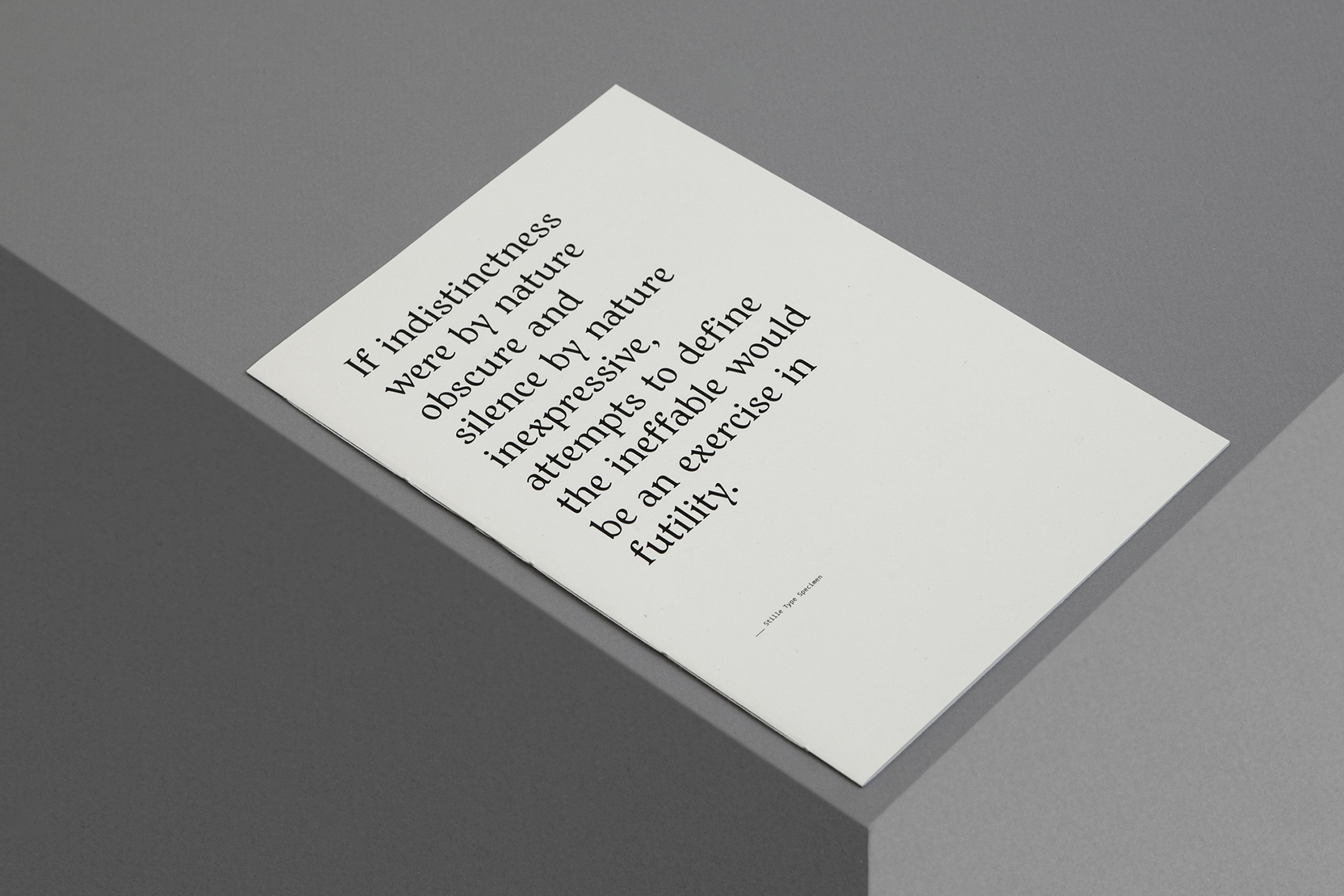
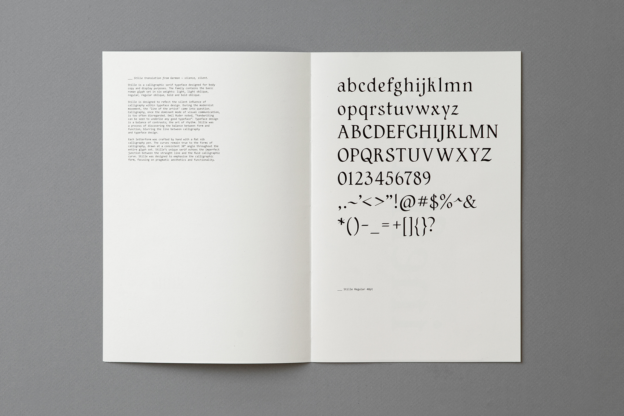
Stille
[University Project]
Typeface
Stille
Paper Stock
ECO100 100gsm
Trophée Pink 80gsmAwards
DINZ Best Awards 2016
Gold in Student CategoryAGDA Awards 2016
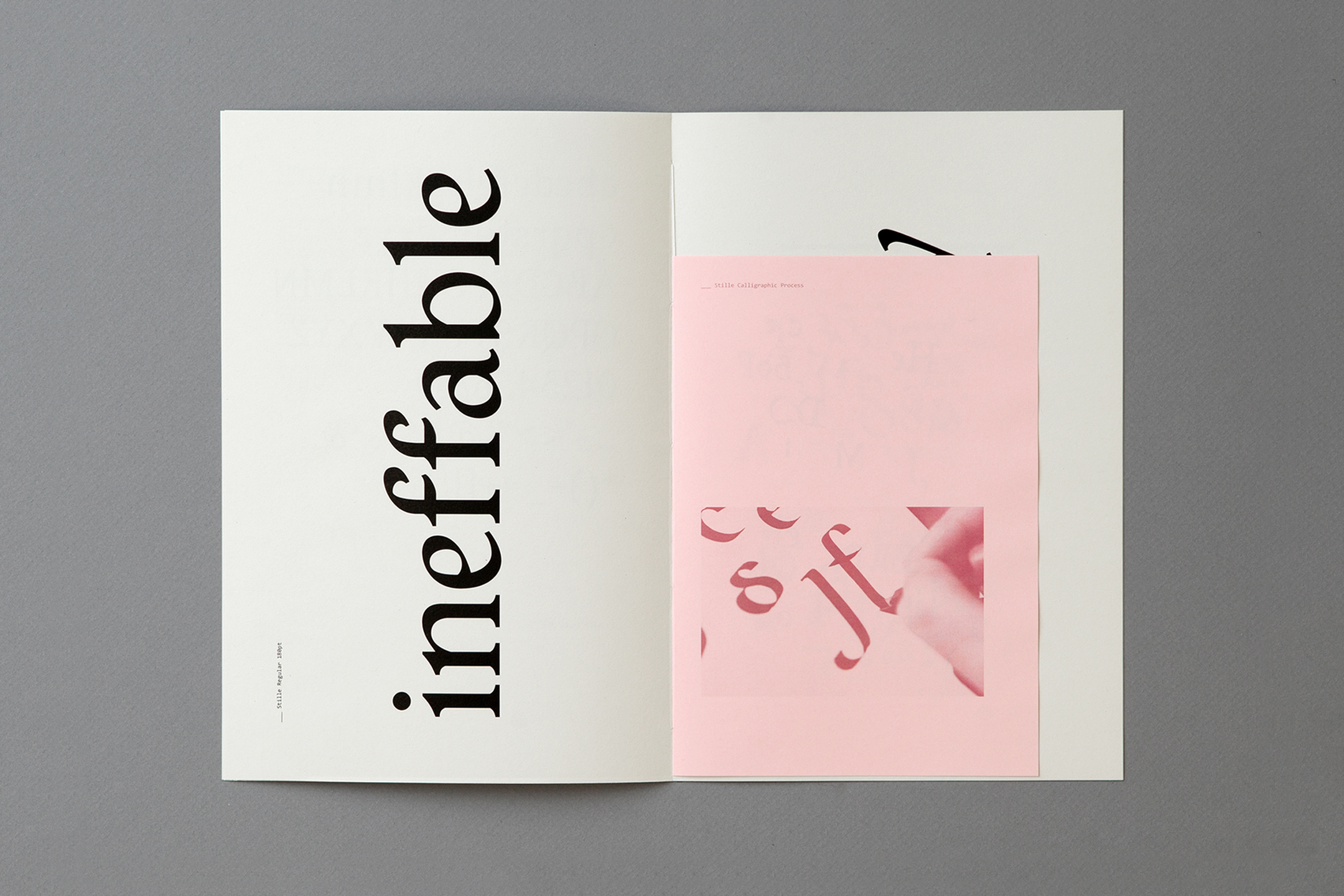
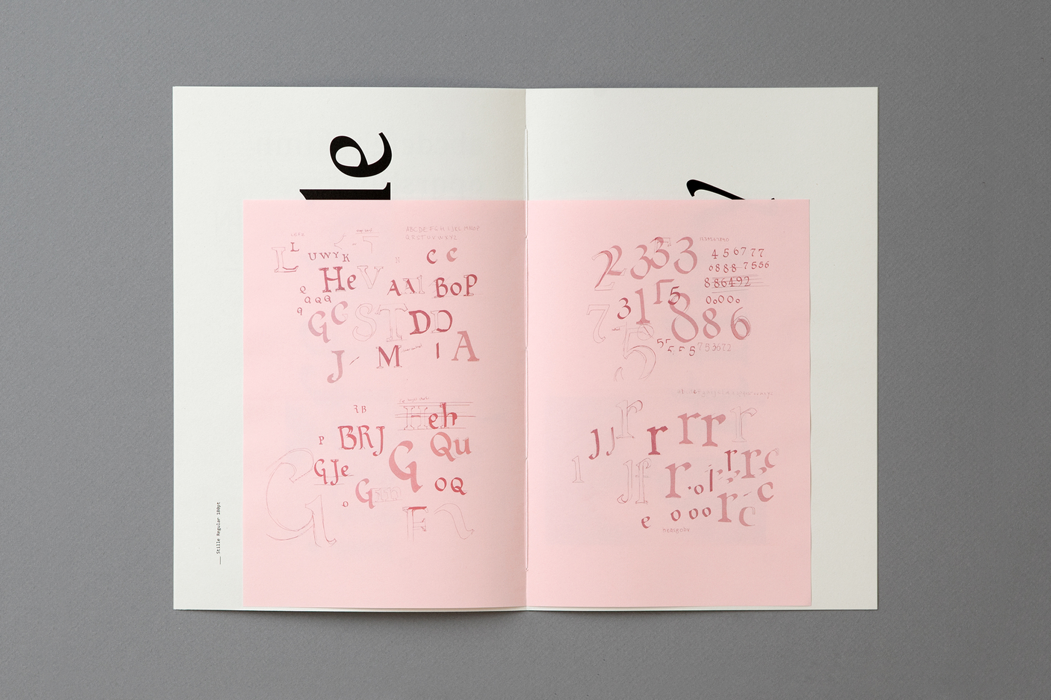
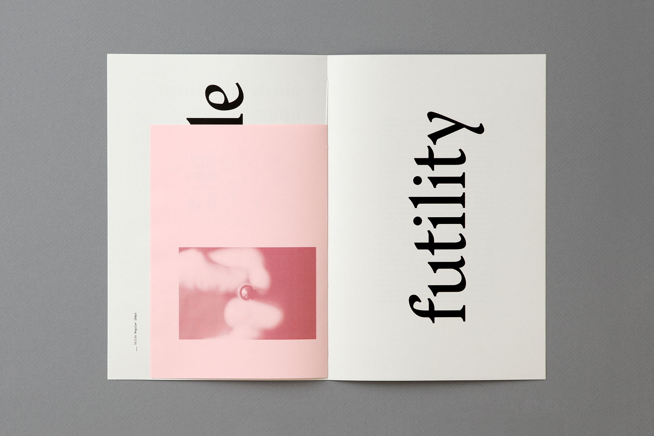
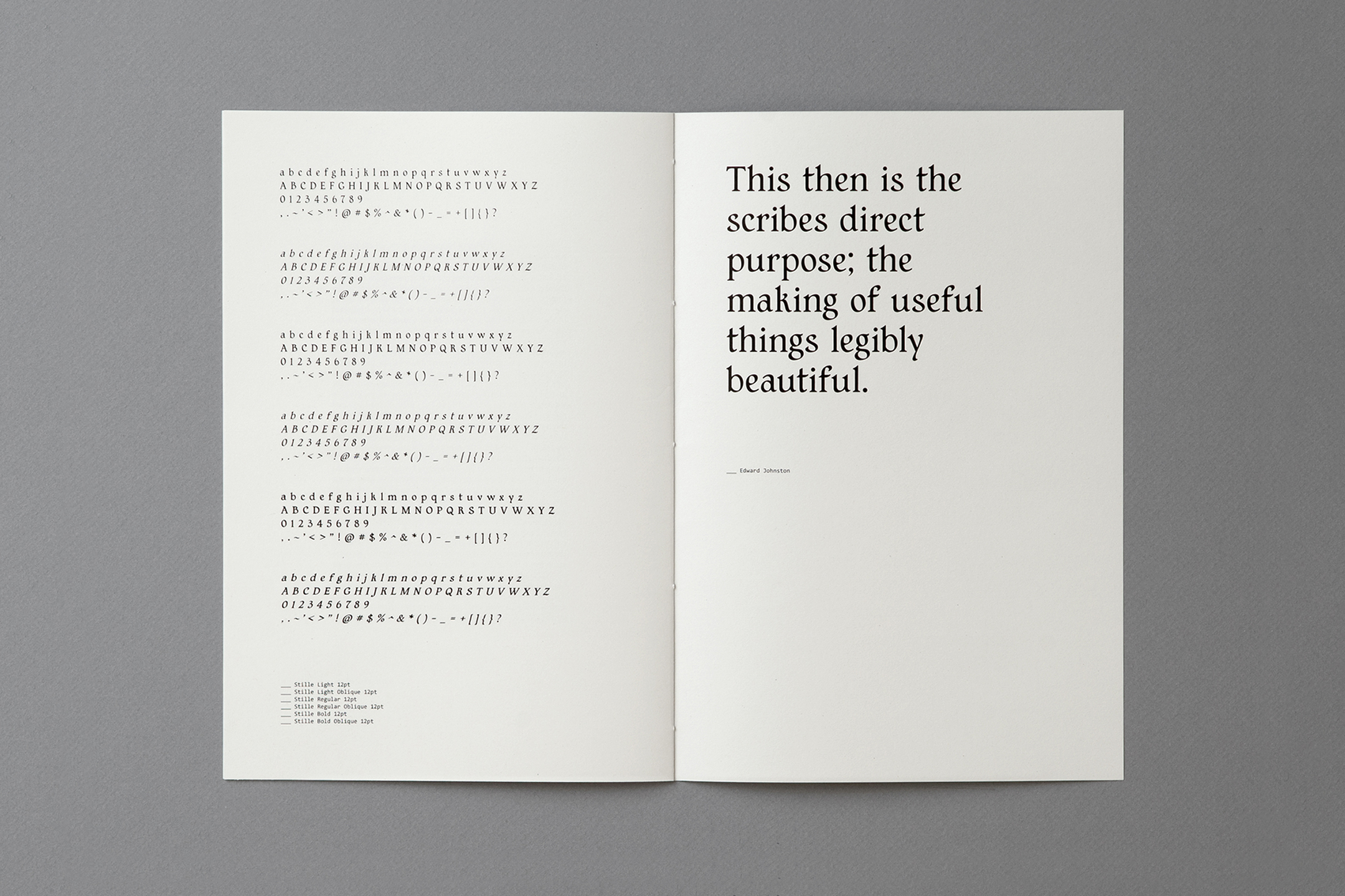
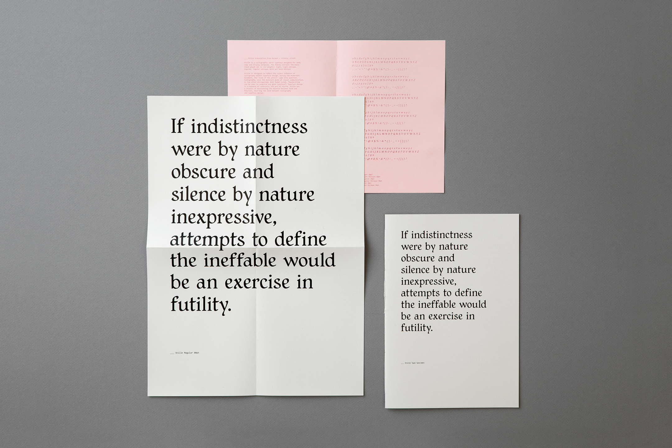
Distinction in Student CategoryStille is a calligraphic serif typeface, referencing the silent influence of calligraphy within typeface design. The broader project involved researching into the significance of the transitional period from calligraphy to Gutenberg's printing press, identifying the remnants of the artform still present in typeface design today.
Stille was designed in ink, at a consistent 30° and translated into a digital typeface, remaining true to the gestures left by the hand. The junction between the serif and the steam is created by the calligraphic nib, a feature unique to Stille.
Translation from German: Stille ~ silence, silent.
The family contains the basic roman glyph of 90 glyphs, set in six weights; light, regular and bold with oblique variants.![]()
![]()
![]()
![]()
![]()
![]()
![]()
![]()
-
Verste
[University Project]
Typeface
Verste
Paper Stock
Munken Pure 80gsm
Print
Riso
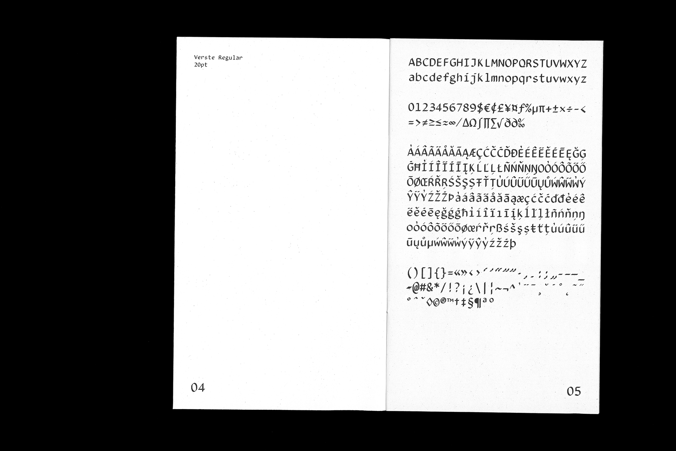
Verste is a calligraphic monospace typeface designed for body copy purposes. As part of a larger research project, reimagining calligraphy for the digital age, Verste was an exploration into the influence of the calligraphic form within typeface design. The fluid forms of the letters are juxtaposed with the monospace structure, the language of code, bringing calligraphy into a digital context.
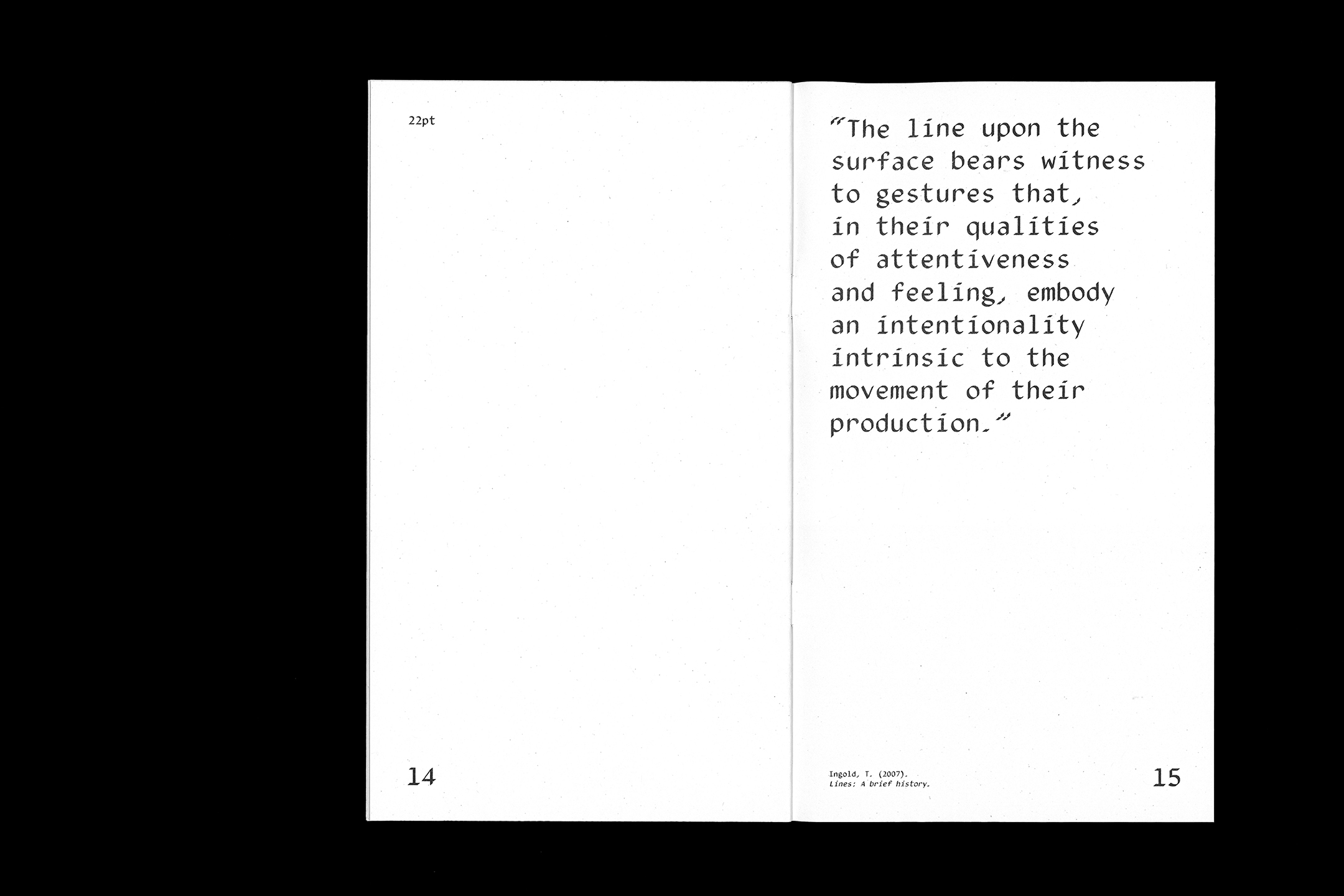
Verste was created entirely through digital processes. Each letterform was crafted by hand with a digital stylus and developed into a functional typeface within Glyphs. Verste is characterised by the refined raw features of the calligraphic form set within the rigid monospace system. Each stroke of the letterform was handcrafted at a consistent 40° angle with a digital stylus, keeping true to the movement of their production. The 'line of the artist' reproduced in digital form.
The font contains 336 glyphs and is available in two weights: regular and oblique. Verste was designed to emphasise the calligraphic form within a digital setting. Verste was presented in a limited edition run of 26 riso printed type specimen booklets, each containing an individualised process glyph insert. Designed to display the typeface on a neutral platform in various contexts, the specimens showcase its usability and distinguishing features.
![]()
![]()
![]()
![]()
![]()
![]()


© Alexandra Turner 2026.